
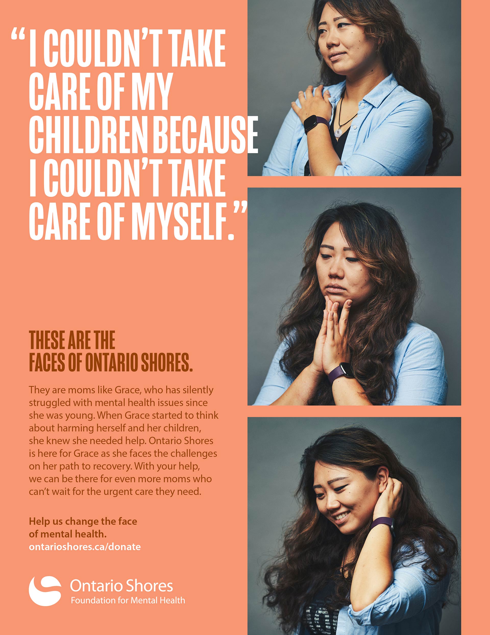
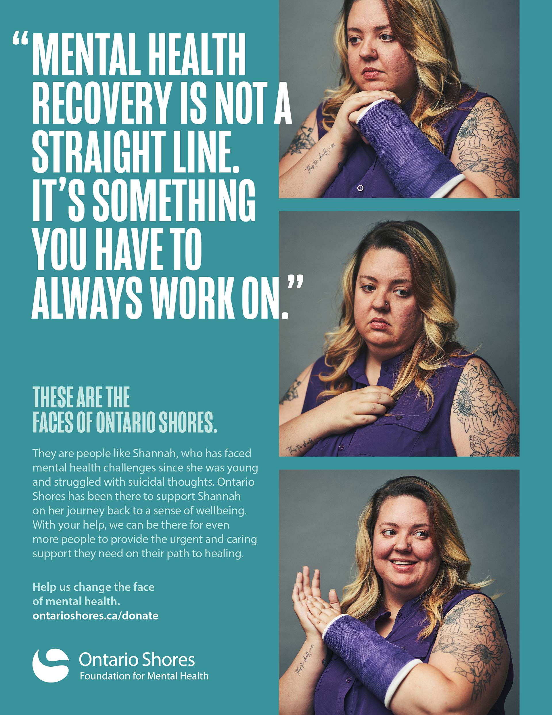
Get ClaritY
Latest news, work, ideas, opinions,
and other musings.

For more than two decades, we’ve worked alongside Jack Liang, aka Spellingbee – sometimes as collaborators, sometimes as creative sparring partners, always in pursuit of the same thing: ideas with substance.
Jack is a writer and strategist who operates at the intersection of branding, communications, and creative development. Over the years, he’s helped a wide range of organizations—from major financial institutions to mission-driven nonprofits—find their voice and tell their stories with clarity, precision, and emotional weight. His work spans brand positioning, messaging, naming, and copywriting. But what truly sets him apart is how seamlessly he moves between strategy and craft. For Jack, writing doesn’t sit downstream of thinking. It is thinking.
Our relationship goes back to our early days as young creatives, learning our craft under pressure and sharpening our ideas through constant challenge. That shared foundation of defending the why before the what, stripping away empty calories, and pushing for work that can hold its own in the real world still defines how we collaborate today.
In this conversation, CS principal Will and Jack reflect on the formative environments that shaped his thinking, the discipline of taste and restraint, the role of emotion in strategically sound work, and what it takes to sustain creative partnerships over decades. It’s a discussion about writing, yes, but more than that, it’s about judgment, trust, and the invisible work beneath the work.
Early Formation
CS: You, Paul, and I all started at Ove as young creatives. What did that environment teach you about thinking, not just execution?
Jack: Oh, the battle scars! You know, looking back on it now, that environment really did shape how we all think and work today.
I think as a young creative, when you’re getting grilled in internal reviews or standing in front of a client trying to sell them on your big idea and you’re forced to defend your work—you figure out pretty fast that having a cool concept isn’t enough. You'd better be able to explain why it works, why it's the right solution, and really, why they should trust you with their budget or their brand.
I mean, if you’re sitting across the table from a CEO or CMO, are they really going to geek out over the nuances of design theory or care about your clever typography? They’re not there for that. What they want to understand is what it means for their business.
So, as you know, we learned early on that the best way to get anyone on board is to always lead with the “why” before you even get to the “what.” Why are we doing this? Why is it the right solution? Why will this connect with their audience?
It became second nature for us to push each other on this. Like, “Okay, that’s really cool, but what’s the thinking behind it? What’s the strategic underpinning here?” There’s a reason we always talked about making our ideas bulletproof—and still do. Because if we couldn’t defend it under pressure, it probably wasn’t strong enough to begin with.
What I really valued about the way you and I worked was that even if we came up with the coolest, most aesthetic concept, if there was nothing solid underneath it, we’d rip it apart ourselves before anyone else could. It was like, “This is beautiful, but it’s empty calories.” And don’t get me wrong, I love cookie dough ice cream—and there’s a time and place for things that are just indulgent. But when you’re trying to solve real business challenges, you need more than that. You need ideas with weight and substance that can actually do the work.
That discipline of always asking “why” before “what”—that’s what stuck with me. It’s not about being precious with your ideas. It’s about making sure they’re actually good.
Beyond the Writer–Designer Divide
CS: You’ve often acted as a true concept partner rather than a downstream writer. What separates productive creative duos from dysfunctional ones?
Jack: I like to joke that I have two pet peeves that drive me irrationally insane. One is drivers in front of me who wait until the light turns green to flip on their left turn signal. The other is designers who arbitrarily change copy just to make their line breaks look prettier—you know, tweaking a headline or cutting words to make the layout flow better visually, without actually thinking about what it does to the message.
I think a strong creative duo is one where both partners fundamentally understand that design and writing work hand-in-hand. They’re not separate disciplines. They’re two sides of the same coin, and the most productive teams really understand the value of both.
There’s as much thought behind the words we choose as there is in every design decision we make. Every word is there for a reason—rhythm, tone, impact. And great designers get that. They respect the craft of writing the same way writers need to respect the craft of design.
And it does go both ways, of course. Writers can’t be too precious about their words either. If a designer comes back and says, “Hey, this is visually cluttered, can we tighten this up?” or “Can we find another way to say this so it doesn’t break across three lines?”—that’s a valid concern. I get it. And, yeah, that ugly line break bothers me too.
I think the best work happens when both sides respect each other, are willing to challenge one another, and ultimately make the work better together.
Thinking Before Language
CS: Your strongest work begins before words exist. How do you approach a problem before copy enters the picture?
Jack: As a writer, it’s kind of weird for me to say this, but words have never really come naturally to me. I think it stems from the fact that English wasn’t my first language. Growing up in an immigrant family, conversations at home were always this mix of English, Mandarin, and Cantonese—sometimes all three in the same sentence. I think a lot of first-gen Canadians or children of immigrants can relate to this. You’re trying to communicate with your parents, but you don’t always have the vocabulary in the language they understand best, and they don’t always have it in yours. So you improvise. You describe things in roundabout ways. You find creative workarounds to get your point across because you don’t have the right words.
And I think that shaped how I approach writing. Ideas have always been more important to me than the actual words themselves. Like, the thought is the thing—the concept, the message, the emotion you’re trying to express. The words are just the vehicle to get you there.
Don’t get me wrong, I love, love, LOVE beautiful prose. There’s something magical about a perfectly crafted sentence. But for me, the idea I’m trying to convey always takes the lead. Because at the end of the day, it’s not about showing off how well you can write. It’s about whether people actually “get” what you’re trying to say.
Taste as a Creative Skill
CS: Good taste drives judgment, restraint, and clarity. How do you define it—and how has yours been sharpened over time?
Jack: Hmm... that’s a tough one. I mean, how do you define what good taste is? That’s like asking someone to explain what “cool” is. If you can define it, it’s probably not.
I like what I like, but does that make it good? (The answer is yes by the way. Just kidding.) Someone else will absolutely hate my style—does that mean their taste is bad? (Also yes, haha.)
That said, I like what you said about restraint and clarity because that really speaks to me. I think my personal taste is defined by those qualities. It’s about knowing when to pull back, when to let an idea breathe, when to strip away everything that doesn’t need to be there. “Less, but better,” as Dieter Rams would say.
From Agencies to Independence
CS: What ultimately pushed you to start Spellingbee, and what did agency life fail to support as your thinking matured?
Jack: I wouldn’t want to position it as a failure at all—I mean, some of the best times of my career and closest friendships I made were from when we all worked together at Ove. Those years shaped so much of how I think and work today.
But for me, it really came down to wanting more control over the work I was doing. Control over what I was working on, who I was working with, and how I spent my time. In an agency, you’re often at the mercy of whatever comes through the door—sometimes it’s dream projects, sometimes it’s not. And as I matured creatively, I found myself wanting to be more selective. To say yes to the projects that excited me and no to the ones that didn’t.
There are absolutely pros and cons to going out on your own, of course. And it’s definitely not for everyone. I thought about it for years before I actually took the leap. There’s a certain security and structure that comes with agency life that you give up when you go solo or start your own thing. But I feel fortunate that things worked out the way they did for me.
That said, I do miss certain things. Like the camaraderie of the studio environment—the energy of being surrounded by talented people every day, the spontaneous conversations, just seeing my friends regularly. You can’t replace that. But do I miss the daily commute? Nope. Don’t miss that at all.
Strategy Disguised as Story
CS: Your writing often carries heavy strategic weight without feeling strategic. How do you turn abstract positioning into something people feel?
Jack: I’m a vibes guy, what can I say? How many times in our creative meetings have you heard me say, “I want to make the client cry”? And I mean that sincerely—not in a manipulative way, but in the sense that I want people to feel something when they encounter the work.
Because if people don’t feel anything, it doesn’t matter how strategically sound your positioning is. It just becomes noise. Or wallpaper. I don’t want work that feels focus-group tested or inauthentic or like it came out of a messaging workshop. I want work that feels human.
So, for me, it’s always about getting to the heart of the story you need to tell. Really understanding why it matters to the people you’re trying to reach. What’s the emotional truth at the heart of this? What’s the thing that’s going to make them lean in, pay attention, feel something they didn’t expect to feel?
And once you find that, the strategic part almost takes care of itself. Because when you connect with people emotionally, when you tap into something real, the strategy becomes invisible. It’s there, doing all the heavy lifting in the background, but what people experience is just the feeling. And that’s when you know you’ve got it right.
Writing That Asks People to Care
CS: Fundraising work demands emotional precision. Where do you draw the line between persuasion and manipulation?
Jack: It’s a fine line, isn’t it? For me, it comes down to authenticity. Being real in the emotions you’re conveying. If you’re manufacturing feelings just to pull at heartstrings, people can sense that. They might not be able to articulate why something feels off, but they’ll feel it. And once you lose that trust, it’s gone.
To me, it’s about telling a true story in the most compelling way possible. It’s about finding the human truth in a situation and bringing it to life so people can connect with it.
I think you just have to ask yourself: Are you being honest about the problem, the impact, and what’s at stake? Are you representing the people and communities you’re advocating for with dignity and accuracy? If the answer is yes, then you’re persuading. If you’re cutting corners on truth to amp up the emotional impact, that’s when you’ve probably crossed the line.
At the end of the day, the best fundraising work doesn’t need to manipulate because the real stories are powerful enough on their own. Your job is just to tell them well.
Why Clear Space Is Different
CS: You collaborate with many designers and studios. Why do you keep coming back to work with us—and what makes our way of working fundamentally different?
Jack: I think what makes our relationship so special is that we think in fundamentally the same way. We approach our work with the same strategic, integrated mindset where it’s never about protecting our individual turf. It’s not, “You do the design and I’ll do the writing, and let’s just hope it all comes together in the end.” We both understand that it’s the idea above all—wherever it comes from.
That’s why I loved working with Clear Space on the new Spellingbee website. It was really collaborative from the start. It wasn’t just, “Here’s what I want the site look to like, can you guys execute it?” We really worked together to understand what I needed the website to do. But even before that, you pushed me to take a step back and articulate what my business goals were going forward. You made me define that—which, as we all know, is hard to do for ourselves. And that all happened before we even talked about design.
Often there’s this invisible boundary where the writer stays in their lane and the designer stays in theirs. But with you guys, there’s this fluidity. You understand that strategy, design and communication all work together. You’ll push on the writing if it’s not working. I’ll push on the design if I think we can go further. And neither of us gets defensive about it because we’re both doing it in the interest of arriving at the best possible idea, executed in the best possible way.
Also, you guys are funny. I’m here for the jokes.
Sustaining Long Creative Relationships
CS: We’ve collaborated across decades and many projects. What allows a creative partnership to stay sharp rather than familiar?
Jack: I think a big part of it is that the way we originally worked together as a creative team—the way we learned to approach our thinking, challenge each other, and push for stronger ideas—that’s been instilled in the rest of your team. It’s not just you and me anymore. Or you, me and Paul. It’s a whole studio of people who think the same way, who apply the same rigour and curiosity to how they work. And they’re always bringing fresh perspectives to the table. New references, new ways of solving problems, new energy.
So even though we’ve been working together for years, it never feels like we’re just going through the motions. It’s so easy to just coast on what worked before—and you really have to catch yourself when you do. It’s important to keep evolving, keep bringing new voices into the conversation, keep challenging yourself to do better work than you did last time. Even if it is stressful sometimes to keep trying to top yourself.
The Unwritten Idea
CS: What’s a project, idea, or truth you’ve never been asked to write—but think the industry desperately needs to hear?
Jack: I don’t have enough of an ego to think the industry is desperately missing something from me. I mean, I’m not out here thinking, “If only they’d let me share my wisdom, everything would change.” That feels off brand for Spellingbee (haha). I’m just out here doing my thing.
Do I have projects or ideas I’d love to work on? Absolutely. But they’re more like personal projects than anything tied to creative briefs or client budgets. They’re the kind of things you make for yourself—not because someone’s paying you, but because you just need to get them out of your head and into the world.
I like the thought of producing something and sending it out into the ether to be received or not. No expectations, no agenda. Just putting it out there and seeing what happens.
Maybe it lands with someone right away. Maybe it takes years. Maybe it never does. But the act of creating it and releasing it—and trusting that if it’s meaningful, it’ll find its way to the people who need it. I think there’s something beautiful and freeing in that. In the thought that, kind of like starlight, one day this will reach you.

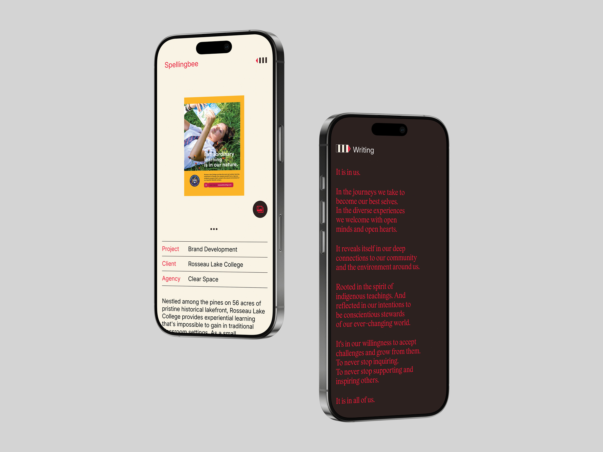
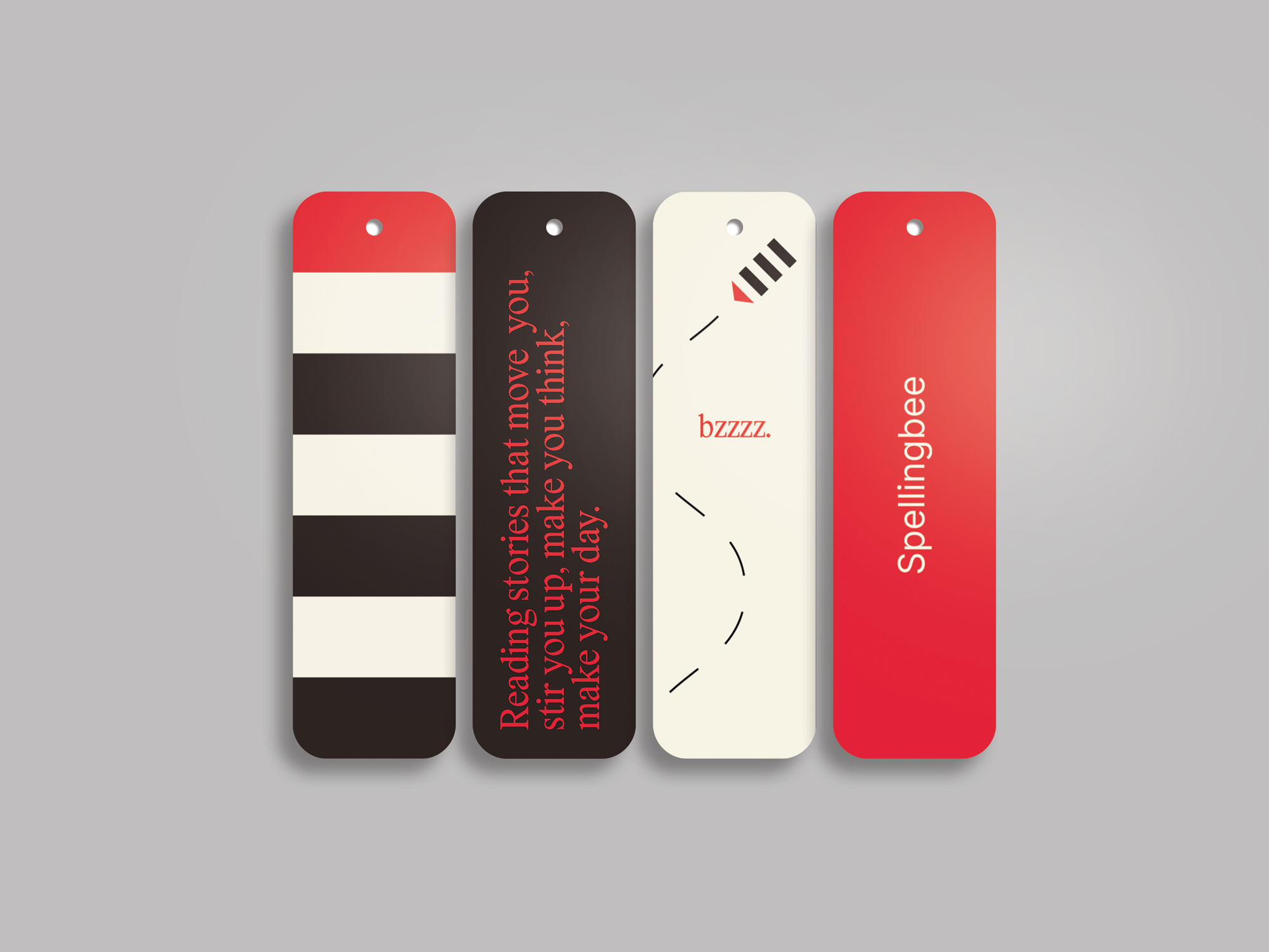
We’re stoked to share the launch of a refreshed identity and website for longtime friend and collaborator Jack Liang and his writing and communications practice, Spellingbee.
Originally last updated in 2016, the refresh reflects how Jack’s practice has evolved—broadening the way his work and services are presented, improving usability, and modernizing the technical foundation under the hood. The goal was simple but ambitious: create a clearer, more comprehensive way to showcase the full scope of his capabilities, from writing and creative development to strategy, while making it easier for agencies and design partners to envision how he can support their work.
In true Jack form, the new look is minimalist and considered, anchored by elegant typography and a smart, understated interface that puts the thinking first. We also introduced a new visual device we’ve affectionately dubbed the “bee pen.” It’s a familiar, flexible logo bug (pun intended) designed to live comfortably on the web and print—part functional signature, part whimsical nod to the Spellingbee name.
“Working with Clear Space is a true partnership. They’re really good at helping you articulate what you’re trying to achieve while opening your eyes to opportunities you hadn’t even thought of—which ultimately makes your project stronger. Couldn’t be happier with the site. They’ve done a great job of capturing who I am. This is me in web form.”
— Jack Liang

Our relationship with Jack goes back to our early days as young creatives, shaped by a shared belief in defending the why before the what, stripping away empty calories, and pushing for ideas with real weight. This project is a continuation of that same mindset. Clear thinking, thoughtfully expressed.
Visit the new Spellingbee site to see the work in its refreshed form, and read our full interview with Jack for a deeper look at the thinking behind the words.

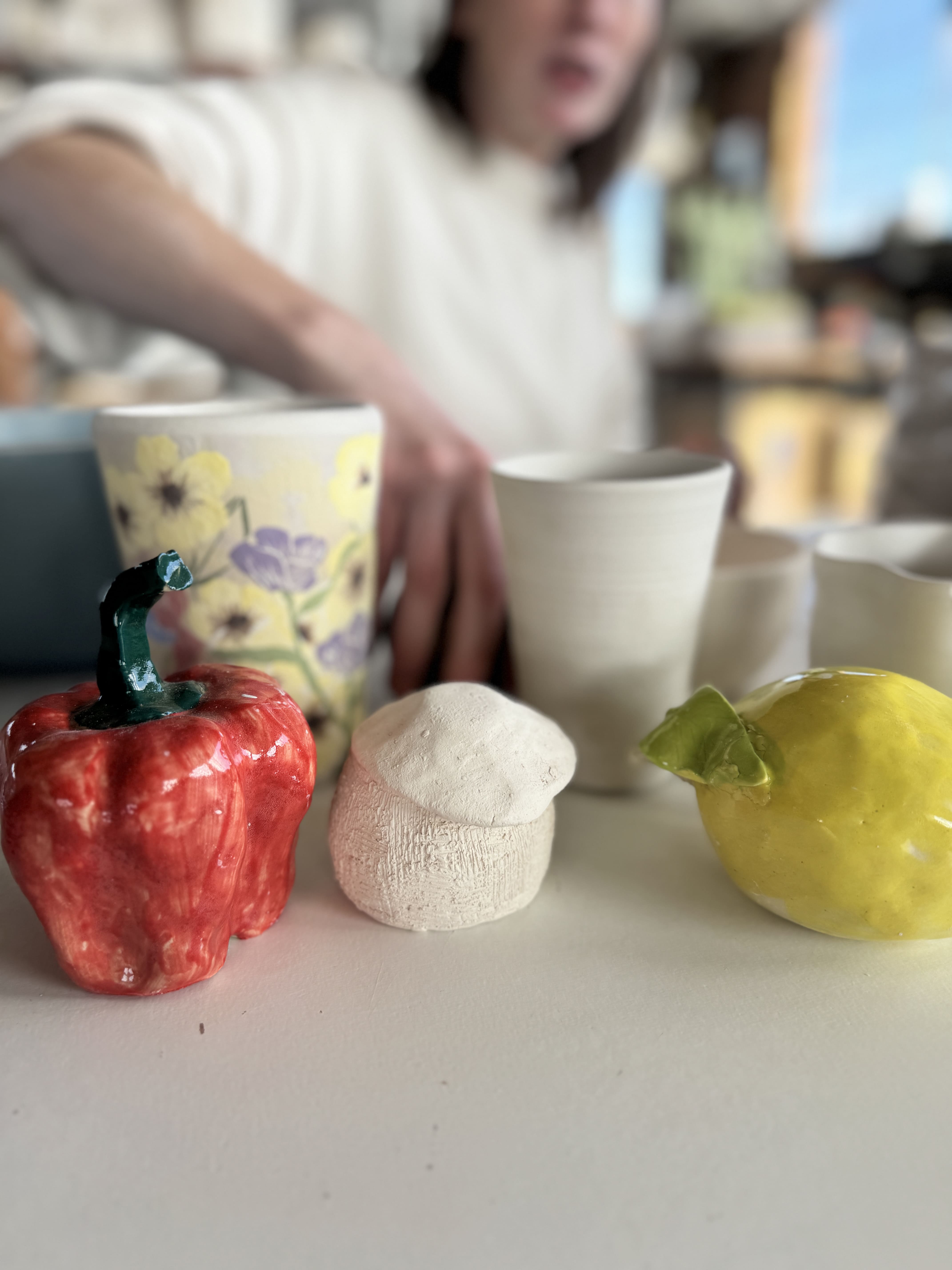
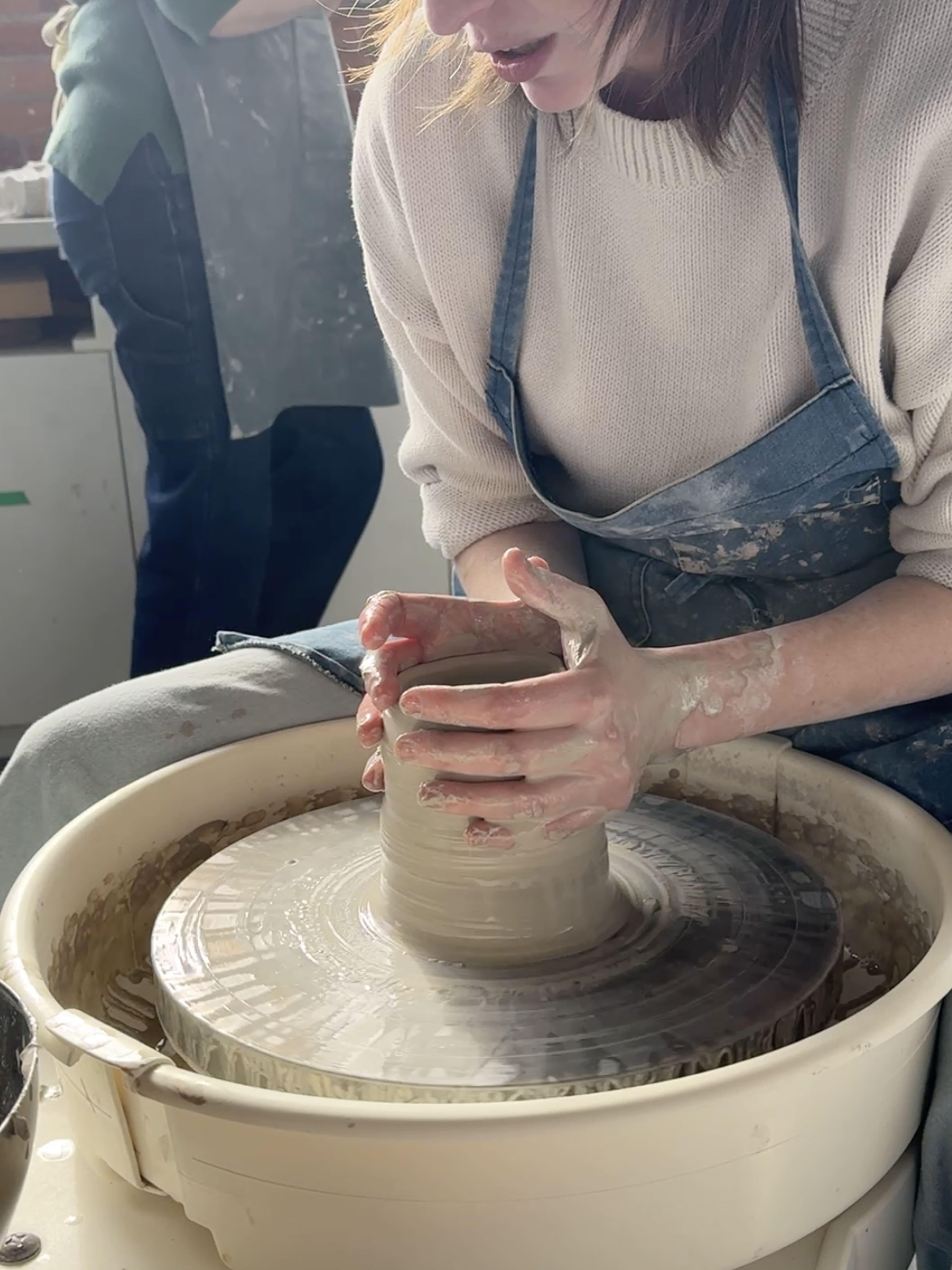
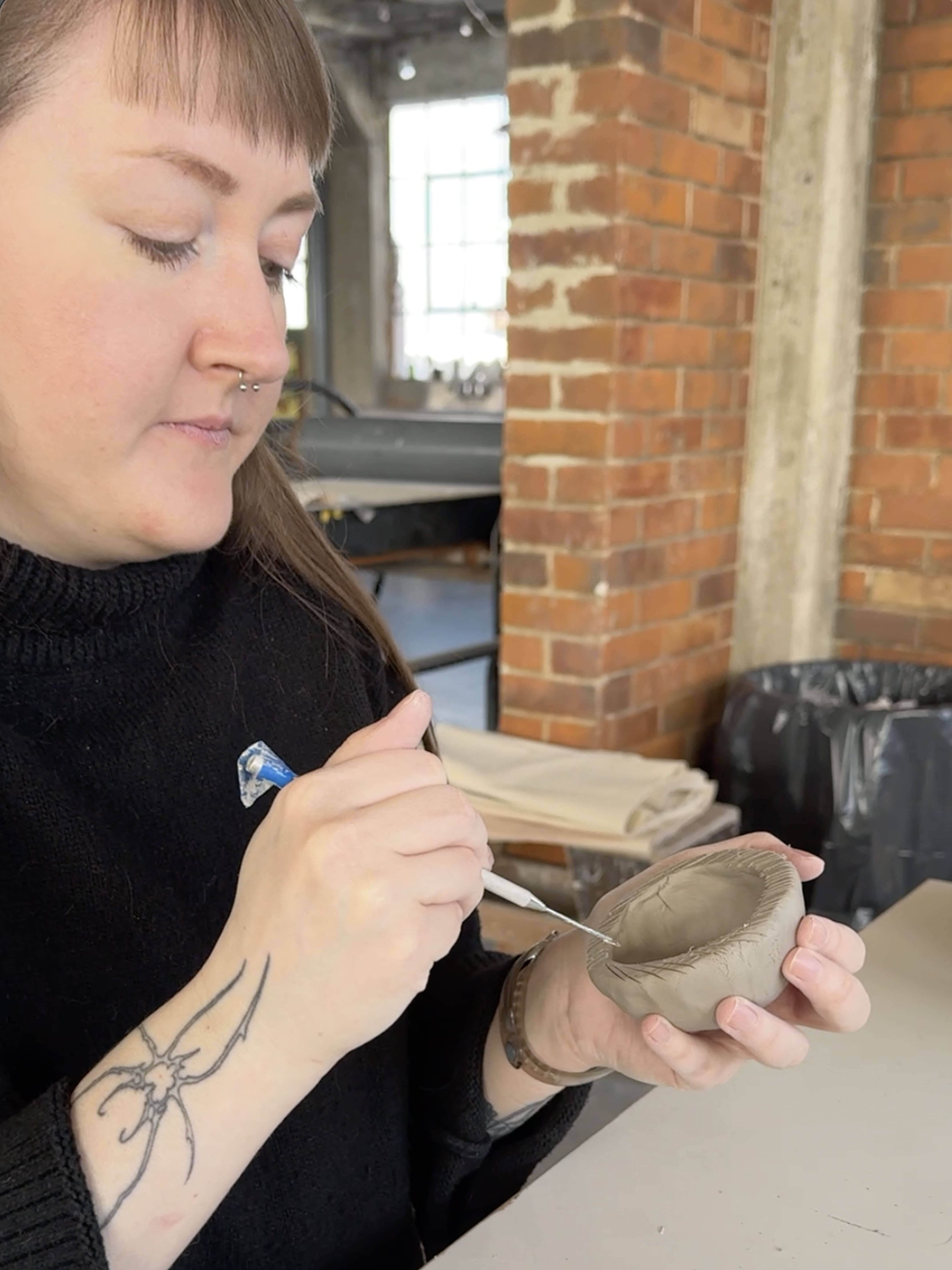
The Clear Space team rang in the new year in a decidedly low-tech way, ditching screens and deadlines for clay and creativity at Hamilton Craft Studios. The group spent a day at the community-focused makerspace learning the basics of working with clay—from simple hand-modelling techniques to the thrill of throwing pieces on the pottery wheel.
Hamilton Craft Studios is a shared creative studio in downtown Hamilton that offers makers of all levels access to workspace, tools, and classes spanning ceramics, woodworking, textiles, and more. The studio’s mission is to support artistic exploration and skill building in a welcoming, community-oriented environment.
The CS crew jumped straight into the tactile world of clay, guided through fundamentals that had them shaping and centring clay with their own hands. Wheel throwing quickly became the highlight—a rhythm of focus and balance, punctuated by the occasional splatter of clay, and more than one cheerful do-over.
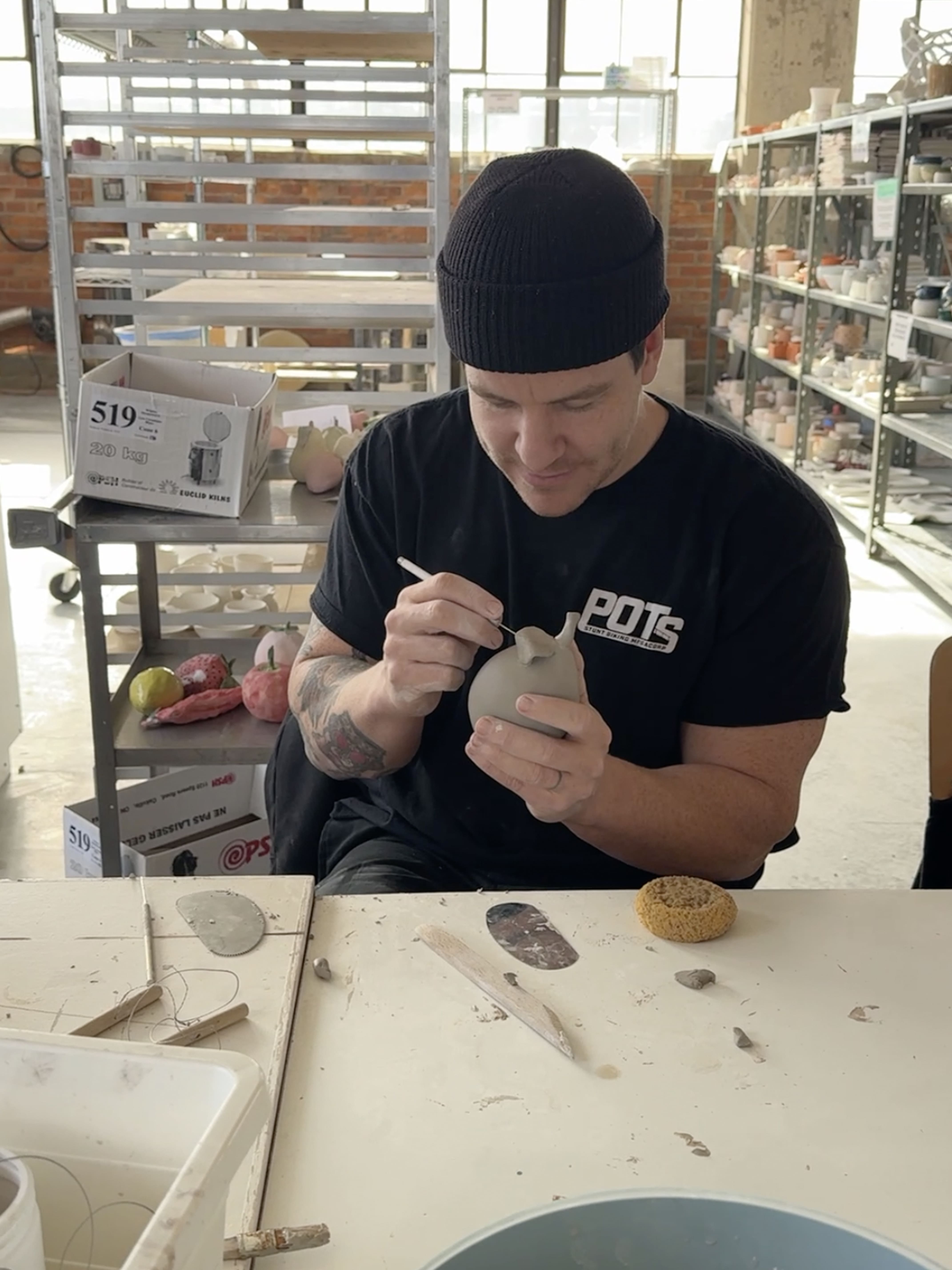
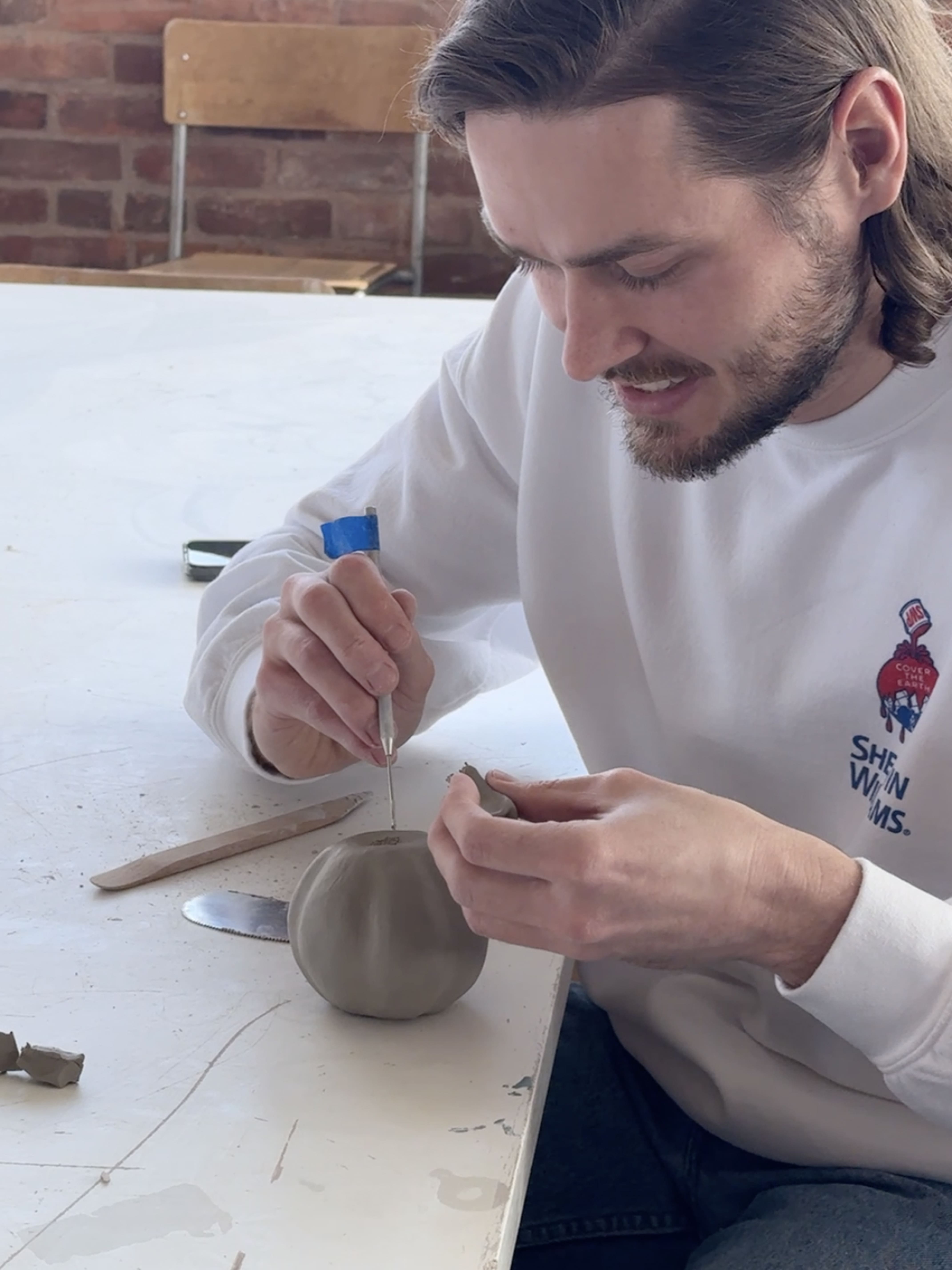
The day fostered collaboration and connection, giving everyone a chance to slip into a creative flow state together. We laughed, shared challenges, and reminded ourselves of the value of slowing down and making things by hand—while also confirming that, pottery ambitions aside, it’s probably wise that we all stick to our day jobs as designers. 🥴

Kids Help Phone Foundation has selected Clear Space to create their inaugural website.
The launch of KHP Foundation represents an important step in sustaining and growing national support for youth mental health. The new website will serve as a distinct digital platform focused on storytelling, impact, and relationship-building—clearly articulating why KHP matters and how donors, partners, and communities across Canada can take action.
Clear Space will design a Foundation website that remains visually and tonally connected to the trusted KHP brand, while establishing a clear, adult-centred experience. The work will prioritize clarity, accessibility, emotional resonance, and intuitive pathways to action, ensuring KHP Foundation is positioned as a credible and inspiring extension of KHP, without overlapping with service delivery.
This engagement builds on Clear Space’s extensive experience designing accessible, human-centred digital platforms for healthcare organizations, foundations, and national non-profits—where trust, clarity, and impact are essential to engagement and giving.

When I was in high school, my parents didn’t understand what graphic design was – let alone what branding meant. They knew I liked art and drawing, but as a career it felt vague.
So when it came time to think about post-secondary options, they nudged me toward something more concrete. Engineering came up more than once. It made sense to them. It was a path they understood, especially since another family member had gone that route. Engineering felt structured.
I didn’t become an engineer. I followed my heart and went to art school instead. And yet, decades later, there’s a bit of irony in where web design has landed.
Today, much of what we do blends visual design, writing, structure, logic, and systems thinking. In many ways, modern web design looks a lot like the thing my parents hoped I’d pursue back then. It feels a bit like coming full circle.
For our clients, that evolution matters. Because the websites that perform best today aren’t just well-designed—they’re thoughtfully built. They’re clearer to use, easier to manage, and better equipped to support real goals, from engagement to growth.
From Pages to Systems
For a long time, web design was mostly about how things looked. Layouts. Colour. Imagery. That work still matters, but it’s no longer the whole story. Or even the main one.
Websites today aren’t designed page by page. They’re built as systems. We think in components (like Lego) and patterns. Reusable structures. We decide what repeats, what needs flexibility, and what must remain consistent everywhere. Those decisions shape how a site performs, how easy it is to maintain, and how well it holds up over time.
Design choices aren’t just visual anymore. They’re structural.
The platforms we use reinforce this way of thinking. At Clear Space, we build on Webflow, which pushes clarity around hierarchy, structure, and how content is meant to live and evolve. We pair the platform with frameworks and systems based on each client’s needs, audiences, and the type of site they actually require. The tools themselves aren’t the point. They simply reveal whether the thinking underneath is solid.
Designing Inside an Ecosystem
Most websites today don’t live on their own. They sit in the middle of a much larger ecosystem.
They connect to CRMs like HubSpot or Salesforce, integrate with fundraising tools such as Fundraise Up, and rely on email platforms, analytics, and payment systems.
Every integration adds complexity. Data needs to flow properly. Users need clear hand-offs. Internal teams need to trust what’s happening behind the scenes. When integrations are bolted on without much thought, things don’t usually break right away. They degrade slowly. Then all at once.
This is also why modern websites must serve more than one audience at the same time. There’s the external audience—clients, donors, customers, communities. And there’s the internal audience—teams updating content, managing campaigns, pulling reports, and working with the data the site produces.
If the internal experience is confusing or fragile, the external experience eventually suffers. Clarity has to exist on both sides of the screen.
Where Clear Space Comes In
As web design has become more technical and systems-driven, many firms have drifted in one of two directions. Some lean heavily into visuals. Others focus almost entirely on the technical side. Clear Space sits in the middle.
We’re a brand- and story-based firm at our core. Clarity of purpose, audience, and narrative comes first. But we also understand how those stories need to live inside real systems (platforms, integrations, and workflows) to actually work.
That’s why our process is collaborative early on. Creative ideas don’t appear fully formed on a screen. They emerge from strategic thinking, conversation, and testing directions together before significant time and resources are spent building them. We share ideas early, not because they’re finished, but because that’s how we get to stronger, more strategically sound solutions faster. It leads to fewer surprises, better decisions, and more efficient use of design and development effort.
Looking back, my parents weren’t entirely wrong. The work does involve structure, logic, and problem-solving. It just happens to do so through story, design, and experience.
When those things align, the result isn’t just a better website.
It’s a clearer one.

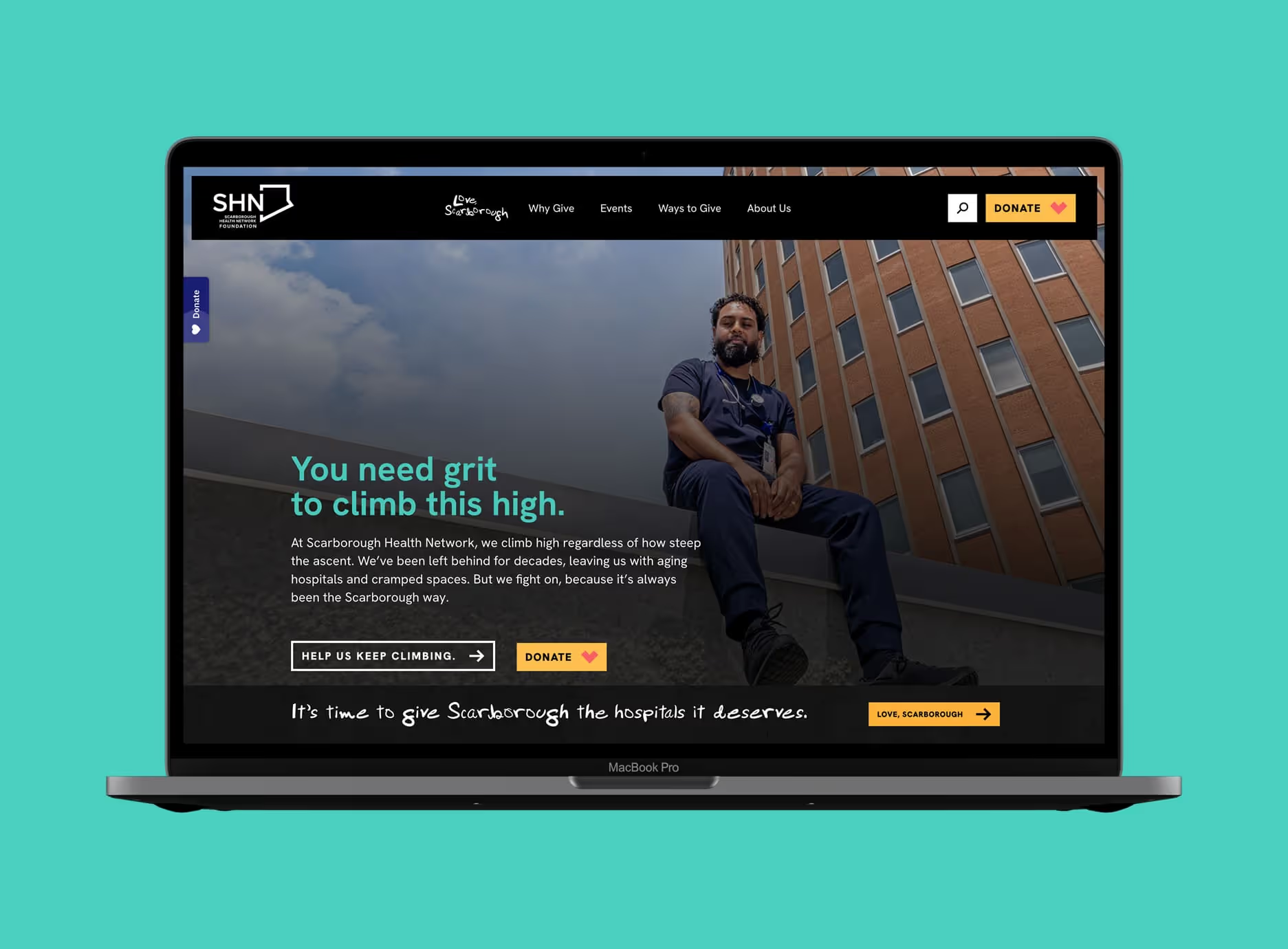
Scarborough Health Network (SHN) Foundation has launched its new website, created in partnership with Clear Space, as part of its ongoing effort to unify brand, storytelling, and digital experience.
The new site brings together the Foundation’s identity and its bold Love, Scarborough campaign under one digital home. Designed to inspire pride and generosity, it reflects the community’s resilience and the hospitals’ excellence, while making it easier for donors, volunteers, and partners to engage and take action.
Built on Webflow, the platform emphasizes accessibility, storytelling, and donor experience. The result is a modern, mobile-first site that captures the energy of Love, Scarborough and sets the stage for the Foundation’s next chapter of growth and impact.
“It was one of the most seamless partnerships we’ve had,” said Jennifer Lee, Associate Vice President of Marketing and Communications at SHN Foundation. “Clear Space weren’t just taking direction—they were right there with us, thinking strategically, problem-solving, and bringing ideas we hadn’t even considered. They understood the emotion and the community behind Love, Scarborough, and they made a complex project feel easy.”
Explore the new SHN Foundation website at shnfoundation.ca.
Read our full interview with Jennifer Lee here to learn more about the creative process, storytelling, and collaboration behind the project.

When most of us told our parents we wanted to be graphic designers, they thought we’d grow up to be commercial artists, drawing for a living, fiddling with fonts, and using computers to “make things look nice.” And to be fair, we probably thought the same thing back then.
But as our careers evolved, we learned that the best designers don’t just make things look good, they make them make sense. The real work isn’t just visual. It’s intellectual. It’s about thinking critically, writing clearly, and asking the right questions; the kind that get to the heart of a client’s challenge. The kind that solves business problems.
To do that, we need to understand how businesses actually work. That means cultivating a research-oriented mind, being endlessly curious, and developing a broad general knowledge base. One week we might be diving into the nuances of healthcare fundraising; the next, unpacking the messaging for a fintech start-up or a recruitment challenge for an educational institution. Our curiosity has to stretch across sectors, because design that resonates comes from truly understanding the people and organizations behind it.
At Clear Space, we’ve come to see design as a discipline rooted in analysis as much as aesthetics. The best creatives think like business analysts: connecting dots, identifying gaps, and turning insight into clarity. We may use design software, sure, but our sharpest tools are empathy, research, and the written word.
Beyond the Brief
Clients often come to us with a specific request: a new website, a refreshed brand, a campaign. We deliver those. But we rarely stop there. The real work begins by interrogating the brief.
Often, the project a client asks for isn’t the solution they actually need. By looking beyond the immediate task, we uncover the root challenges and reframe the problem in a way that creates lasting value.
For example, take a recent office graphics assignment we did for CreateTO. They initially approached us to bring their Vision, Mission, and Values onto their walls. We asked: would that alone inspire their main audience (staff) to live the brand? That question led to a richer conversation about internal engagement and how brand culture is experienced every day, not just displayed.
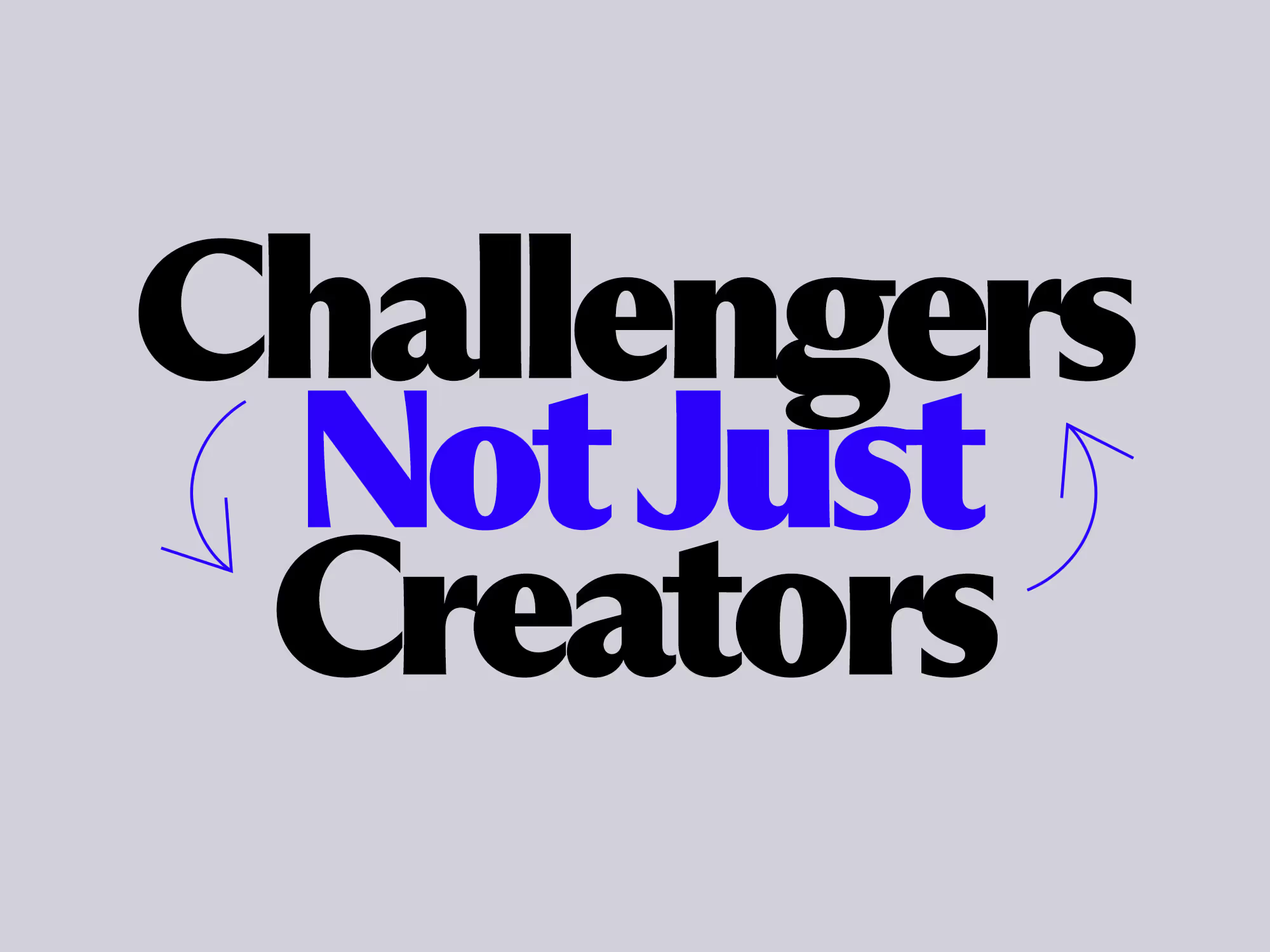
Challengers, Not Just Creators
The difference is that we don’t take requests at face value. We analyze. We probe. We challenge with empathy.
That might mean asking how a campaign integrates with existing marketing efforts, advising on how to socialize a new brand internally, or suggesting ways to streamline content and workflows. Sometimes, it means questioning whether the initiative itself is worth pursuing.
These aren’t things you’ll find in a typical scope of work. But they’re often the reasons clients keep coming back. Because what we offer isn’t just design. It’s clarity. The ability to see the bigger picture and guide clients toward smarter decisions.
Design as Business Strategy
When design starts with analysis, aesthetics become more than decoration. They become strategy made visible. Every choice in a campaign, website, or identity flows from a deep understanding of your market, your audiences, and your organizational goals.
Our role often extends beyond the creative. We think about how a brand system scales, how digital platforms support long-term growth, and how every communication touchpoint reinforces your purpose. In that sense, our designers operate more like advisors; collaborators who help align design with business strategy, ensuring every effort contributes to a unified vision.
This is what makes our work different. We don’t just make things look good. We make sure they make sense.
Why It Matters
For clients, this approach delivers tangible benefits:
- Stronger results. Work aligns with strategy, not just style.
- Smarter investment. No wasted resources on irrelevant initiatives.
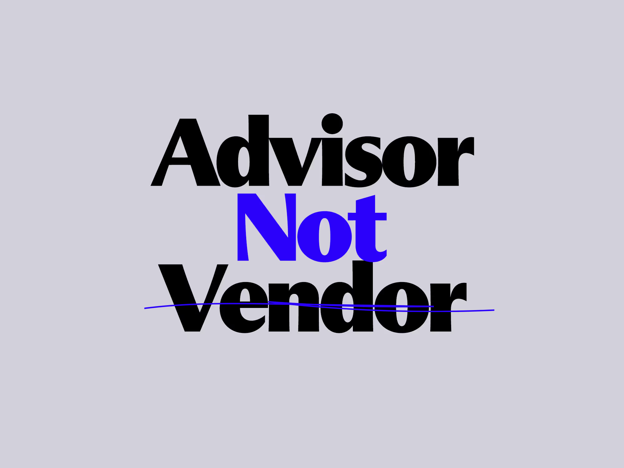
- Trusted partnership. We’re not a vendor you manage, but an advisor you rely on.
In a market crowded with agencies and freelancers ready to “make it pretty,” Clear Space stands apart. We bring the creativity, yes. But more importantly, we bring the clarity that helps your business think smarter and move further.
The Takeaway
If you’re looking for someone to simply execute, there are plenty of options. But if you want a partner who will challenge you, advise you, and bring clarity to your toughest business problems, hire a creative team that thinks like Clear Space.
Because the best design isn’t about what looks good. It’s about what works for your brand, your strategy, and your future.

Will Hum delivered a guest lecture titled Beyond Graphic Design: Evolving the Creative Mind to brand and graphic design foundation students at George Brown College, invited by Blair Francey, Professor at the School of Design.
Will traced the shifting definition of what it means to be a designer, from the traditional, aesthetics-first role to a discipline that blends analysis, technology, strategy, and creativity. He spoke about building trust with clients, developing an analytical lens alongside artistic instinct, and recognizing the deeper purpose behind the work.
Drawing on his own journey, from a budding designer focused on visuals to a critical thinker driven by clarity and meaning, Will shared how this evolution ultimately led him toward a broader mission of uplifting others, including emerging designers, clients, and his wider community.

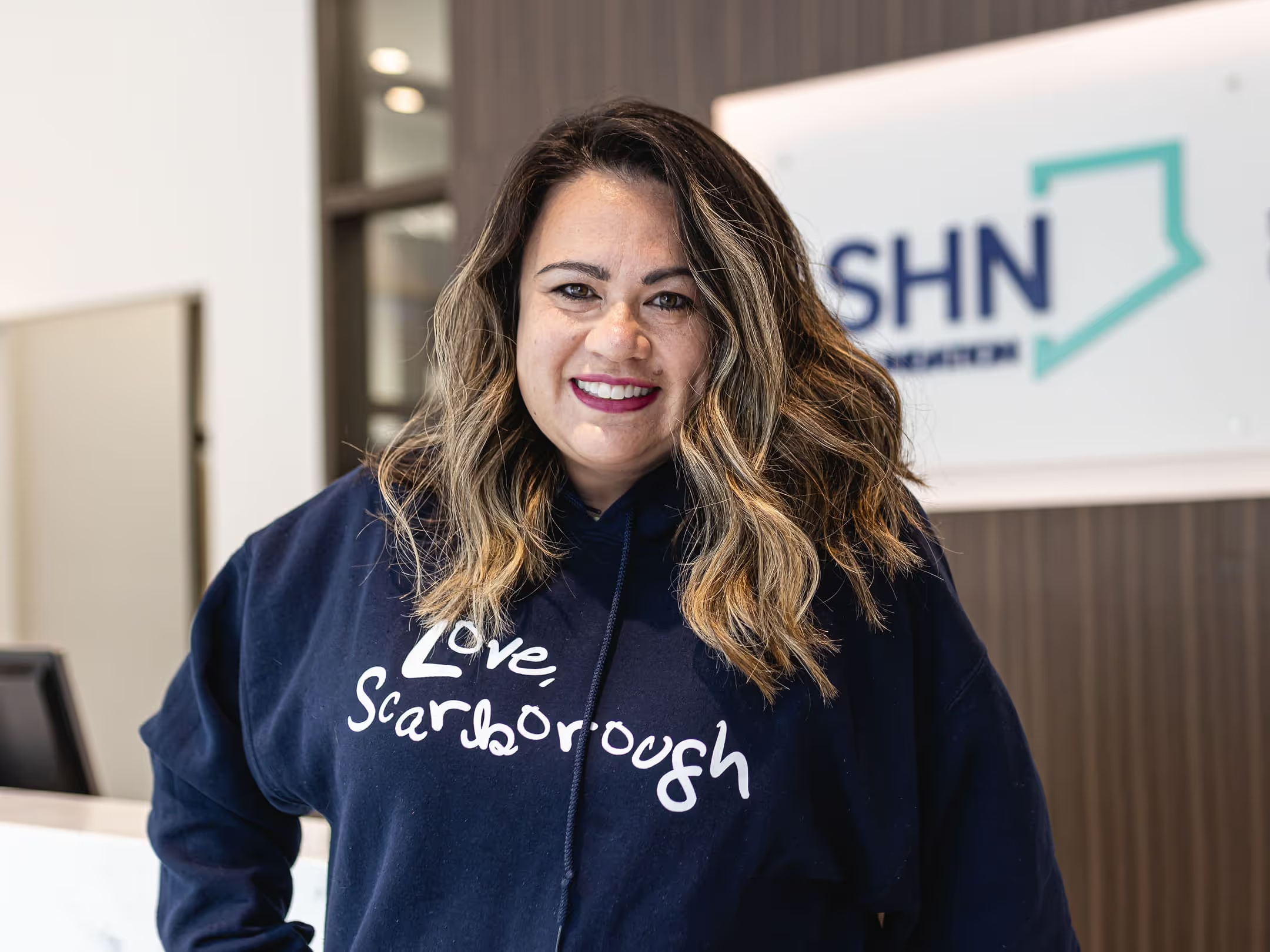
Few people understand the power of storytelling like Jennifer Lee, Associate Vice President of Marketing and Communications at SHN Foundation. As the architect behind the Love, Scarborough campaign and a driving force in redefining the Foundation’s brand presence, Jennifer has helped turn Scarborough’s signature grit into a rallying cry for better healthcare.
With the launch of the Foundation’s new website, created in partnership with Clear Space as a unified platform to connect hearts and inspire action, we sat down with Jennifer for a quick-fire conversation about purpose, creativity, and what it means to build a digital experience that truly reflects the community it serves.
CS: Jennifer, thanks for taking the time to chat with us. Let’s start by talking about what the driving motivation was behind redesigning SHN Foundation’s website?
Jennifer: Sure. The main driver was that our old site had reached a point where it no longer reflected who we were. It looked dated, it was hard to update, and it didn’t capture the energy of our Love, Scarborough campaign or the growth happening across SHN Foundation.
We were also managing two different sites. One for the Foundation and another for Love, Scarborough. That setup made things complicated. As we began focusing more on digital engagement and online giving, it became clear that having two platforms was holding us back. It was hard to tell a single cohesive story, and the backend had been frankensteined too many times.
The redesign was an important part of our five-year strategic plan. It was about improving digital tools, building stronger donor engagement, and bringing our brand into alignment. Inside the organization, we wanted something our team could easily manage. Externally, we wanted to inspire confidence and generosity. We wanted people to see that Scarborough’s hospitals deliver excellent care and that both our staff and community are worth investing in.
CS: How does the new site help unify the Foundation’s story with the Love, Scarborough campaign?
Jennifer: We wanted one home for both. Visitors shouldn’t have to jump between two sites to understand how Love, Scarborough connects to SHN Foundation. It is all part of the same story.
We worked carefully to keep both voices clear. Love, Scarborough carries that bold emotional storytelling, while the Foundation represents credibility and transparency. Together they show who we are and what we stand for.
The main thing we hope people take away is a sense of pride. We want to show the uniqueness of SHN, the strength of the community, and the excellence of our hospitals, all expressed through that unmistakable Scarborough tone.
CS: How does the redesign better serve your donors and community?
Jennifer: The new site makes it easy for people to take action. That might mean donating, signing up for an event, or simply learning more. The giving process is simpler now. Calls to action are clearer, and stories about impact are front and centre.
“We also wanted the site to encourage people naturally. It should inspire involvement without feeling forced. And representing Scarborough’s diversity was essential. The site had to feel authentic and inclusive.”
CS: What changes or features are you most excited about?
Jennifer: To be honest, we’ve only been live for a short time, so it’s too early for analytics, but we’re already thrilled with how it looks and feels. The new homepage and navigation make everything easier to find. The design finally reflects the modern, confident tone we were after.
As you know, we haven’t finished all our backend training with your team yet, so we’re still getting comfortable with Webflow. Overall, it feels like a huge leap forward.
CS: Accessibility and inclusivity were major priorities from the start. How does the site reflect that?
Jennifer: Yes, it was key that the site be accessible to everyone. It‘s fully AODA and WCAG 2.1 compliant, with strong colour contrast, scalable text, and complete screen-reader and keyboard support. It was also designed mobile-first, so it feels seamless on any device.
We built it with future language support in mind. Phase two will include translations in Mandarin, Cantonese, and Tamil so even more of our community can connect with us. Every part of the experience, from visuals to navigation to plain-language content, was created to make people feel welcome.
CS: What was it really like working with the Clear Space crew? (No pressure.)
Jennifer: laughs Honestly, all good things!
“It was one of the most seamless partnerships we’ve had. You weren’t just taking direction, you were right there in the trenches with us, thinking strategically, problem-solving, and bringing ideas we hadn’t even considered.”
You understood how complex our world is, balancing the hospital, the campaign, and our team. And you were patient. Like really patient. I can’t stress that enough.
The best part is you captured the heart of Love, Scarborough. You understood the emotion and the community behind it. That’s not something every creative team can do. And I’ll give you this: you made a complex project feel easy. Mostly. laughs again
CS: Thanks for being gentle! Now let’s talk storytelling. It has always been central to your brand. How did that come through in the new site?
Jennifer: Storytelling is everything. People give when they feel something. Love, Scarborough has always been about showcasing our community and sharing real stories about their experiences and connections to SHN.
Photography plays a big role. We wanted the visuals to feel raw and human, to show the grit and pride that make Scarborough unique. Bringing that emotional tone into the design helps us stand apart from other foundations.
CS: How do you see the site evolving in the future?
Jennifer: Thanks to your team, it’s been built to grow with us. It’s modular and flexible so it can adapt as our needs change. New campaigns, event microsites, or tools like AI chatbots can all fit naturally into the platform.
We’re also connecting more data and insights through our CRM tools like Hubspot. This helps us understand our donors better and strengthen our digital strategy. The site positions us well for long-term success.
CS: Finally, what do you hope visitors feel when they land on the new SHN Foundation site?
Jennifer: Pride. Inspiration. Connection.
I want people to see that SHN accomplishes so much with limited resources and that every contribution truly matters. We need support to help us continue climbing upwards. The site is bold, inclusive, and simple to navigate. More than anything, I hope visitors leave with a sense that SHN Foundation is a trusted, community-driven organization that reflects the heart of Scarborough.
CS: Jennifer, thank you again for taking the time to share your perspective and for the incredible collaboration throughout this project.
Jennifer: It was my pleasure!

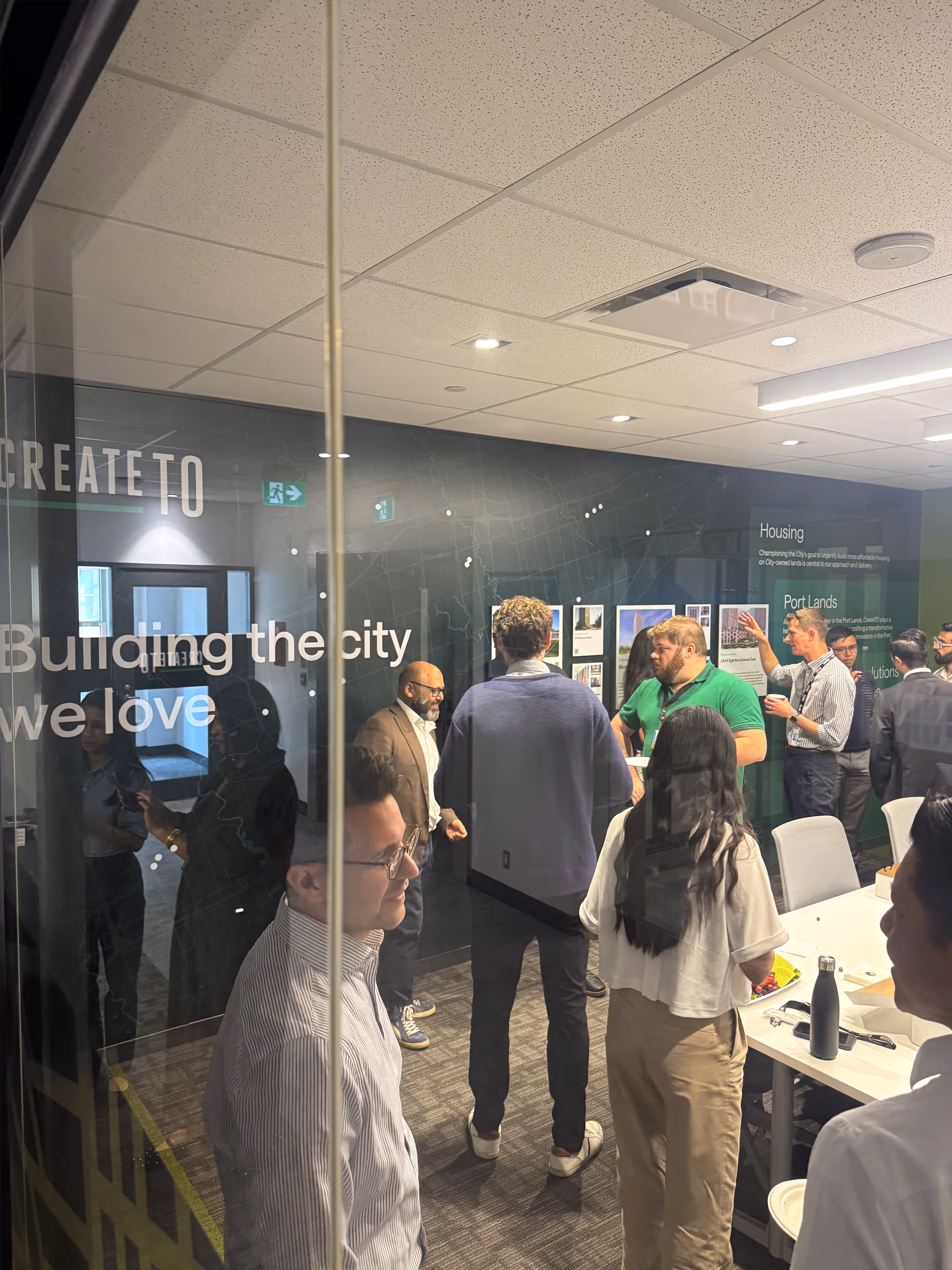
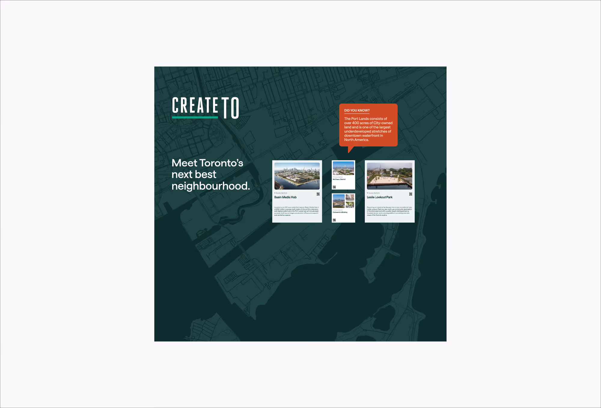
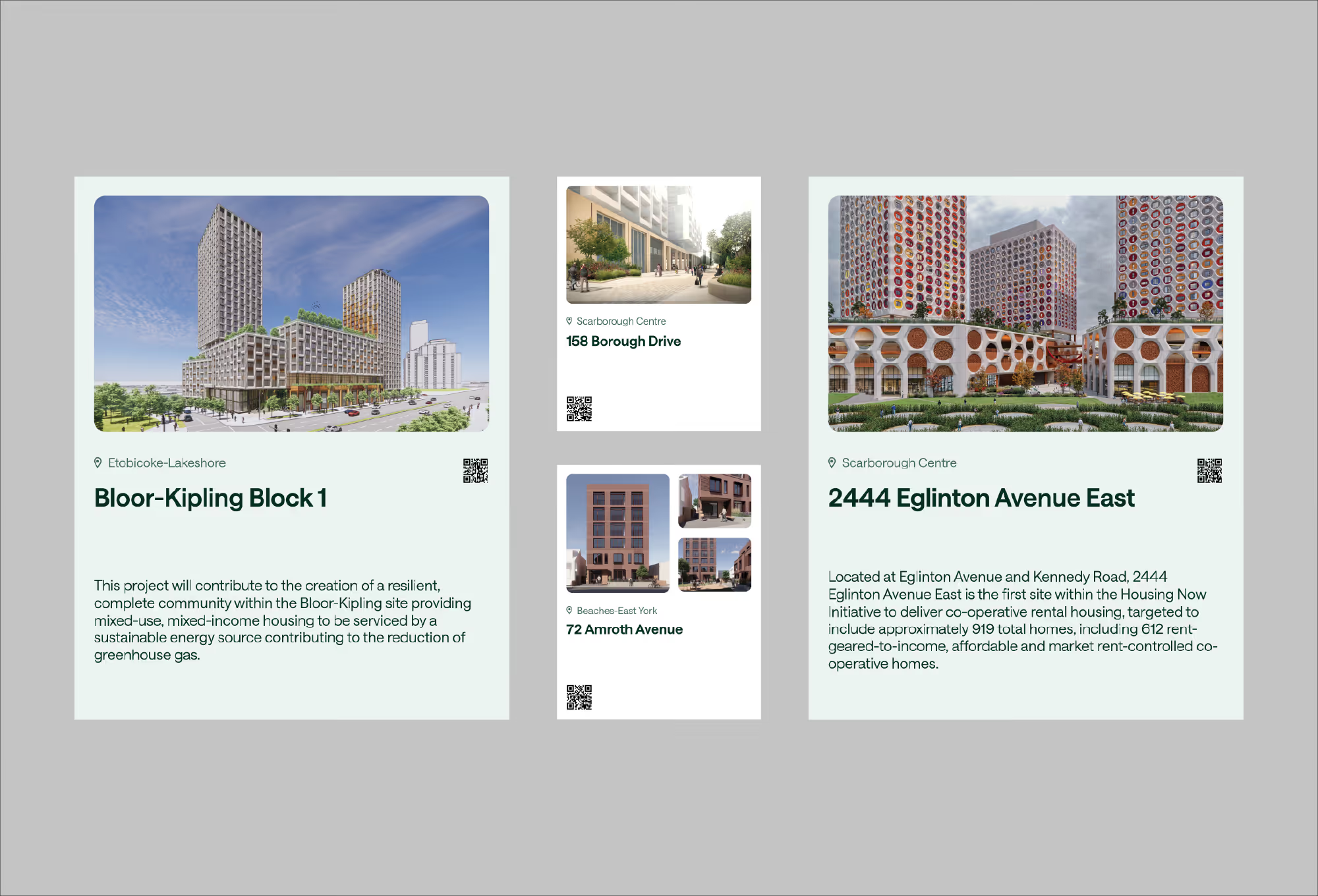
Building the city we love. That’s CreateTO’s purpose and it set the tone for everything that followed. As the City of Toronto’s real estate agency, CreateTO manages the city’s real estate assets and develops city-building projects that benefit all Torontonians.
For B2B organizations like CreateTO that don’t market directly to the public, there are often very few physical touch points where their brand can really show up. Most of it lives online, or as digital files such as reports and slide decks. So when a chance like this comes along—to shape a real, physical environment that tells a story—it’s a rare and exciting opportunity.
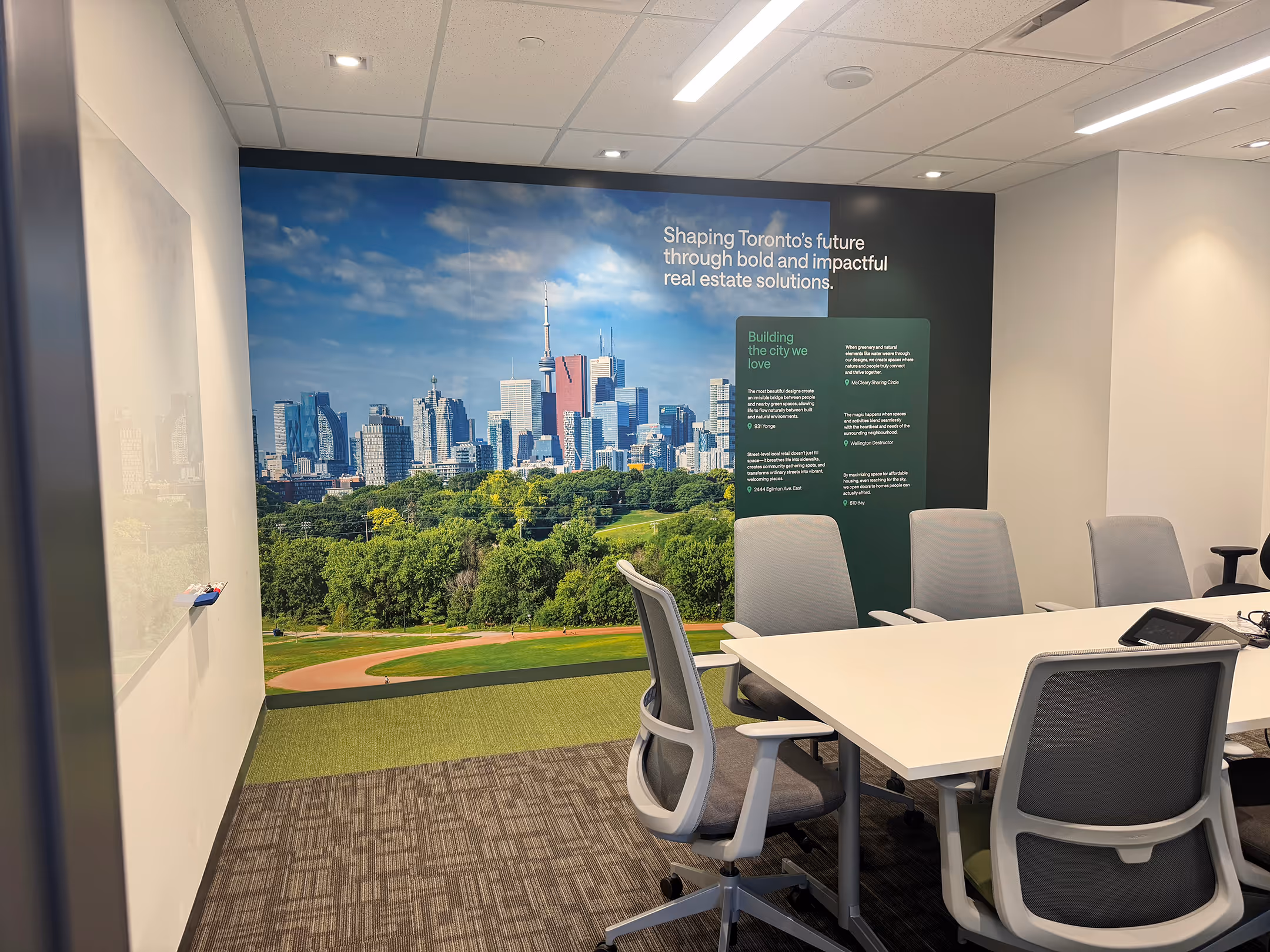
“The team at Clear Space completely understood our vision, and then took it further. They brought clarity, creativity, and a deep respect for our purpose into every detail. The result is a space that truly reflects who we are and inspires our team every day.”
When we came to meet and get the office tour with Susan O’Neill, Head of Communications and Public Engagement, we were delighted and daunted by such a big blank canvas. While that might sound like a designer’s dream, the truth is, it’s actually much more challenging. Filling a large space with meaning and not just decoration takes thought, restraint, and clarity.
But here’s the thing, it wasn’t our work that made the office space great. It was CreateTO’s work. Their purpose, their projects, and their role in building the city we all love. That gave us something worth designing around. Our job was to make that visible.
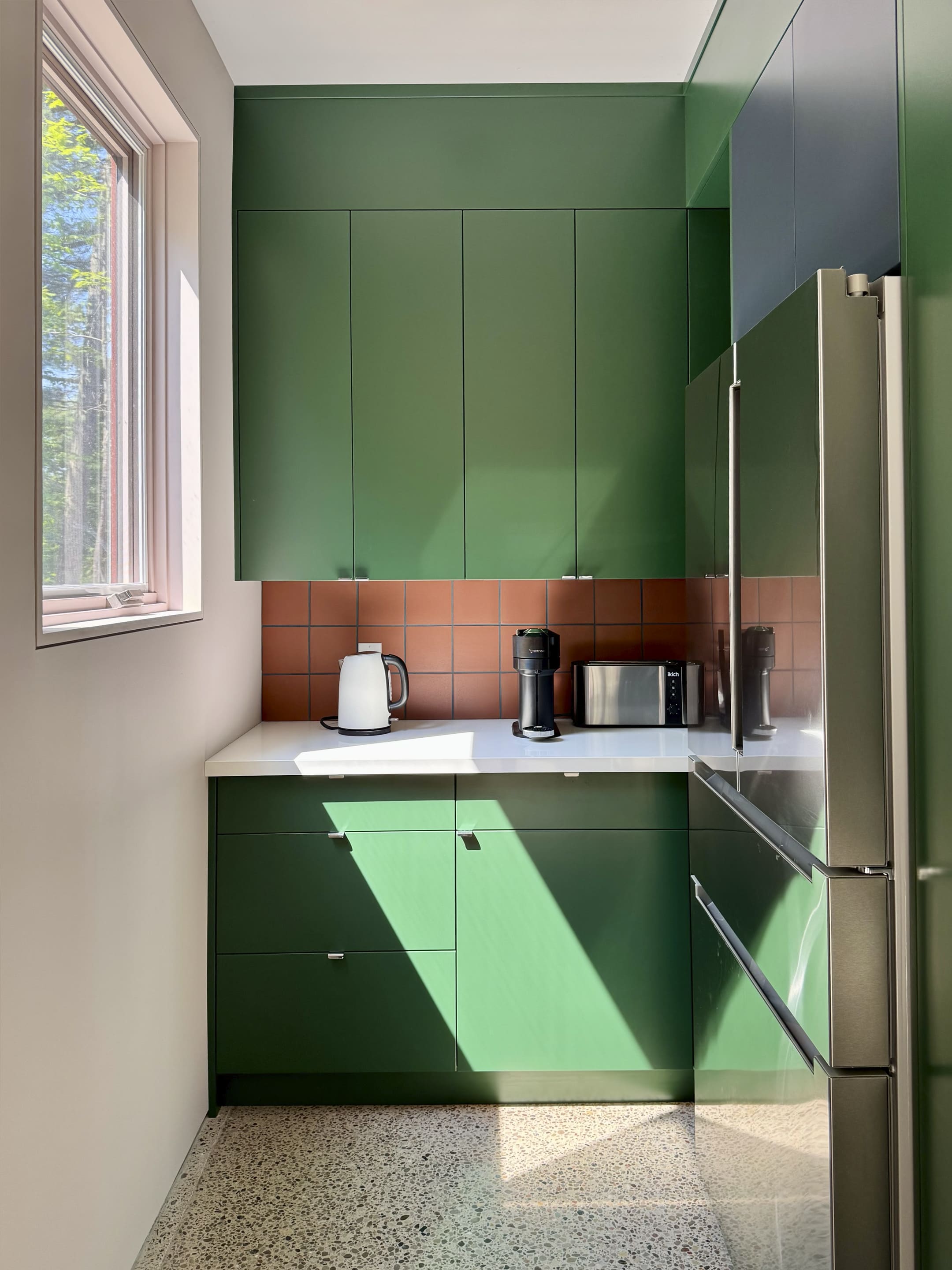
.avif "Beyond design: Our weirdest creative fixations")
As designers we are curious creatures. By day, we build brand systems and wrangle pixels. But outside of work? We’re collecting reel mowers from England, splitting firewood for fun, sweating it out in saunas with strangers, restoring vintage motorcycles, and freeze-framing movies to admire background props.
In this edition of Clarity, we’re peeling back the curtain on the weird hobbies that keep us inspired. These side passions might seem a little obsessive, but they spark joy, sharpen our creative edge, and remind us that design is just one of many things we love to perfect.
Paused for props – Tahirah’s love affair with cinematic design details
The driving factor in making my switch from film to design was just how much I loved noticing design in film. Not just the promo art or title design (I’m looking at you, opening title sequence of The Phoenician Scheme), but the props and background pieces: signage, labels, documents, the fake brands that live in the background for half a second. The film’s visual brand.
In film school we tried to wear every hat once. As an art director, it was fun to find the perfect item for a scene, not just for storytelling, but to solidify the visual style. As an editor, I’d spend way too long digging through my fonts folder just for a documentary lower third.
Watching movies is a perfectly normal hobby. Just not when I do it. I’m pausing to look at the details, screenshotting them for a folder I keep for inspiration (or just to revisit because they tickle some strange, comfy part of my brain). Is that typeface era-appropriate? Did someone actually design a cereal box for a 2-second breakaway?
My biggest inspiration is Annie Atkins (Bridge of Spies, Penny Dreadful, and a handful of Wes Anderson projects). She’s designed wayfinding, packaging, letters, newspapers—whatever the story needs. I saw her speak at Design Thinkers 2024, and got to thank her for her work and how it’s impacted my own love for the intersection of film and design.
Sure, sometimes I miss the plot because I’m too busy staring at the background of a scene, but I wouldn’t have it any other way.
Kickstarts and carburetors – Will Robinson’s slow fix hobby
When I tell people I collect vintage motorcycles, I’d like to think they picture me cruising scenic roads on pristine classic bikes. While I do love riding these beautiful machines, the truth is my real passion lies in the dirty work: I love working on them.
These bikes are relics from a different era, frozen in time with mechanical simplicity that modern machines have left behind. A 1982 Suzuki spent countless hours in various stages of disassembly, patiently waiting for my attention. After my son was born, afternoon projects stretched over months and years. I would sneak out to the garage during his naps at family gatherings, picking up where I left off, gradually bringing the patiently waiting machine back to life.
What makes this hobby truly rewarding is the problem-solving. There’s something magical about diagnosing what’s wrong with a machine that’s been silent for decades and figuring out the fix. There is nothing like hearing a motorcycle run for the first time.
Warm conversations – Korneliusz’ sauna rituals
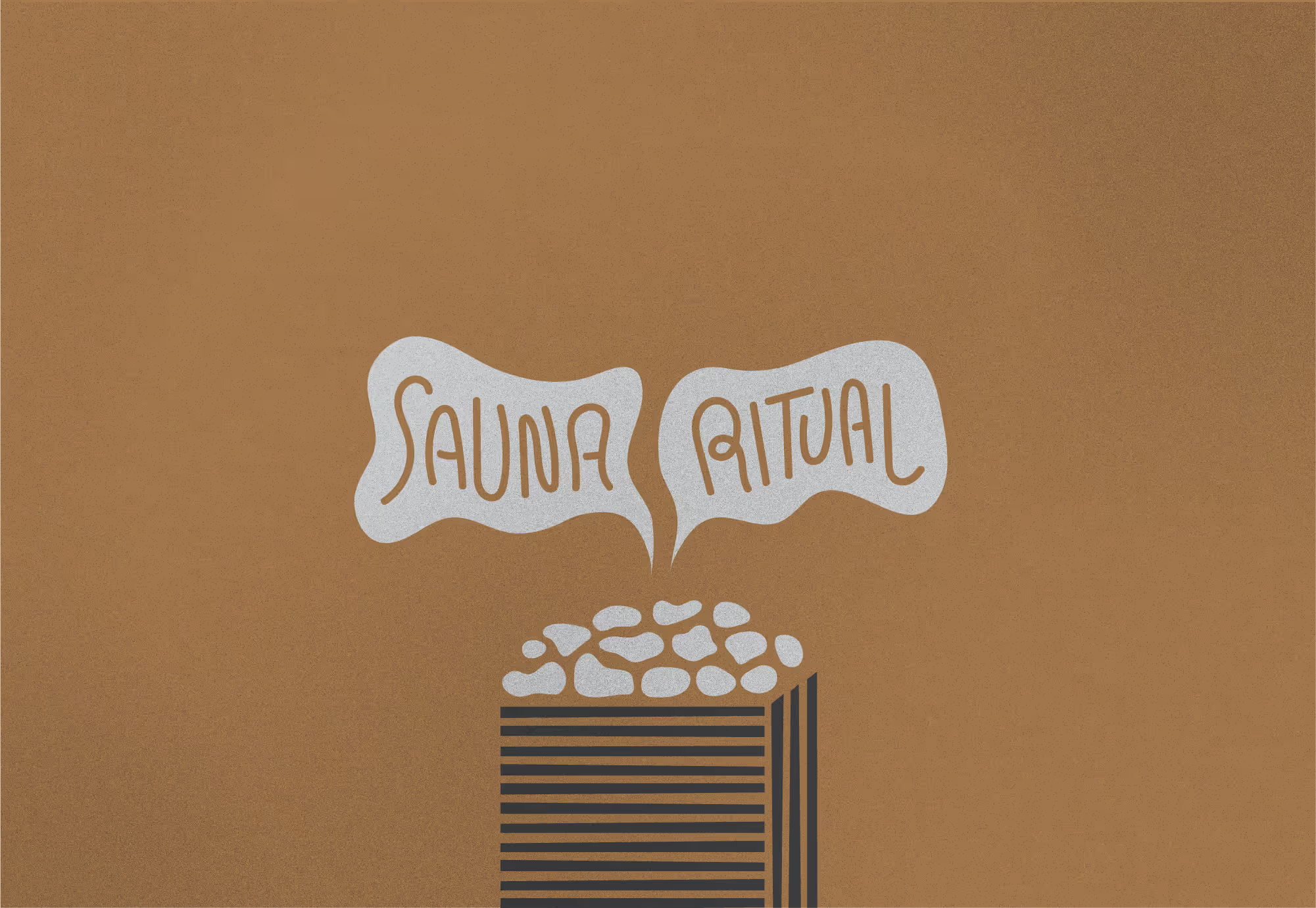
The ritual of using the sauna has become one of the most important aspects of my weekly routine. It has many physical benefits like helping with muscle recovery after a workout, cleaning my pours, and releasing toxins from my body. These were the main reasons why I started, but over time I discovered that the social ritual was why I kept coming back.
I love meeting new people and striking up warm conversations. In the gentle heat of the sauna, the walls seem to drop—people open up. Unlike the high energy of the gym, the sauna creates a calm, reflective space where deeper conversations unfold naturally. Over time, I’ve found more meaningful connections there than almost anywhere else.
People often walk in looking unsure about whether to start a conversation, so I usually break the ice by asking if they’re okay with me adding a few drops of essential oil to the stones. That small gesture almost always sparks a dialogue—and from there, the conversation can go anywhere. I’ve talked with strangers about life struggles, dreams, family, even regrets—things I’d rarely share outside that space. But there’s something about the heat that makes people open up… just like our pores. 🤷🏼♂️
It’s amazing how much people crave connection. Sometimes, all it takes is a bit of honesty and vulnerability. That’s what the sauna gives me—not just heat and sweat, but real human warmth.
Stacked to perfection – why Will splits wood for fun

My weird hobby? Wood. Splitting, stacking, burning, or cooking over it. I love everything about it. There’s nothing quite like the warmth of a hearth or a backyard pit. It hits all the senses: the weight of the axe, the smell of the wood, the crackle of bark, the smokey taste of grilled steak, the way the flames dance and glow. And it’s meditative. I can sit by a fire for hours, totally present. Sometimes just staring at the flames, other times contemplating the meaning of life.
I’m lucky to have a wood-burning fireplace in my home, so I stalk Kijiji for arborists posting free hardwood. When I see a fresh pile of maple or oak, especially the big rounds, I’m on it. Processing them by hand with a splitting axe or heavy duty maul is a workout I actually look forward to. As the saying goes, wood warms you twice.
But maybe my favourite part is stacking. There’s an art and design to it. Getting the airflow right, making it beautiful and solid. If it doesn’t look or feel right, I’ll tear it down and rebuild it. It’s the perfect weird hobby: mentally grounding, physically demanding, and totally absorbing.
Better stripes – Paul’s descent into lawn obsession
.jpeg)
I got a little obsessed with my lawn. It started innocently enough: you walk across a golf green and think, “why doesn’t my lawn look like this.” And then you catch a glimpse of those ballpark stripes and think, I could do that. Next thing you know, your YouTube subscriptions are full of “How to Cut Your Lawn Short,” “What is Lawn Striping,” and “What the Hell is Bent Grass.”
So you rip out the Kentucky Bluegrass and replace it with Pencross Bentgrass from a turf farmer you found in Saskatchewan. Why? Because Bentgrass cuts shorter. And shorter means crisper stripes. And crisper stripes mean you’re a god among lawn mortals.
Then it gets serious. Push mowers? Please. We use precision-ground reel mowers (made in Britain) at twice the price. And no, we don’t mow the lawn—we manicure it. We feed it with liquid fertilizer like a baby with a bottle, and fight fungus like a grizzly protecting her cubs. Why? Say it with me: Better. Stripes.
Eventually, your children stop asking to play outside because “Dad’s filming the grass again.” You’re crouched in the bushes at golden hour, adjusting your iPhone for peak angle and light, muttering things like “That’s just beautiful man.”
And that’s when it hits you: this may have gone too far.
But then the light hits just right, the blades shimmer like emerald velvet, and all is forgiven.
Because… better stripes.

Here’s what we’ve learned over the last two decades. When a client asks us for a new website, the request usually starts with visual design: “We want something modern.” “We need to update our look.” That’s a good instinct. But it’s only the beginning.
Here’s the truth: your website isn’t just a digital asset. It’s the clearest expression of your brand. And at Clear Space, that’s exactly how we treat it.
When you engage us, you’re not just getting a new site. You’re getting a chance to define or refine how your organization shows up in the world.
We bring clarity to your positioning, consistency to your voice, and purpose to your design. That’s what makes us different from freelance web shops or off-the-shelf platforms like Squarespace or Wix. They might give you a site. We give you a brand experience.
Your brand is what they experience
In consumer markets, a brand is shaped through dozens of informal touchpoints—product use, social buzz, word-of-mouth. But in B2B and mission-driven sectors, most people experience your brand primarily through one channel: your website.
That means the site isn’t just a reflection of your brand. It is your brand, to the people who matter.
Your site tells visitors:
If your site is clunky, confusing, or outdated? That’s your brand talking. If it’s focused, smart, and easy to navigate? That’s your brand too.
Know your audience(s) and design for all of them
One of the biggest missteps we see is building a website around a single, generic user. That approach doesn’t work in B2B.
Take Oak Valley Health, for example. When we helped them build a site for their strategic plan, we weren’t speaking to just one group, we were speaking to many:
Each audience had distinct needs. But they all needed to feel like the site was made for them.
Or consider Altas Partners, a private equity firm we worked with. Their website had to build credibility with two critical audiences:
The messaging, tone, and design had to thread a needle: trustworthy and data-driven on one hand, human and empathetic on the other.
Every audience matters. And if your site doesn’t acknowledge their unique perspectives, you risk losing them altogether.
Design, messaging, UX. All brand decisions.
When people say “brand,” they often think of logos and colour palettes. That’s part of it. But the real work of branding happens in how you communicate and how people experience your presence.
Design = Brand Expression
A crisp, cohesive visual identity shows you care about the details. It signals professionalism. It tells your audience you’re in control and worth their time.
Messaging = Brand Voice
Are you speaking with clarity and confidence? Do you lead with outcomes, not just features? Is your language human and grounded, or generic and forgettable? These choices shape trust.
UX = Brand Experience
Can people find what they’re looking for? Do they know what to do next? A good user experience shows that you respect your audience’s time. A bad one suggests disorganization, confusion, or indifference.
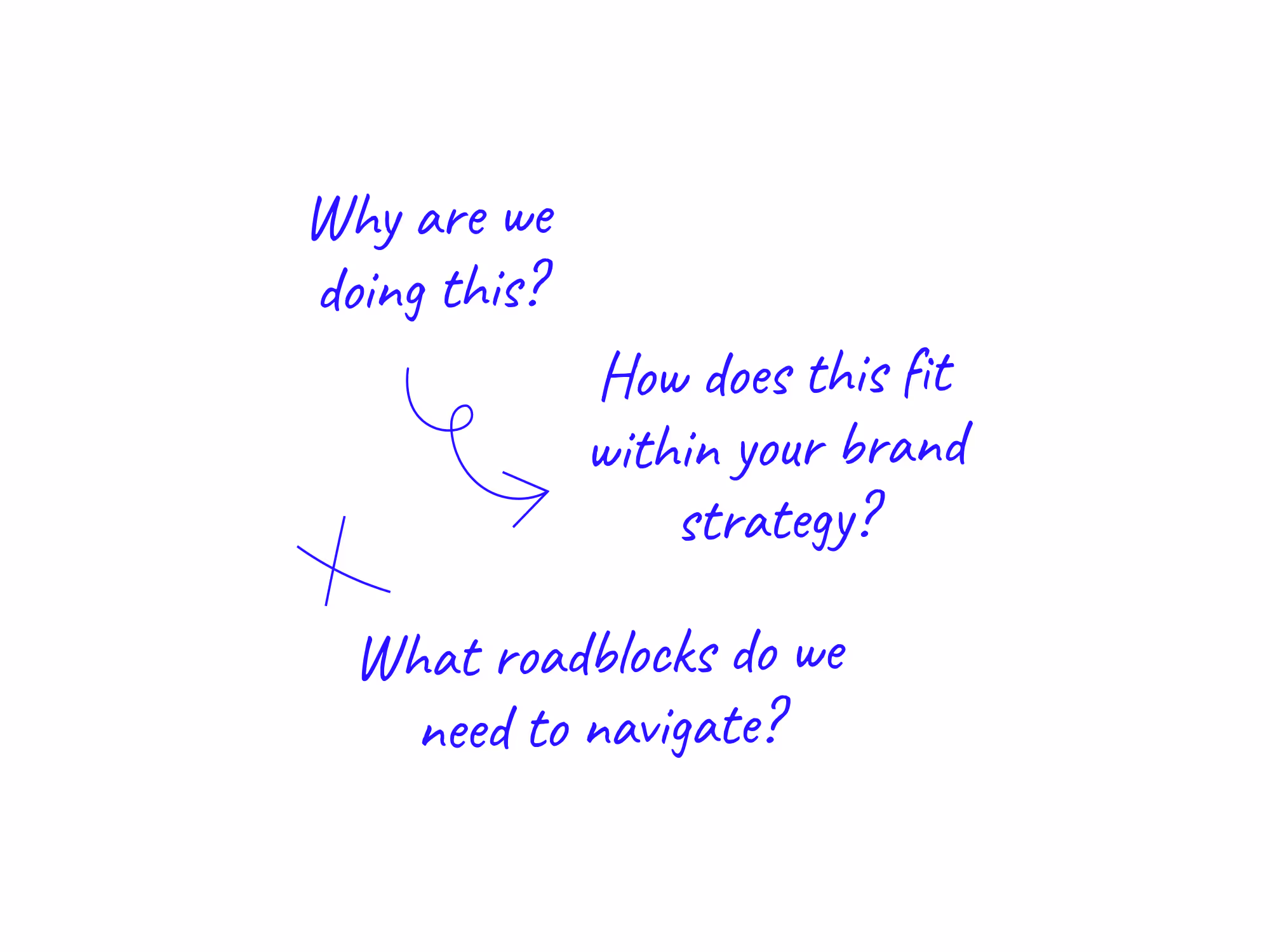
Start with the right questions
If you’re building or redesigning a site, pause before jumping into wireframes or mood boards. Ask:
These questions aren’t just strategic—they’re brand-defining.
We challenge assumptions. That’s how you get clarity.
You may think you already know what your brand stands for. But when you work with Clear Space, we don’t just take your positioning at face value. We challenge it. We ask tough questions. We dig into the details. We present new ideas and alternative ways of seeing your brand’s potential.
It’s not always comfortable, but it’s how we get to the truth.
Our process surfaces blind spots, outdated narratives, and messaging that doesn’t align with your goals or audience. Through conversation and strategic pressure, we help you break through the noise and land on something sharper, clearer, and more powerful.
The result? Real clarity. And a website that reflects it.

More than a website, it’s brand strategy in action.
When you engage Clear Space to “make” a website, you’re getting far more than code and design. You’re entering a process that sharpens your brand. If you already have a brand image, we refine and elevate it. If you don’t, we help you define it clearly, confidently, and strategically.
That’s the Clear Space difference.
Other shops may build you a site. We build your brand presence online. From positioning to messaging to experience. We don’t just design what your audience sees. We help shape what they think when they see it.
Yes, our work comes at a premium compared to a freelancer or a plug-and-play solution. But what you’re getting isn’t just a site. You’re getting clarity. Alignment. A platform that moves your organization forward.
That’s the value we bring. That’s why our clients choose us and why the end result is worth it.

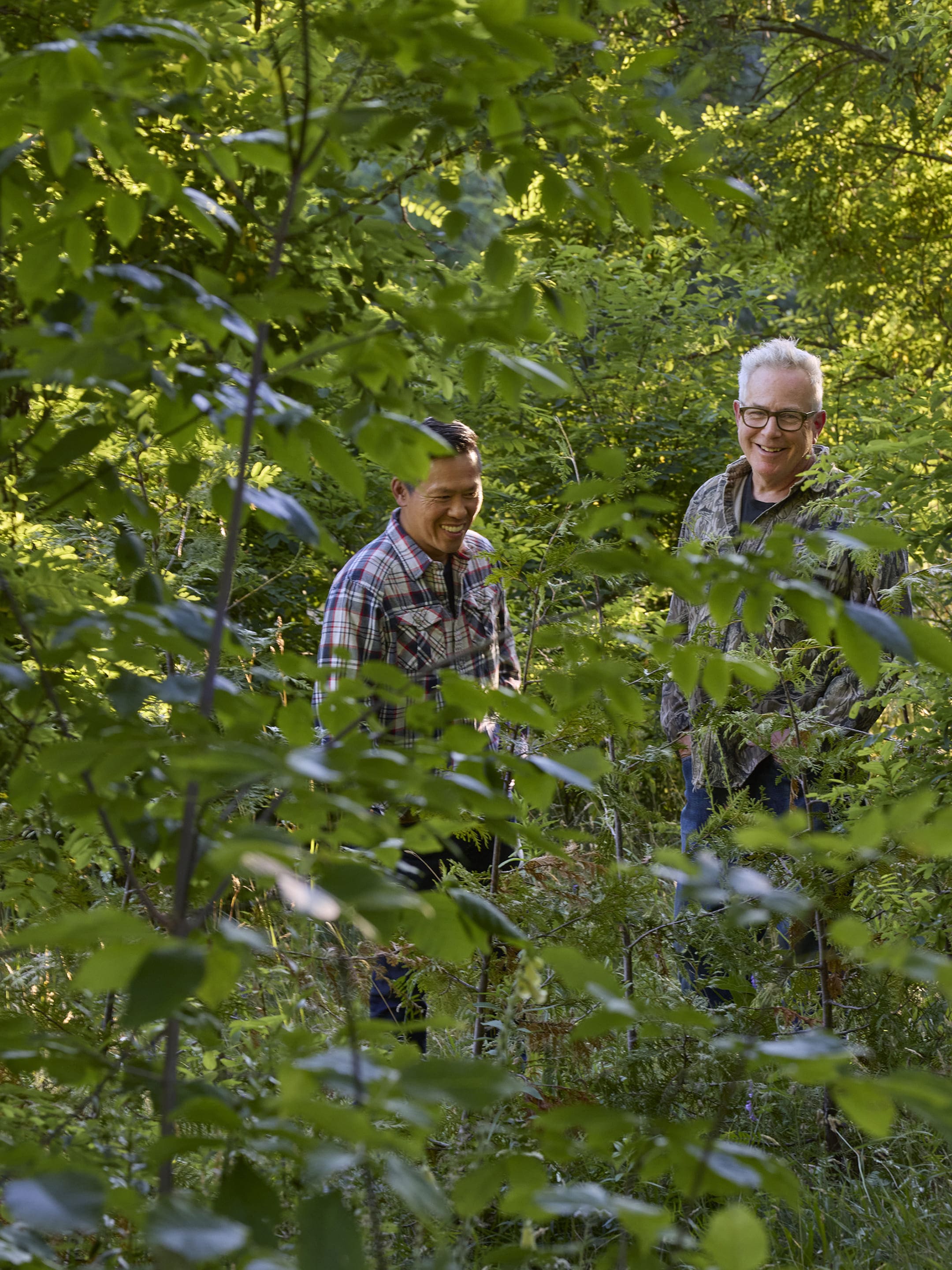
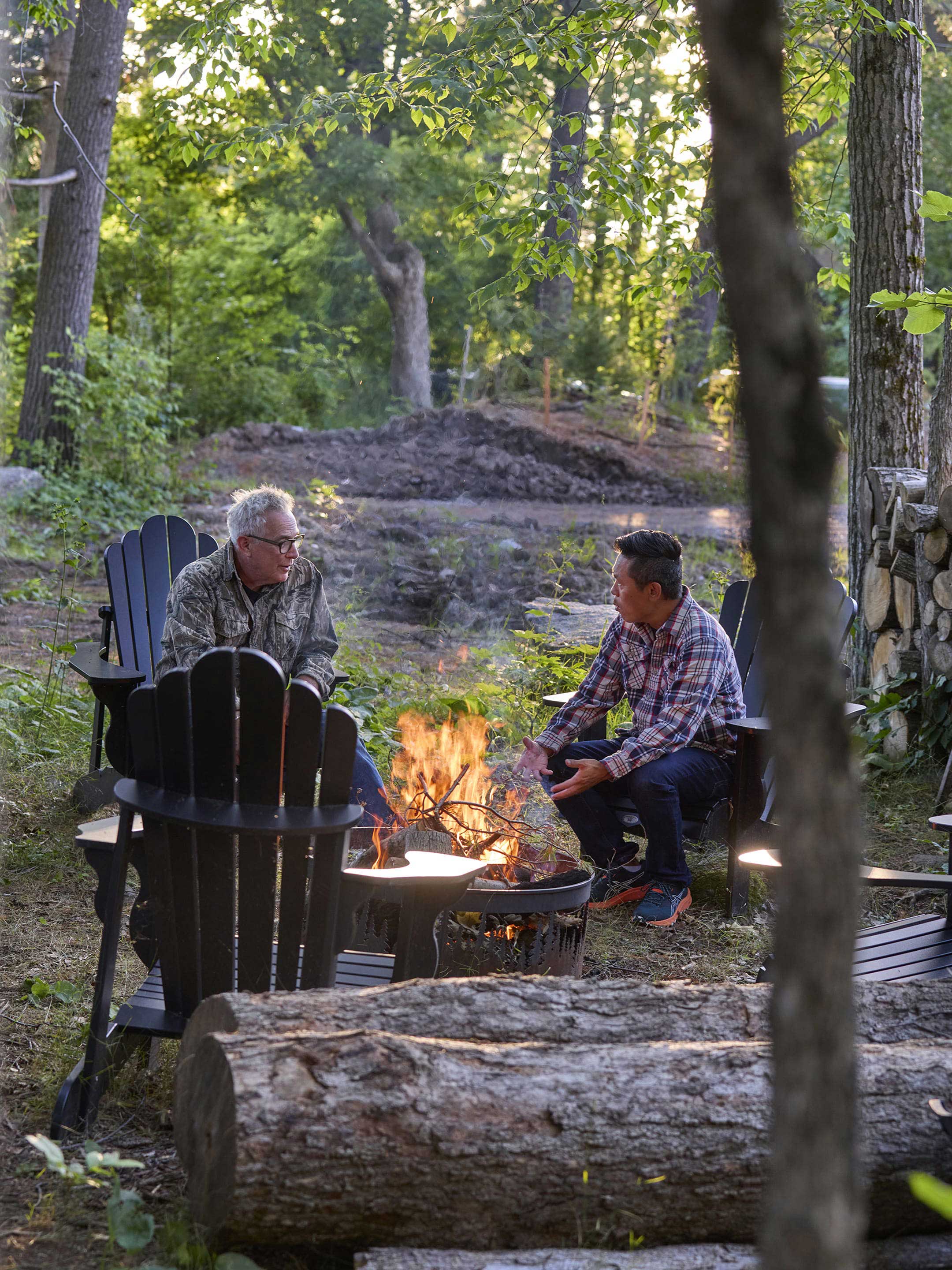
David Graham White and I go way back. In fact, he was the photographer on my first professional art direction assignment back in 2000. Since then, we’ve collaborated on many projects, swapped ideas, shared stories, and bonded over a love of design, photography, firewood, and beer. David has a calm, considered presence and a deeply artistic vision that’s shaped how I work to this day.
This conversation took place at his newly built home in Muskoka, a space he and his wife Meredith (also a talented photographer and artist) designed together. It’s rustic, modern, and whimsical all at once, with playful use of colour, a forest-facing studio, and an energy that makes you want to slow down and make something meaningful. We covered a lot, the evolution of image-making, making people feel comfortable on set, teaching creativity, and where AI fits into it all.
Will: Hi David! Let’s go back in time. What do you remember about that first shoot we did together back in 2000. I believe it was an annual report for Leitch Technology Corporation, a company leading the charge on supporting real-time video. How has your approach to photography evolved since then?
David: I remember that shoot really well, especially how much you talked about story. I learned that from you. It’s something that’s stuck with me ever since. I think that’s what separates a strong image from a weak one, whether it tells a story or not. You helped me see that early on.
Technically, photography has obviously changed a lot since then, but my style and approach have remained fairly consistent. I’ve always tried to celebrate the people I photograph, to capture something true about them. It all comes back to story.
Will: An image can convey so much in an instant. I remember we set up a sleepover scene of teens watching a live NSYNC concert from their bedroom. The idea was to represent Leitchs’ video processing capabilities to allow for better streaming quality on the internet. Today of course we don’t think anything of watching live video content on screens or on our mobiles. But back in 2000 this image really conveyed the notion that the future was video.

“I remember Meredith was on set to coach and cheerlead the girls to bring the energy level up. The expressions on their faces made that shot.”
Will: This leads to my next question. You’ve always had this calm, grounded presence on set. How important is that energy when working with clients or subjects—especially those who are nervous in front of the camera?
David: It’s funny. When I think about that question, I instinctively think about technique as being contrived. But really, I don’t rely on “techniques.” I don’t have a script or tricks to get people to smile. I think that would feel inauthentic. Instead, I just try to show up as myself—low-key, curious, genuinely interested in people.
That energy works for a lot of situations. If I feel like a subject or an idea potentially needs more energy than I’ll bring someone in; like how Meredith stepped in to cheer those teens on at the sleepover shot. But mostly, it’s about connecting on a human level. I find people fascinating. And they can sense when you’re actually interested in them.
Will: I’ve learned that from you as well. When I’m on set, I find that sometimes clients want to get on with the shot quickly. But, I think it’s more important to stand back from the camera at the start and get to know the person, loosen them up, and make them feel more comfortable.
Will: Speaking about “feeling”, from your perspective, what role does photography play in shaping a brand’s identity or emotional connection with its audience?
David: Photography plays a huge role. It used to be that photography and truth were closely linked. But even before AI, photos were never completely “true”—they were always curated or manipulated in some way.
Now, with the saturation of imagery, it’s even more important that a photo connects emotionally. We live in a world where people almost want to be inside the image, they imagine themselves living in it. For example, if you see an image of a coffee shop in a city neighbourhood with beautiful light, you may imagine yourself sitting in that shop enjoying a nice americano or something. You want to be in the ad. That’s the power of branding, right? It’s not just about a product or service; it’s about selling a story, a feeling. And photography delivers that in a split second.
Will: If you’re on IG and see this beautiful image of a sunset over an ocean, you can only appreciate it so much because you’re not there. You can’t feel the warmth on your face or the smell of the sea.
David: It’s easy to get cynical about commerce, but we are naturally part of that culture of being persuaded; being sold an image.
Will: Like an ideal.
David: Exactly, yes.
Will: As a professor of photography at Sheridan, how do you coach students to think beyond the technical and tap into storytelling or emotion in their work?
David: First, you have to get comfortable with the technical. Photography is a very technical craft. Once that’s second nature, then you can focus on the deeper stuff—the messaging, the emotion, the intention.
But more than that, it’s about being an interesting person. If you don’t have interests beyond what’s in front of you, you’re essentially just regurgitating what’s already there. It’s about having an opinion, being curious about life and the world. I try to inspire curiosity. You can’t be a good storyteller if you’re not curious about the world.
“I push students to get out of their comfort zone, try new things, talk to new people. That’s where their unique point of view comes from. Technique is learnable. Curiosity has to be cultivated.”
Will: This idea parallels the journey of graphic design as well. Like photography it was a very technical skill or craft back in the early days. But with the advent of the Mac and desktop publishing, anyone could lay out a page. The question was what’s next? As a trained creator, what can I bring to the storytelling to make it richer and fuller.
David: And not just visually, but engaging with the world. Making relationships and connections with people and seeing things differently. The idea of using a GPS, for example, to get you there and back every time—but, you’re not really knowing where you are. I’m not against technology per se, but it’s about taking a different route sometimes. Or talking to someone you normally wouldn’t. Or seeing a movie of a different genre. All those things make us more interesting as creatives.
Will: I love the GPS analogy. I know some people that love to travel but with super-planned-out itineraries. On the other hand there are those that love to get lost. Not knowing where you are exactly and what you’re going to do next. Every corner is new. That’s fun!
Will: As a corporate photographer you’ve probably worked with many agencies and art directors over your career. Can you talk about the dance between photographer and art director? What makes that collaboration successful?
David: It is a dance. A good art director knows the client better than I do. So my role is to follow their lead and then bring some flourishes, maybe something unexpected.
But sometimes I’ve worked with the same client for years and I know them better than a new art director. That’s where it gets tricky. You don’t want to step on toes, but you also want to make sure the client gets what they really need.
“With you, Will, it’s always been easy. You bring clarity, and you’re open to ideas. That’s rare. There’s no ego. Just teamwork.”
Will: Exactly. That’s the way I treat shoots, as a team. I don’t ever go into a shoot knowing exactly what I’m going to get. But I usually have an inkling on what to aim for. During the concept phase, we typically show a mock-up photo to the client, but they often expect that exact image as the outcome. I always caveat that the final result may not be exactly as shown. When on set, I often want input from the photographer, like yourself, as an expert storyteller through imagery. And so I’m always interested to see what your perspective is on a concept; it may be different or an expanded version – not just my narrow view.
David: I think that’s unique though. You’re confident and you know that you’re good at what you do. And your ego is low, so you allow for that play to happen on the fly. I think that’s fairly rare. I’ve worked with many art directors who want to put their own stamp on an image by super art directing it and therefore already limiting the possibilities.
Will: We recently worked together on creating portraits and b-roll video for the Markham Stouffville Hospital Foundation “MSH Heroes” campaign. How do you balance the artistic vision with the practical demands of that kind of shoot—especially with colourful backdrops and dynamic lighting setups?
David: That shoot was a great example of needing to pre-plan everything. The technical setup had to be solid so that once people arrived, I could focus on them. The lighting, the backdrop colours, everything was dialed-in ahead of time so I could just connect with the subjects.

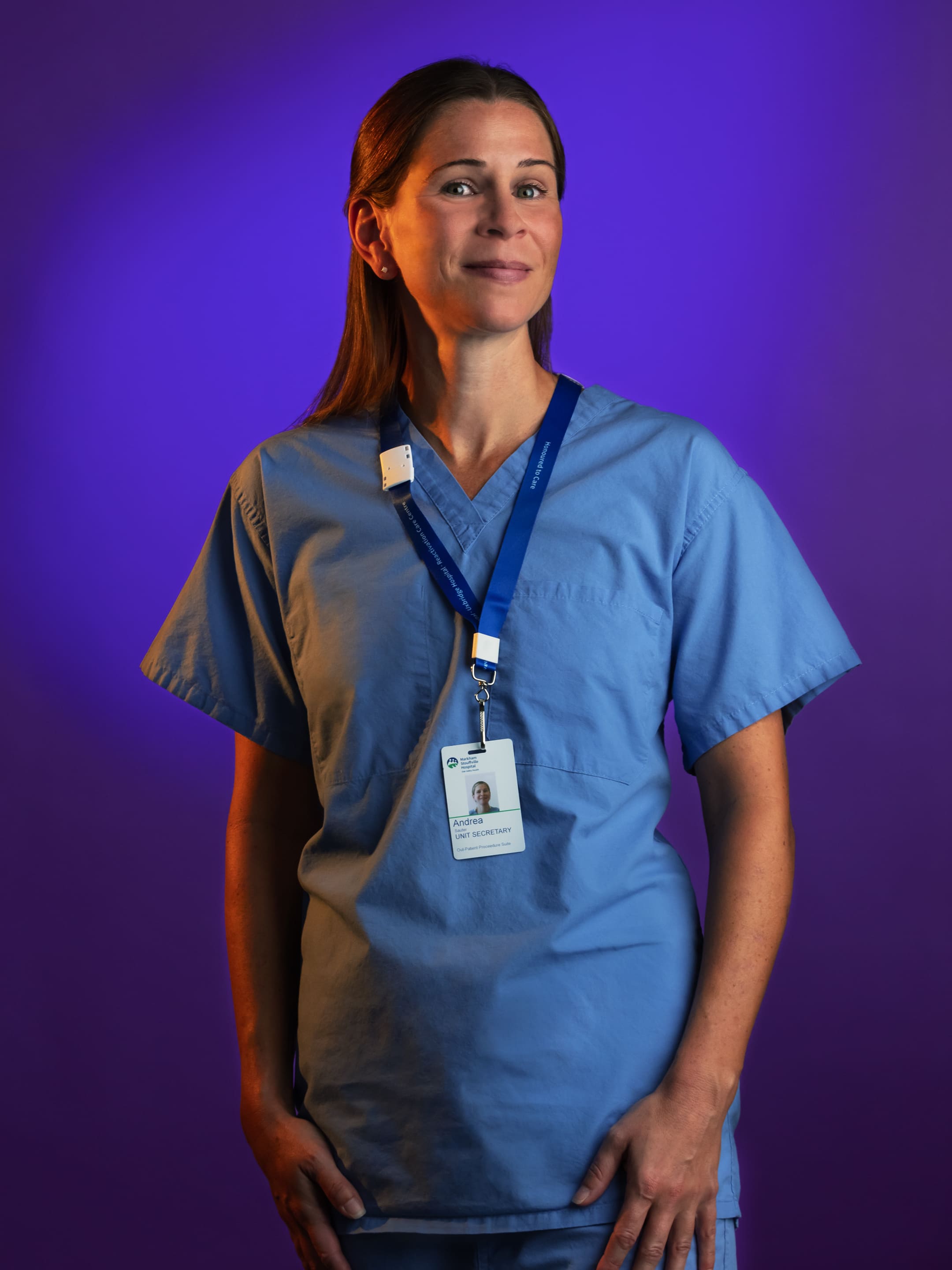
And those people truly were heroes. It was an honour to photograph them. I wanted the portraits to reflect that. So once the setup was locked in, it was all about making them feel celebrated. We even did test shots ahead of time to match colours to the foundation’s brand palette, and rehearsed in a mock studio space. It made the shoot run smoothly and gave us room to capture real, powerful moments.
Will: Not every shoot goes smoothly. Can you share a challenge you’ve faced on set and how you worked around it?
David: There was a time I shot a product for a client—a plexiglass 3D logo. Technically it was fine, but I knew it wasn’t my best. It just didn’t sing. It happened to be the day after my daughter was born, so my head wasn’t in the game.
They were happy with it, but I wasn’t. So I offered to reshoot it on my own time. I just wanted to get it right. That’s the only time I’ve voluntarily done a redo. But I’ve never had a reshoot requested otherwise. Again, planning and prep go a long way.
Will: We always think that shooting real people can be challenging, but in general, they warm up and eventually you get something great. Ironically, shooting still life or product can be difficult because of the variety of materials. And I would imagine food falls into that category too.
David: I don’t do a lot of food, but yes, challenging for sure. I think that’s a niche that’s getting heavily affected by AI now.
Will: Good segue to my next question.
Will: There’s a lot of chatter right now about AI-generated imagery. How are you feeling about AI’s role in photography and the creative industry at large?
David: It’s exciting and terrifying all at once. As a creative, change is part of the job. And AI brings new tools and new ways to explore. I use it in retouching now. But when it comes to the kind of work I do—real people, real stories—there’s still a need for human connection.
“What I find fascinating is that younger generations know AI isn’t real, and they don’t care. The idea of truth is shifting. That’s going to change how we tell stories, how we connect emotionally through imagery. We’re only just beginning to see where it’ll take us.”
Will: Indeed, AI is a whole deeper topic to discuss beyond this interview isn’t it?
David: Something to chat over another campfire I guess.
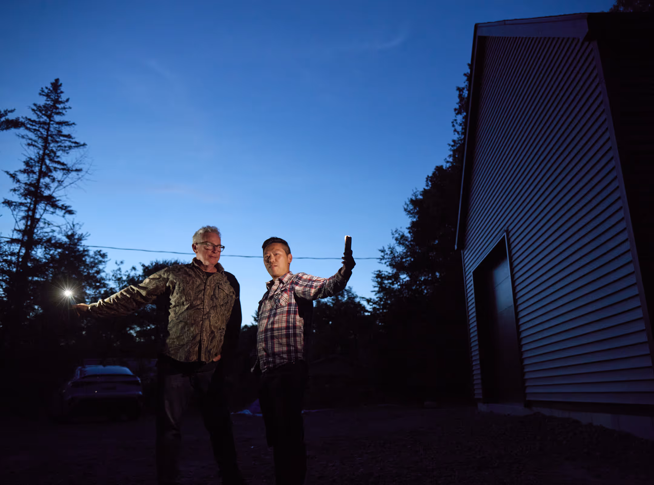
Will: You and Meredith have only recently moved into this stunning new cottage here in Muskoka—modern, rustic, a little whimsical, and full of bold colour choices. What was the process like designing and building it together? And looking ahead, what kind of creative potential do you see this place unlocking for both of you?
David: We designed and built this place from the ground up, and it’s been a huge creative outlet. Everything from the colour of the walls (which, yes, are pink!) to the orientation of the windows was intentional. We wanted it to feel calm, unique, and full of personality.
The original cottage on the lot was referred to locally as “The Pink House,” and oddly, the name stuck. The siding had faded to pink over time, and now we’ve brought that back inside.

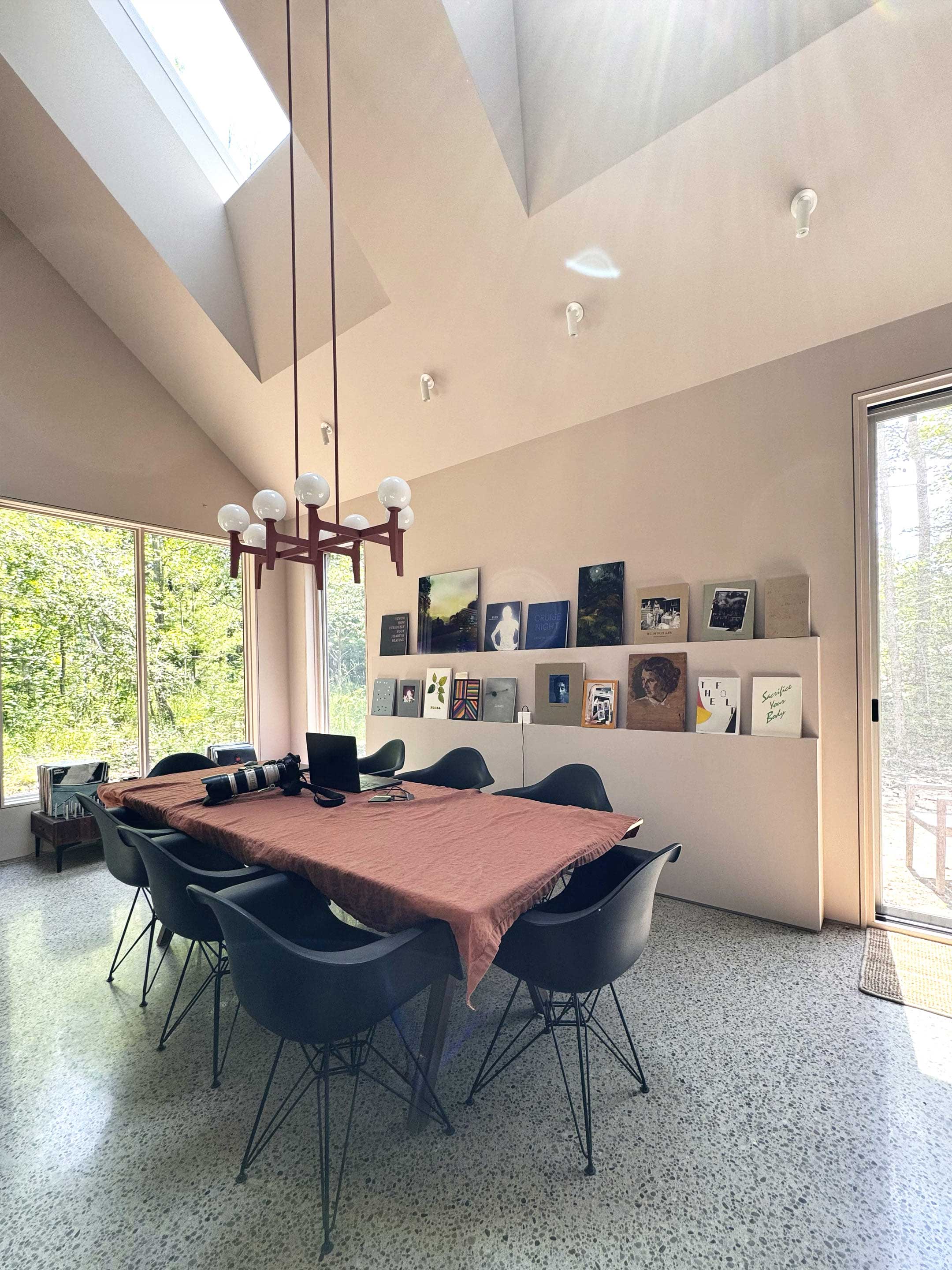
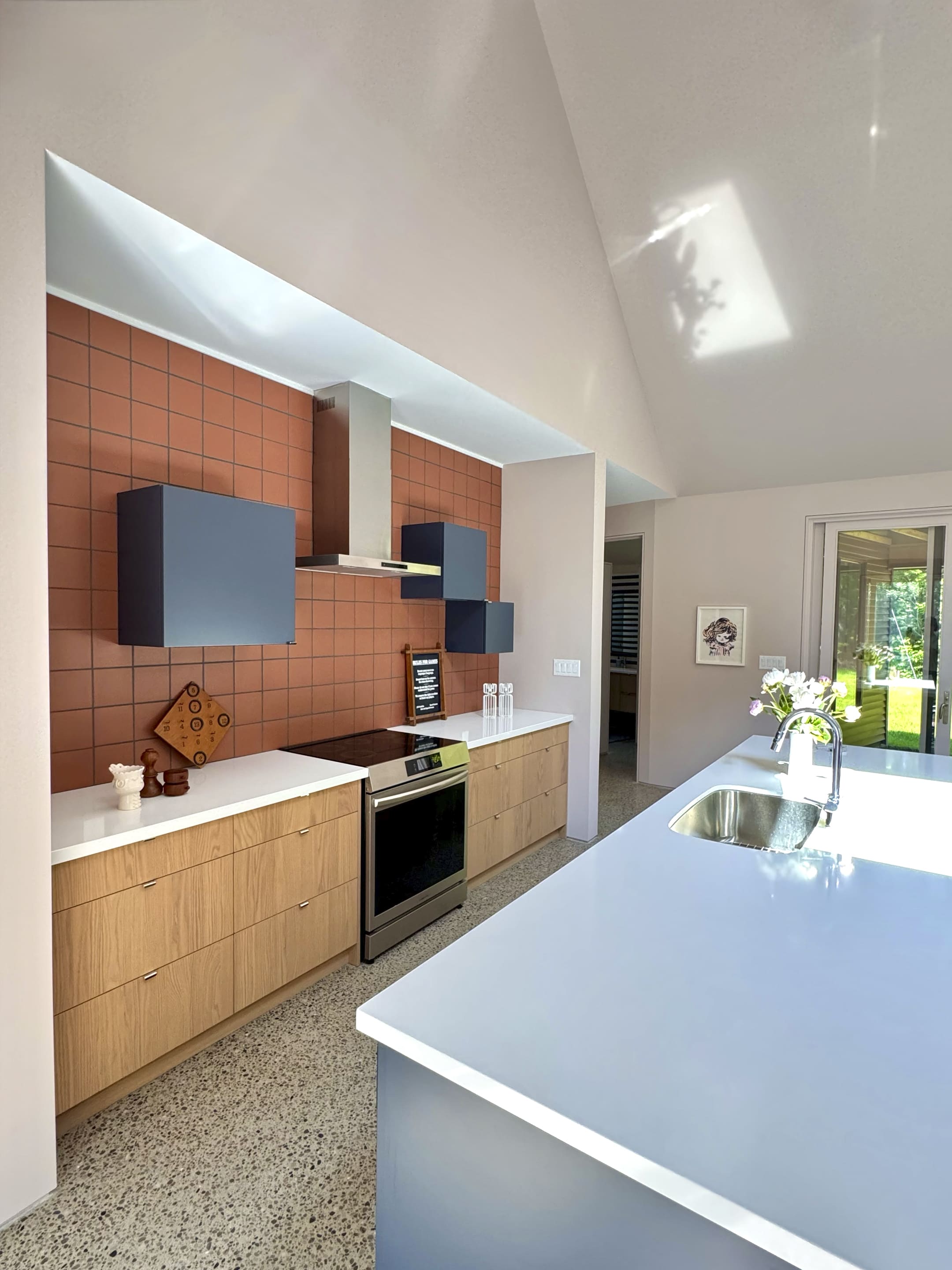
There’s still more to do, but even now, I’m already feeling how the space changes my creative rhythm. The light, the quiet, the forest views—it’s all fuel. I can’t wait to see how it shapes the work we make here going forward.
Will: David it’s been an illuminating conversation. Thank you for chatting with me.
David: My pleasure!

I first met Bennett C. Lo in the mid-90s, working at the iconic design office of Burton Kramer. It was there, where we collaborated on branding and space design projects, that we struck up a creative rapport. We always had strong dialogue, not just about design decisions, but about the why behind them. Even early on, Bennett had a thoughtful, deliberate approach to his work, and our conversations often pushed each other to think more critically, more strategically.
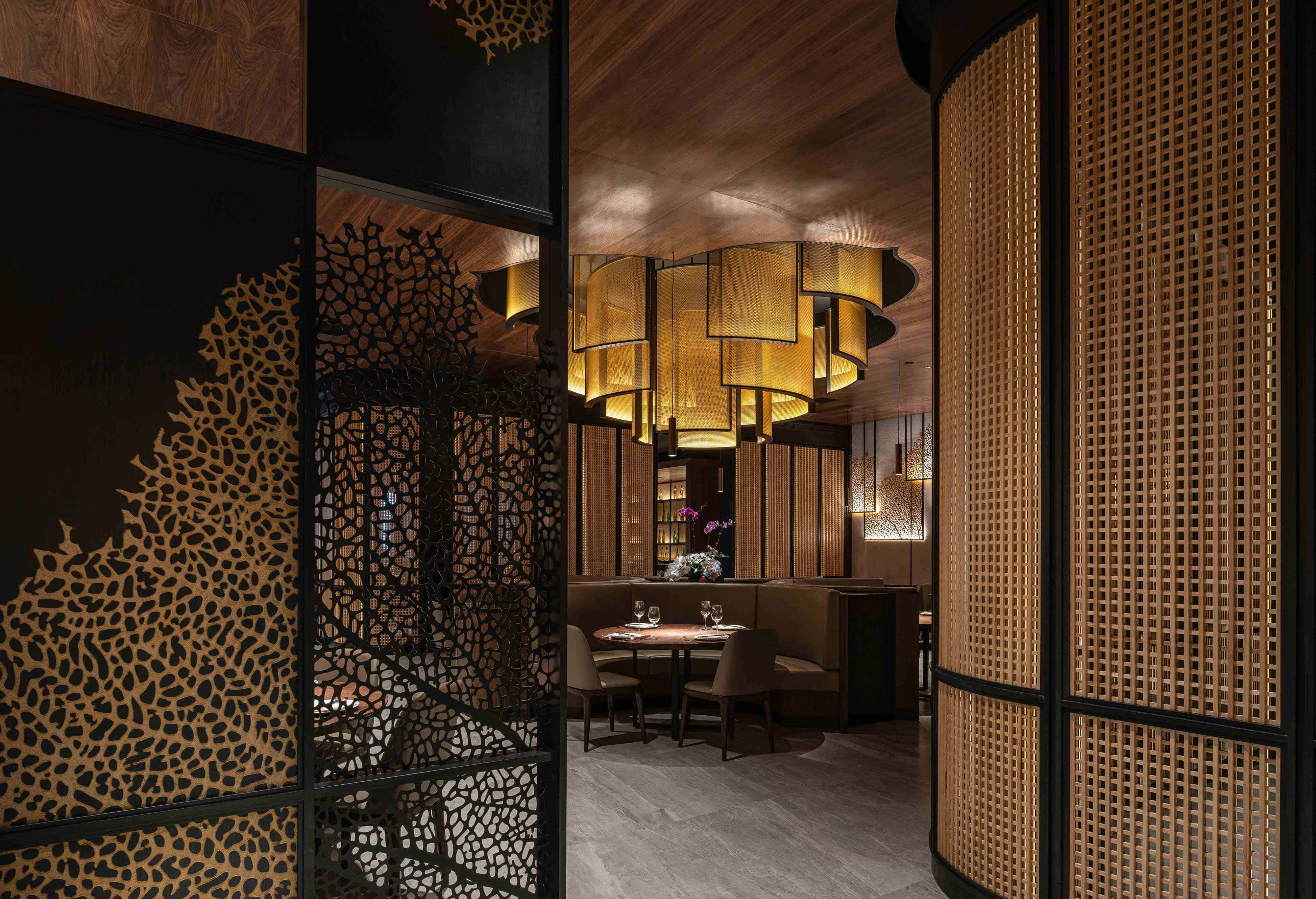
That spirit of dialogue between creative collaborators and between disciplines has shaped both of our careers ever since. Bennett went on to found Dialogue 38, an internationally recognized interior design firm known for refined, modern environments across North America, Europe, and Asia. The studio got its start in Toronto, helping launch one of the city’s first Asian fusion restaurants—a bold, genre-defining concept that helped shape the future of contemporary dining spaces in the city.
Since then, Dialogue 38 has built an impressive portfolio, including recent standout projects like Yu Seafood, an upscale Chinese dining experience at Yorkdale Mall and in Richmond Hill, and the rebranding of Air Canada’s Maple Leaf Lounges in two of Europe’s busiest airports—Frankfurt and London Heathrow Terminal 2B. Each project, whether a hospitality destination or a high-traffic transit lounge, reflects the firm’s commitment to crafting purposeful, elevated experiences through space.
We worked together on some of those early hospitality projects, where I helped create the brand identity and image that supported Bennett’s spatial concepts. It was always about more than just logos and layouts—it was about alignment, tone, and experience.
Today, our work lives in different design disciplines, but the challenges we face are strikingly similar: how to turn ideas into impact, how to balance creativity with business needs, and how to keep the conversation open—with our clients, with ourselves, and with the people we’re designing for.
I caught up with Bennett recently to talk about all of it.
Will Hum: Hello old friend! Are you ready to get started?
Bennett C. Lo: You're going to make me look good right?
Will: Don’t worry I’ll be nice!
Bennett: Right. Okay.
Will: Your firm is named Dialogue 38. What does dialogue mean to you in the context of design – and in your work?
Bennett: To explain that, I’ll need to give you a bit of history. When I first started the company, it was honestly a bit of a scramble. Remember how we used to go to Spring Rolls all the time? We became regulars.
Will: Yep. I remember it was one of the firsts, if not the first, Asian-fusion restaurants to serve traditional Chinese dishes in a modern setting. We got to know the owner pretty well.
Bennett: Right. One night after dinner, he sat down with me and said, “You’re a designer, and you’ve got good taste. What do you think of the food and the concept?” I told him he had a great idea. Then he asked, “What about the space?” I said, “It’s okay.” He laughed and said, “You think you could do better?” I said, “Of course I can.”
Then he said, “Well, I’m building a new restaurant next door. Why don’t you show me?” And I just said, “Sure, let’s do it!”
Will: Ah yes, ****I remember this. Brilliant. So confident.
Bennett: After the first project, it turned out really well. The restaurant concept took off, and within a year, we were doing another one. At that time, I was still working full-time at Kramer. Eventually, the owner said, “I’m spending this kind of money, and you’re still just a part-time architect. How’s that going to work long-term?”It was clear he planned to open more restaurants—and he was nudging me to take the leap. He said, “Don’t worry. You have to start somewhere. Build it, and they will come.”
I was having a lot of fun with it, so I thought, why not? I was young. Next thing you know, I’m starting my own design practice—and I needed a name.
Will: Right, you had to register something fast.


“Great work requires collaboration, real dialogue between everyone: the client, your team, the contractors, the trades. That’s how you bring a vision to life.”
Bennett: Exactly. I didn’t want something like “Lo & Associates”—because I never believed design is a one-person effort. It’s always a team. Great work requires collaboration, real dialogue between everyone: the client, your team, the contractors, the trades.
So I landed on the word “Dialogue”—but it felt a little plain. I was 38 years old at the time, so I added that to the name: Dialogue 38.
Will: Right, good Chinese numbers!
Bennett: In the end, the name reflects how we work: design is a dialogue. It’s about collaboration and clear communication. That’s how you bring a vision to life.
Will: Good segue. How do you balance the artistic side of your vision with the real-world business needs of your clients?
Bennett: First and foremost it’s what will be best for the client and their brand. We will always try to understand what they stand for. It’s hard to escape current styles and trends, but we don't want to do anything dated, because you have to look back 10 years from now, and say this still looks pretty good and it served the client well.
Will: Speaking of branding, both interior design and branding aim to create experiences. How do you think physical space can support—or even elevate—a brand?
Bennett Lo: Most clients don’t envision their business lasting just a couple of years. They’re building something lasting. We’re fortunate to have helped some clients from their very first location to their 50th. Along the way, we’ve made adjustments, of course, but the core remains. One client we first designed for over a decade ago—today, we’re on their second version of the design. It’s evolved, but when you walk in, it still feels true to the original. That continuity tells their story and reflects their growth.
Will Hum: So the design grows with the brand?
Bennett: Exactly. The heart and soul stay intact. For example, one of our clients operates mostly in busy food courts, competing with ten other brands around them. Early on, we created a strong visual identity by owning a distinctive colour—something no other competitor was using. It’s a lesson I actually picked up from branding: CIBC has its burgundy, TD has green, BMO has blue—you own a colour, and it becomes part of your brand equity.
Will: Right, colour becomes a critical part of the identity. That’s a shared principle between our worlds.
Bennett: Definitely. And for that client, even after many years, that distinctive look still sets them apart in a very crowded environment.
Will: Have you ever had to push back on a client’s idea for the sake of good design?
Bennett Lo: Honestly, not often. We’re fortunate—clients usually come to us because they trust we know what we’re doing. Of course, sometimes we have to work harder to explain why we’re making certain decisions. Like, moody lighting for a fine dining restaurant, versus bright lighting for a retail space—you tailor everything to the context. It’s never about what’s trendy or cool; it’s about what serves the client’s needs.
Will: But what if a client pushes an idea that isn’t the right solution?
Bennett: Then you explain why. Sometimes clients suggest changes—like, “What if you try red?” It doesn’t always mean they want red. You have to read between the lines. Less experienced designers might just take it literally. But as consultants, our job is to understand the intent behind a request, not just take orders. We filter ideas, ask the right questions, and guide them. Because at the end of the day, if it turns out badly, no one will care who suggested it—they’ll only see the final result.
Will: Especially in the built environment—you can’t just tear it down the next day.
Bennett: Exactly. Once it’s built, it stays. That’s why we work so hard to get it right.
Will: You mentioned lighting earlier. That leads into my next question: how do you approach designing a space to tell a story or evoke emotion?


“Every project is different. In a restaurant, for instance, it’s about setting the right mood. Where you direct people’s gaze, how comfortable they feel—it’s all part of the story.”
Bennett: Every project is different. In a restaurant, for instance, it’s about setting the right mood. Where you direct people’s gaze, how comfortable they feel—it’s all part of the story. Even things like vent placement matter. If you’re designing an office, you balance staff comfort with the impression visitors get in the lobby or boardroom. You layer all these functional needs with emotional cues to craft the experience.
Will: So it’s about shaping emotion through every detail?
Bennett: Absolutely. In a fine dining restaurant, you want people to relax and stay longer. In a quick-service restaurant, you design for a 30-minute experience—good, but efficient. Maybe the chairs are less cushy so customers naturally move on. It’s all intentional. You design not just for the experience itself, but for the desired length and nature of that experience.
Will: That’s brilliant. It's about shaping behaviour without them even realizing it.
Bennett: Exactly.
Will: A few more questions. You’ve worked globally—how do cultural differences shape your design approach?
Bennett: At first, we were nervous about building codes in different countries. But really, building codes aren’t that different. It’s accessibility standards that vary more. In North America, there’s a big emphasis on accessibility. In parts of Asia or Europe, especially older cities, it’s harder because the infrastructure is ancient. Culturally, the brands we work with tend to maintain their identity when they expand internationally. Our job is to adapt their brand image to local conditions without losing the essence. So it’s less about changing the brand, and more about thoughtful local integration.
Will: Makes sense. Toronto is one of the most culturally diverse cities, so we’re used to blending cultures.
Bennett: Exactly.


“Design is full of subtle, nuanced decisions—things you only catch through physical experience and dialogue with clients. Until AI can replicate that, it’s just a tool, not a replacement.”
Will: Last question. AI is reshaping creative industries. How do you think it might impact interior design and architecture?
Bennett: I haven’t used AI much yet, but I can see the potential. Someday, a client might say, “Just get AI to do it.” But there’s still a huge difference between AI and human experience. Design is full of subtle, nuanced decisions—things you only catch through physical experience and dialogue with clients. Like the way sunlight hits a site differently because of a building nearby—AI might not pick up on those subtleties. Until AI can replicate human dialogue, intuition, and experience, it’s just a tool, not a replacement.
Will: Perfectly said. It comes back to dialogue—you design for humans, and you need human conversations to do that right.
Thank you for sitting down to chat with me. This was great.
Bennett Lo: My pleasure. Talk soon.
It’s always a pleasure reconnecting with Bennett—not just because of our shared history, but because he brings such clarity and intelligence to every conversation about design. Whether you’re branding a company or designing a space, the underlying goal is the same: to create something that resonates, that feels human, and that moves people.
Bennett reminds us that great design doesn’t happen in isolation. It’s the result of dialogue—between people, between disciplines, and between ideas. That’s a principle we live by at Clear Space, too.

The following article is adapted from a talk delivered by our co-founder and creative director, Will Hum, at Minds of Design—an event hosted by the Association of Registered Graphic Designers (RGD) on April 30, 2025.
For the past 30 years, I’ve been walking a creative path. From designer to strategist to mentor, and now, someone who sees his role as something more.
What follows is a short reflection on that journey of transformation. It’s about creativity, clarity, and discovering that the most powerful thing we can design... is who we become.
Act I — The Maker
As a young designer (sad to say, several decades ago now) I believed my purpose was to make things look good. Beautiful typography, imagery, perfect grids. I chased awards. Hoarded design magazines. Obsessed over kerning. Everything revolved around design.
I studied at OCA and cut my teeth at some of the city’s most respected firms: Bhandari & Plater, Ove Brand Design, and Burton Kramer’s office; he, of course, being the legendary mind behind the CBC logo.
I loved the act of making. I was addicted to seeing things come to life: logos and brand systems, books and reports, websites, vehicle wraps, environments.
But back then, I didn’t speak directly with clients much. The brief came from someone in strategy or comms. I stayed in my lane. Over time, though, I began to feel something was missing. Even when I delivered work I was proud of, it felt incomplete. Like I had solved the brief, but missed the point.
I believed I did great work, but did it move anyone forward?
As I advanced, I got closer to the client. I listened. I observed. And I started learning what mattered to them. I began to realize, the real value wasn’t the work itself, but in the process. It’s in helping people see themselves differently.
Act II — The Thinker
I found myself drawn to people—their stories, their challenges, the way they think. I started asking better questions and offering more thoughtful solutions. Not just what clients wanted, but what they needed.
That curiosity led me to strategy. And in 2004, I co-founded Clear Space. We built a practice around asking smart, often tough, questions: What are you really trying to say? Who are you trying to reach? Why now? Design became less about making and more about meaning.
I saw a shift. Not just in my work, but in myself. Clients weren’t hiring us for creative anymore. They were hiring us for clarity. And I realized my job wasn’t to impress them. It was to elevate them.
“Clients weren’t hiring us for creative anymore. They were hiring us for clarity. And I realized my job wasn’t to impress them. It was to elevate them.”
Act III — The Uplifter
With time and experience came perspective. And clarity.
I began mentoring through RGD and with local design schools. What started as a small side project quickly became the most meaningful part of my work. Helping a young designer navigate self-doubt? That stuck with me longer than any award. Lifting a client’s confidence so they could step into their message? That felt more powerful than the design itself.
It hit me: Your creative gift isn’t what you make. It’s what you pass on.
I haven’t stopped being a designer, or a strategist. I’m still heavily invested in “making and thinking” at Clear Space. But my lens has shifted. Now, I see everything through the lens of an Uplifter—someone who helps others define their voice and own their value.
We’re living in uncertain times. Expectations, pressure, stress—it’s all around us. More than ever, we need people who build others up.
So what makes someone an Uplifter? They’re calm. They’re generous. They speak with purpose—and listen more than they talk. They inspire confidence. They offer clarity, not just answers.

What I’ve Learned
After 30 years, here’s what’s stayed with me:
- Your craft will evolve, but your purpose deepens.
- We’re not just here to design brands, we’re here to build belief.
- What you give is often more valuable than what you create.
- Mentorship isn’t a role, it’s a responsibility.
Design is still in my heart. It always will be. It’s my job. But uplifting? That’s my purpose. And it’s what the world needs more of.
So wherever you are on your path, whether you're building a career, leading a team, raising a family, or figuring out what’s next, ask yourself:
What’s my gift? And how can I give it away?

Nonprofit websites have come a long way. What used to be simple brochure-style pages are now expected to support everything from secure donation processing to event ticketing, volunteer signups, and ad tracking. That’s a big ask for small teams, especially those without full-time developers or IT staff. This is exactly why we like embedding third-party applications directly into nonprofit websites. They allow lean teams to deliver sophisticated functionality without the overhead of building it all in-house.
They (third-party apps) allow lean teams to deliver sophisticated functionality without the overhead of building it all in-house.
Embedding these tools also creates a smoother, more cohesive experience for users. Instead of sending someone off-site to register for an event or make a donation, keep them within your own website and maintain your style, user interface and navigation. This continuity builds trust, improves usability (especially on mobile), and leads to higher conversion rates. Plus, keeping things within your domain simplifies analytics. It's possible to track behaviour across domains, but embedded tools let you keep all your data in one place with far less effort.
Embedded third-party apps also offer the benefit of modularity. If a tool isn’t working for you or their support team never responds, look for other options and swap it out. You are not beholden to one vendor or one technology. And the quality of third party apps keeps getting better so you have a variety of options. Many offer excellent design, responsive layouts, and new features added on a regular basis. Even better, many of them are no-code, meaning they can be dropped into your site with just a few clicks and no custom development work. Yes there’s more to manage but lately we’ve heard more complaints about being “locked” into one vendor and living in “support ticket hell”. Free yourself and consider the variety of third-party options.
Yes there’s more to manage but lately we’ve heard more complaints about being “locked” into one vendor and living in “support ticket hell”.
Lastly, the best third-party tools don’t just look good. They also connect with the rest of your tech stack. Look for apps that offer native integrations or easy CSV exports for your CRM. Can you map form fields to donor records? Does the platform help automate follow-ups or sync campaign data? These connections turn your website from a passive tool into an active part of your fundraising, engagement, and operations strategy. Embedding the right applications is one of the smartest ways to build a scalable, future-ready nonprofit site without overwhelming your team.
If you’re interested in hearing more about our perspective on third-party integrations for your website, email us at business@clearspace.ca, or fill out our contact form.

At Clear Space, we’re endlessly curious about design, creativity, and the clever little things that make life smoother, smarter, or just more fun. So every couple of months, we’re sharing a handful of our current favourites.
Each edition, one pick from each of us, could be a beautifully designed object, a killer app, a game-changing gadget, or something that just gets our creative gears turning. It’s a peek behind the scenes, a snapshot of what’s inspiring us right now, and a reminder that great design shows up everywhere.
Tahirah – Nothing Phone (3a)
Right now I’m obsessed with my new Nothing Phone (3a). I’ve had my eye on Nothing’s products for a while, and finally getting one feels like joining a very stylish tech cult (in a good way). The glyph lighting and transparent back showing off the faux ribbon cables are just cool. But it’s not just the hardware, Nothing OS feels thoughtfully designed and fresh. I’ve been customizing my phone since the CyanogenMod days (full theming support, staying up until 3 am building the perfect home screen, showing off on r/androidthemes) and Nothing scratches that itch. It nails the aesthetic I used to chase when I had full control over every detail. Their widget library is functional and fun (one is literally Snake), and their fonts Ndot and NType 82 look beautiful on screen. The new Essential Space and its dedicated button has been beyond useful, too. I can screenshot some design inspo, record a voice memo to attach to it, and come back to it later. Which has been way better than screenshotting something and forgetting why it’s in my gallery a month later. It’s nice when a device doesn’t just work well, but actually sparks inspiration and creativity. Nothing does this!

Will Hum – Kalour Colour Pencils
After a pretty long break from drawing or painting I picked up a sketchbook and a set of 72 Kalour colour pencils. They came in this sleek travel-sized tube with a white gel pen and a colourless blender, which is a nice touch. That said, the tube isn’t super practical, once you've sharpened some of the pencils down they disappear into the mix and become hard to find.
The colours themselves are surprisingly vibrant, with a solid range across the spectrum. Oddly heavy on the greens, but no problem here, green’s my favourite anyway. The pencils are on the softer side, so I’m sharpening them a fair bit, but I kind of enjoy that rhythm.
They’re not top-tier artist quality or anything, but that’s not the point. This set is more of a warm-up—something to help me ease back into sketching without any pressure. Once I get into the groove again, I’m thinking of levelling up with a set of Moleskine watercolour pencils. I’ve painted with watercolours before, but never used the pencil version, so that’ll be a fun experiment.
Lately, I’ve been reaching for the sketchbook often, getting into a nice flow for an hour or so at a time. It’s such a refreshing shift from the screen.

Korneliusz – Wacom One Sm Pen Tablet
I’ve been using the Wacom One Sm Pen Tablet lately, and honestly, it’s become my go-to creative tool—especially with my remote work setup constantly shifting. Some days I’m at the dining table, others I’m in a café or tucked away in a library corner (classic remote worker life). Because it’s so compact and has Bluetooth plus a solid 3–4 day battery life, it’s super easy to bring with me and turn any random spot into a legit workspace. What I love most is using a pen instead of a mouse—it just feels more intuitive, like writing or sketching on paper. It’s way easier on the wrist too, which means I can keep working comfortably late into the night (sorry, not sorry, hand cramps). While my MacBook’s doing the grunt work, the tablet is what really unlocks the creative flow. A trackpad feels clunky, a mouse gets tiring—but this? This is smooth, responsive, and natural. It takes me right back to why I got into design in the first place: an idea, a medium, and a canvas. Only now, it’s all digital.

Will Robinson – Umbra Picket 5 Wall Hook
Right now, I'm digging the Umbra Picket 5 Wall Hook. It is a wall-mounted hook system with five fold-down hooks. I have three of them on the wall of my entranceway.
When I first moved into my apartment, there was a long piece of wood with a ton metal hooks screwed onto it. Great for hanging up coats, bags and hats, but it didn't have the warm, minimal vibe I was going for. I found the Picket 5 Wall Hook and was hooked on the clean, minimal aesthetic with high functionality. I bought three of them and still have 15 hooks at my disposal, but now the space looks clean and warm when not in use. The wood is smooth, and folding the hooks up or down is effortless. They are surprisingly sturdy. Combining this fold-away storage idea with the TRONES shoe cabinet from Ikea keeps my entrance clean and organized while being functional and helpful.
Applying this concept to web design, I like the idea of creating a minimal, satisfying visual experience while still being a helpful website.

Paul – Spencerian Penmanship Workbook (and Blackwing 602)
I’ve started taking notes in the morning instead of jumping straight into email. It’s a slower, more thoughtful way to begin the day. But my handwriting? A mess. So I searched how to fix my handwriting and stumbled on an 8-year-old video by @TinyOryx about Platt Rogers Spencer and his penmanship workbooks.
Spencer developed a full system for elegant, legible writing that took off in the 19th century. His sons published theory and practice books that were taught in schools across the U.S. I’m now working my way through the Spencerian Penmanship workbooks.
Still with me? One more rabbit hole: in @TinyOryx’s video, she held up a pencil I didn’t recognize, the Blackwing 602. Apparently, it’s a legend. Artists, writers, and musicians like John Steinbeck, Aaron Copland, E.B. White, and Chuck Jones swore by it. Discontinued in 1998 and revived in 2011, the Blackwing 602 is loved for its smooth glide and iconic design.
If it was good enough for Steinbeck, I figure it can handle my morning scribbles.
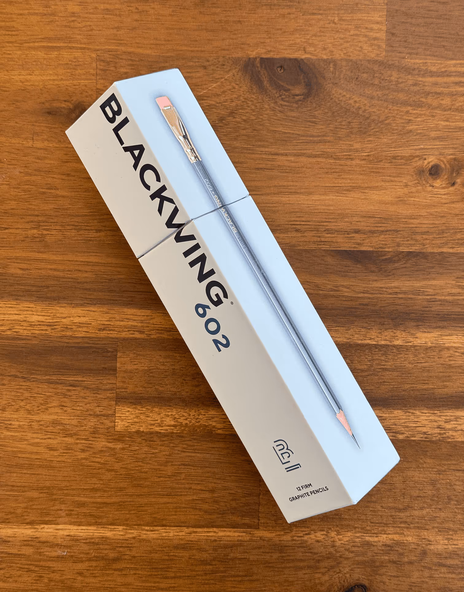

At the recent RGD Minds of Design event, co-founding principal and creative director Will Hum took the stage to reflect on nearly three decades in the industry, not just building brands, but building people. In a talk grounded in experience and generosity, Will encouraged fellow creatives to shift their focus from what they produce to the impact they leave behind.
The event brought together designers from across disciplines for a day of engaging talks, open conversations, and community connection. Attendees experienced a mix of keynote presentations, Q&A sessions, and informal networking, designed to spark dialogue and share insight. Will’s session stood out for its candid perspective on evolving purpose and how giving back can become a designer’s most meaningful legacy.
👉🏻 Check out Will’s adapted talk here

Ever wonder how Clear Space got its start? Spoiler: it involves a coffee break, a shared love of design, and the wide-open possibilities of the early 2000s web. Our industry association RGD recently profiled us as a Featured Firm, diving into our origin story, our obsession with clarity, and why we believe great design is more about what you take away than what you add.
It’s a look back at where it all began—agency days, big ideas, and striped sweaters that were somehow very on-trend at the time. 🫣
👉 Read the full story on RGD.ca

No, a portmanteau isn’t a fancy new burger – it’s when two words get together and make a word baby.
As brand designers we have a plethora of creative tools in our kit, but perhaps none more integral than words. Words and phrases shape how audiences perceive and connect with a brand.
At Clear Space, we harness the power of language to craft memorable brand names, compelling messaging, impactful titles, and action-driven calls-to-action that inspire engagement. The right choice of words can be the difference between forgettable and unforgettable.
Much of this magic comes from understanding and mastering rhetorical devices. You already know some of these linguistic tools like metaphors, hyperbole, and alliteration—they add depth, creativity, and emotional resonance to our work. But do you know what a synecdoch is? How about chiasmus, anaphora, or inclusio? And btw, there’s more to an apostrophe than just being a needy punctuation mark!
The following is a quick glossary of a few (certainly not all) rhetorical devices that can be a secret weapon to great creative. To help you understand how we use some of them, we’ve selected a few examples from our portfolio that demonstrate sticky brand messaging.
And just like a portmanteau, when the right words come together, the outcome can be greater than the sum of its parts.
Alliteration
Repeating the initial consonant sound for rhythm or emphasis.
“In to End Diabetes” is a program name and identity we created for Breakthrough T1D. It’s an example of alliteration, since the words “In,” “to,” and “end” all start with a similar soft vowel/consonant sound, creating a rhythmic and memorable phrase.
It also plays with wordplay and double entendre:
“In to end” – suggests commitment and action (as in “we’re all in to end diabetes”).
“Into end” – reads like a single phrase, reinforcing the goal of eliminating diabetes.
Anaphora
Repeating a word or phrase at the start of successive clauses for emphasis.
When Toronto Global, the city’s main FDI agency, asked us to develop a digital campaign for the Amazon HQ2 bid we knew we wanted to lead with an inspiring anthem.
The phrases “You don’t just live in Toronto.” and “You don’t just work in Toronto.” are repeated at both the beginning and end, reinforcing the central message.
The repetition of “We celebrate…” adds a rhythmic, persuasive effect.
The manifesto builds momentum, making the final line “You Experience Toronto.” feel like a natural and powerful conclusion.
Analogy
A comparison between two different things to explain or clarify a concept.
Examples:
“Running a business is like tending a garden—both require patience, care, and the right conditions to grow.”
“Just as a key unlocks a door, knowledge unlocks opportunities.”
Antithesis
Using contrasting ideas in a parallel structure.
Examples:
“It was the best of times, it was the worst of times.”
“To err is human; to forgive, divine.”
Apostrophe
Not just a needy glyph, it’s also directly addressing an absent person or inanimate object as if it could respond.
Examples:
“O Death, where is thy sting?”
“Twinkle, twinkle, little star, how I wonder what you are.”
Aphorisms
Short, pithy statements of truth or wisdom. Like wee nuggets of life advice.
Examples:
“Actions speak louder than words.”
“The early bird catches the worm.”
“What doesn’t kill you makes you stronger.”
Backronym
Where an existing word is repurposed as an acronym, often to create a meaningful or relevant phrase.
<video width="100%" height="auto" autoplay loop muted playsinline loading="eager" style="margin-bottom: 2rem;margin-top: 2rem;">
<source src="https://clearspacexmas.s3.us-east-2.amazonaws.com/WITH_logo-animation_March19.mp4" type="video/mp4">
Your browser does not support the video tag.
</video>
WITH MSH is a name we created for Markham Stouffville Hospital Foundation’s women-led philanthropic initiative. The word “WITH” is used to stand for Women Inspired to Help, even though “WITH” wasn’t originally an acronym. The phrase is constructed to make the word fit a meaningful concept, creating a sense of empowerment and purpose.
It plays on the idea of the word “WITH”, implying both collaboration and support, which ties nicely to the message of women coming together to help others. The word itself evokes a sense of unity, making the phrase feel both inclusive and action-oriented.
Chiasmus
Words or concepts repeated in reverse order for impact.
Examples:
“Never let a fool kiss you or a kiss fool you.”
“Ask not what your country can do for you, ask what you can do for your country.”
Double Entendre
A phrase or expression that has two meanings.
Rosseau Lake College, an independent school located along the beautiful shores of Lake Rosseau, Ontario needed a unique marketing slogan for their brand. We aimed to create an ownable phrase that connects education with both identity and environment.
“Extraordinary learning is in our nature” plays on two meanings at once:
“In our nature” as a core value – suggesting that a love for learning is inherent in the school’s culture and philosophy.
“In our nature” as a nod to the natural environment – highlighting the school’s location in northern Ontario, where nature plays a role in education and experiences.
Euphemism
A polite way of saying something unpleasant or harsh.
Examples:
“Passed away” (instead of died).
“Economical with the truth” (instead of lying).
Hyperbole
Exaggeration for dramatic effect. Not meant to be taken literally.
Examples:
“I’ve told you a million times!”
“I’m so hungry I could eat a horse.”
Idioms
Phrases where the meaning isn’t literal, but everyone knows what they mean.
Examples:
“Kick the bucket” (die).
“Piece of cake” (easy).
“Break the ice” (start a conversation).
Inclusio
Where a text or phrase begins and ends with the same or similar words or ideas, creating a sense of unity, emphasis, and closure.
“Every one of us” is a brand slogan we created for Sunnybrook Foundation and is an example of inclusio and emphasis through repetition. It reinforces a sense of unity and collective responsibility. The phrase slightly echoes itself (“every one” and “of us”) for added emphasis, making it more emotionally resonant. It’s a simple but powerful phrase that fosters connection and shared purpose.
Irony
When the opposite of what’s expected happens.
Examples:
A fire station burns down.
“What a lovely day!” (on a stormy afternoon).
Metaphors
Comparisons where something is described as being something else, to draw a parallel.
When Ontario Shores Foundation for Mental Health asked us to develop an awareness campaign, we named it “Reach the Shore.” It symbolically compares recovery and mental well-being to reaching a shore—suggesting a journey from struggle (open water, uncertainty) to safety, stability, and healing (the shore). This makes it powerful because it:
- taps into feelings of hope, progress, and relief
- is instantly understandable, yet layered with meaning
- it aligns with the organization’s name – “Ontario Shores”
It also has an imperative structure, subtly encouraging action (“Reach”)—which makes it persuasive and motivating.
Metonymies
A posh cousin of metaphor, where you substitute one thing with something closely related.
Examples:
“The crown” (referring to a monarch).
“The pen is mightier than the sword” (pen = writing, sword = force).
“Hollywood” (referring to the American film industry).
Onomatopoeia
Words that sound like the thing they describe.


Oxymoron
Two contradictory terms used together.
Examples:
“Deafening silence.”
“Bittersweet memories.”
Palindrome
Words and phrases that reads the same backward as it does forward.
Examples:
SONOS
TENET
LEVEL
Personification
Giving human traits to non-human things.
Examples:
“The wind whispered through the trees.”
“The clock mocked me with its ticking.”
Portmanteau
Where two words are blended to create a new one.
To market a new lithium battery product for DCL International, we invented the name “LightningVolt.” In this case, “Lightning” represents speed, energy and power, and “Volt” reflects electricity and a unit of energy.
It also has onomatopoeia-like qualities, as “LightningVolt” sounds sharp and energetic when spoken—enhancing its impact.
Pun
A play on words for humorous or clever effect.
Examples:
“I’m reading a book on anti-gravity. It’s impossible to put down!”
“The fish was caught because it took the bait—hook, line, and sinker.”
Simile
Like a metaphor, but with “like” or “as.” It’s a softer comparison.
When the University of Toronto asked us to create ADs to promote their Sport & Rec program, we found inspiration from Muhammad Ali’s famous quote “Float like a butterfly, sting like a bee.”
In our case, “Float Like a Butterfly!” reflects the graceful form of the butterfly swimming style—implying agility, lightness, and fluid motion.
Synecdoche
Similar to metonymy, but here a part represents the whole or vice versa.
Examples:
“All hands on deck” (hands = people).
“He’s behind bars” (bars = prison).
To truly make your brand messaging stick, it’s about more than just choosing the right words—it’s about knowing how to wield them effectively. By mastering rhetorical devices, we elevate simple ideas into powerful, memorable expressions that resonate long after they’ve been heard.

When Andrew Sheiner founded Altas Partners in 2012, he set out to build a different kind of private equity firm—one that takes a focused, long-term approach to investing in high-quality businesses. Operating from offices in Toronto and New York, Altas now manages more than US$10 billion on behalf of leading institutional and family office investors worldwide.
In early 2020, Andrew and his team recognized that their brand identity needed to better reflect the firm’s distinct philosophy. At the time, the Altas website opened with what Andrew described as a “blue wall”—a dark, corporate-looking homepage dominated by a human-less boardroom image. It was professional, but it lacked warmth, personality, and the essence of what makes Altas unique. To “knock down the blue wall,” Andrew engaged Clear Space to help redefine Altas’ brand, website, and communication materials.
More than four years later, our partnership continues to thrive, driven by a shared belief in clarity, precision, and the power of thoughtful design. Unlike many CEOs, Andrew has a keen eye for design and was deeply engaged throughout the creative process, ensuring that every detail aligned with Altas’ ethos.
Despite his demanding schedule, Andrew made time to join us virtually for a quick-fire chat on business, branding, and how both Altas and Clear Space embrace the philosophy of “fewer, better” and “less is more.”
Clear Space: Hello Andrew, thanks for joining us for this quick chat. We’re aiming for 10 questions in 10 minutes. Ready?
Andrew: Happy to!
Clear Space: Your journey started at McKinsey, through to Onex, and then to founding Altas Partners. What inspired you to step away and establish your own firm, and what led you to adopt the “fewer, better” strategy?
Andrew: I spent 17 years working for Gerry Schwartz, helping grow Onex from a small team of six to a large enterprise. In the end, it was very much Gerry’s firm, and I understood that. I was eager to build something that reflected my own ethos, particularly as it relates to team building, culture and purpose. We started by defining a clear objective: to generate strong returns with the least risk over the long term for our partners. From there, we developed an investment strategy and assembled a team to maximize our chances of success. This focused approach was driven by a belief that patience and conviction would serve us best in the long run.
Clear Space: How does your team define “quality” and “opportunity” when evaluating potential investments?
Andrew: Quality relates to the risk part of our framework: we look for businesses that have an enduring advantage and a distinctive asset or capability as a way to minimize the risk of loss. Opportunity relates to a conviction that we need when we buy a business, that there is an achievable path to meaningfully grow cash flow over time. The two attributes taken together are hard to find, which is why we are determined to remain patient as an investor.
Clear Space: What role does long-term stewardship play in Altas’ investment philosophy?
Andrew: It is an orientation and mindset that influences our approach to ownership and stewarding businesses.
Clear Space: Back in 2020, you invited Clear Space to partner with you to refresh the Altas brand image and refresh the website – to tear down “the blue wall.” What prompted Altas to pursue a new brand identity at this stage of the firm’s journey and why us?
Andrew: I was looking for talented collaborators and a highly creative team to elevate the website and the overall look and feel of the Altas brand. We interviewed several firms, ultimately choosing Clear Space because of the firm’s thoughtfulness and sensitivity, in addition to the design sensibility of the Principals and team.
“I have always believed that design – brand image, website, video, furniture, art – is a critical part of crafting a “feel” at Altas and of reinforcing the sense of focus and of serenity.”
Clear Space: Throughout the collaboration, you were notably hands-on and deeply engaged in the creative process. What drew you to take such an active role in shaping Altas’ brand identity?
Andrew: I have always believed that design – brand image, website, video, furniture, art – is a critical part of crafting a “feel” at Altas and of reinforcing the sense of focus and of serenity (there is nothing frenetic about our firm, intentionally) that we are keen to communicate to our various stakeholders. Visitors to our website, or to our offices, will hopefully quickly develop a sense of the place based on the design and aesthetic that has been created. For the website, this required attention not only to imagery but to language as well, which is why I was focused on every word that we included on the site.

Clear Space: Were there specific design elements or decisions—like imagery, colour, typography, or layouts—that you felt strongly about or were particularly invested in?
Andrew: We wanted the site to feel modern but not stylish, and enduring while not feeling heavy or formal. All of the design choices stemmed from that desire.
Clear Space: Many executives view design as a secondary concern, but you clearly approach it as a core part of strategy. Where does this appreciation for design come from?
Andrew: I’ve described building a firm as akin to assembling a jigsaw puzzle. Every piece should ideally fit together to give you the best chance of achieving whatever you set out to achieve. For us that is strategy, team, culture and all the things that reinforce that: values, norms, behaviours, learning and development training, as well as the things we do to make people feel valued and respected beyond compensation. The look and feel of the place, both online and virtually, is critical to support all of this. When we buy a new business, which is a big moment for us and only happens once or twice each year, we commission a unique piece of work from a Canadian artist that we then display in our office. Our offices have no receptionist; when you enter you are welcomed by beautiful contemporary art and furniture where you’d want to sit with a colleague and share a cup of coffee. All of this evokes a “feeling” that reinforces a caring orientation and an attention to detail that is essential to doing great work as well.
Clear Space: In your experience, how critical is design in conveying a firm’s values and vision in the private equity space?
Andrew: Investment firms are all about people, judgement and experience. There is no real IP in these businesses. They succeed over time by creating a repeatable framework and a way to attract and apprentice talented young people to execute on the strategy. Design plays an important role as a piece of the overall puzzle.

“The moment a stakeholder—whether a customer, supplier, partner, or employee—interacts with your brand, they don’t just process information; they feel something. That impression is shaped by the language, imagery, and overall experience you present—and it’s something you can intentionally design.”
Clear Space: What role do tools like Sustainability reports and AGM presentations play in reinforcing a firm’s brand?
Andrew: They are critically important, in that every interaction with an investor, verbal or written, is an important opportunity to reinforce messaging and positioning of the firm within the larger PE ecosystem.
Clear Space: How would you advise other CEOs to approach creative processes, especially those who might not initially see the value in engaging so deeply?
Andrew: The moment a stakeholder—whether a customer, supplier, partner, or employee—interacts with your brand, they don’t just process information; they feel something. That impression is shaped by the language, imagery, and overall experience you present—and it’s something you can intentionally design. By collaborating with a skilled design partner like Clear Space, you ensure that every touchpoint is crafted with bold simplicity and thoughtful strategy, creating clarity, connection, and momentum for your brand.
Clear Space: Andrew, thank you for participating in this quick-fire chat.
Andrew: My pleasure!

Scarborough Health Network (SHN) Foundation has chosen Clear Space as its creative and digital partner to lead the redesign and rebuild of its website.
The Foundation aims to revamp its primary website, shnfoundation.ca, to enhance user experience, boost donor conversions, and better align its campaign creative with its fundraising goals. As part of this initiative, SHN Foundation also plans to integrate its primary website with its campaign site, lovescarborough.ca, creating a cohesive and streamlined digital presence.
The new website will serve as the central hub for SHN Foundation’s communication and fundraising efforts, offering an intuitive, impactful platform that connects donors, community members, and stakeholders to its mission and the Love, Scarborough campaign. The ultimate goal is to inspire engagement and drive key actions.
“We chose Clear Space because they’re not just website designers—they’re storytellers. Their ability to weave compelling narratives through design, combined with their extensive experience in the healthcare sector, made them the perfect partner for our project. Clear Space also brought invaluable strategic branding expertise to the table, which has been instrumental in helping us redefine how we connect with our community.
The SHN Foundation team is genuinely excited to collaborate with such a talented group. We’re confident that their innovative approach and thoughtful creativity will elevate our digital presence and help us make an even greater impact with our Love, Scarborough campaign.”
Jennifer Lee, Associate Vice President, Marketing & Communications

Looking for some fresh reads to inspire you and level up your skills? Or maybe you just need to find some much-needed clarity. Here are seven books that’ll do just that—and maybe even make you look like a genius in the process. These curated picks by our team are the perfect way to keep your brain buzzing and your ideas flowing. Grab a coffee and dive in—you might just finish smarter than you started.

Hyphens & Hashtags, The Stories Behind the Symbols on Our Keyboard, by Claire Cock-Starkey (192 pages)
As graphic designers, we often geek out over the small typographic details and symbols that most people overlook—the ones that, though subtle, play a huge role in shaping how we communicate.
Hyphens & Hashtags: The Stories Behind the Symbols on Our Keyboard by Claire Cock-Starkey is a delightful exploration of the often-overlooked symbols that populate our digital conversations. From the pound sign to the asterisk, Cock-Starkey uncovers the fascinating histories, quirks, and cultural shifts behind these everyday characters. Filled with fun facts, witty anecdotes, and rich storytelling, the book reveals how these small symbols have evolved and shaped communication over time. It’s an engaging journey into the hidden stories behind the symbols we use daily.

Microstyle, The Art of Writing Little, by Christopher Johnson (256 pages)
Do you struggle with creative writing? Or perhaps find yourself writing too much and never quite getting to the point?
If so, Microstyle: The Art of Writing Less and Saying More by Christopher Johnson could be the perfect solution. This insightful book teaches you how to craft short, impactful phrases that convey big ideas with precision and style. Johnson shows how the art of brevity can be used in everything from branding to social media, helping you communicate more effectively and memorably. With practical tips and plenty of examples, Microstyle is an essential read for anyone looking to make their writing sharper, clearer, and more powerful.

All Marketers Tell Stories by Seth Godin (240 pages)
There’s a brilliant and simple analogy that explains the difference between branding, advertising and marketing:
Marketing is getting the word out, to the right people.
Advertising is placing paid content in front of those people.
Branding is about making people feel something.
Each plays a distinct role, yet they all share one unifying element: story.
In All Marketers Tell Stories, Seth Godin explores this idea with sharp insight and engaging examples. He reveals that successful marketers don’t just sell products—they craft stories that align with their audience’s beliefs, sparking trust and emotional connection. Godin’s message is clear: mastering the art of storytelling is essential for building lasting relationships and thriving in today’s market. A must-read for anyone serious about marketing, branding, or advertising.

Flow, The Psychology of Optimal Experience, by Mihaly Csikszentmihalyi (336 pages)
Have you ever been so deeply immersed in an activity—fully in sync, almost like you’re riding a wave—that you lose all sense of time? That’s what renowned Hungarian-American psychologist Mihaly Csikszentmihalyi (pronounced Cheek-sent-me-high, you’re welcome!) calls a flow state. He’s best known for pioneering research into this phenomenon, which captures the essence of optimal focus and effortless engagement.
His book Flow: The Psychology of Optimal Experience is for anyone seeking to thrive by living intentionally and embracing the magic of the present. With engaging insights, the book reveals how to harness focus, align challenges with skills, and create moments of pure joy and fulfillment.

The Creative Act, A Way of Being, by Rick Rubin (432 pages)
You may not be a fan of Run-D.M.C., Beastie Boys, Johnny Cash, or the Red Hot Chili Peppers, but we’re certain you’ve heard some of their iconic songs. That may be in large part because of the influence of legendary music producer Rick Rubin, who is often credited as an instrumental influence in shaping the sound of modern music and artists across genres, from hip-hop and rock to country and pop. Ironically, Rubin himself says he knows nothing about music! Check out this viral clip of Rubin telling CNN’s Anderson Cooper why artists pay him.
Beyond his production genius, Rubin is also celebrated for his philosophical and spiritual approach to creativity, which he explores in his book The Creative Act: A Way of Being. His work transcends music, inspiring creators of all kinds to embrace authenticity and explore the depths of their artistic potential.

Essentialism, The Disciplined Pursuit of Less, by Greg McKeown (304 pages)
At Clear Space, we’re all about embracing minimalism, clarity, and the beauty of less. So naturally, we couldn’t resist diving into Essentialism: The Disciplined Pursuit of Less by Greg McKeown.
If you were inspired by Marie Kondo’s The Life-Changing Magic of Tidying Up, this book will feel like its philosophical counterpart. McKeown delivers a transformative guide to cutting through the noise of modern life, urging us to abandon the culture of busyness and focus solely on what truly matters. Packed with practical strategies and profound insights, Essentialism teaches you how to simplify decisions, reclaim your time, and channel your energy into meaningful pursuits. It’s an empowering read for anyone looking to thrive through clarity, intention, and purpose.

Ikigai, The Japanese Secret to a Long and Happy Life, by Hector Garcia and Francesc Miralles (208 pages)
Why do you get out of bed every day? Do you feel like you need to find meaning? Purpose?
Ikigai: The Japanese Secret to a Long and Happy Life by Hector Garcia and Francesc Miralles offers a thoughtful exploration of how the Japanese concept of ikigai—a reason for being—can provide just that. Through interviews with centenarians from Okinawa, known for their remarkable longevity, the book reveals how aligning passion, mission, vocation, and profession can lead to a fulfilling and vibrant life. Filled with practical wisdom and simple yet profound insights, this book encourages readers to live longer, happier, and more meaningful lives. A must-read for anyone seeking deeper purpose and contentment.

I first met Tracy Clegg in early 2019 when Clear Space had the privilege of partnering with the Markham Stouffville Hospital Foundation to develop their most ambitious fundraising campaign yet. As the Vice-President of Community Engagement and Operations, she was a key leader in the campaign working group, collaborating closely with the CEO and the marketing team. I’ve worked with many senior executives on branding and creative projects over the years, with varying results—ahem, not always great. But Tracy just gets it. We connected immediately. Over three years, we built a professional relationship grounded in trust, respect, and radical candor. So, when Tracy transitioned in 2022 to become CEO of the Ontario Shores Foundation for Mental Health, she knew exactly who to call when it was time to refresh their brand image: Clear Space.
Rooted in her own personal connection to mental health Tracy’s vision is to ignite change at a time when demand for mental health is at an all-time high. I‘m delighted that Tracy is able to join me for a conversation about how branding and design is helping her mission to bring mental health awareness to the forefront.
Will Hum: Hi Tracy, good to see you, and thank you for doing this.
Tracy Clegg: It’s a privilege to do anything with you or for you.
Will: That’s so nice!
Tracy: I mean it.
Will: Thank you. For more than 25 years, you’ve held leadership roles in major healthcare foundations including World Wildlife Fund, Markham Stouffville Hospital Foundation and now Ontario Shores Foundation for Mental Health. Tell me what initially drew you to Ontario Shores and what excites you about your work here?
Tracy: So, I landed at Ontario Shores after I had a very intriguing call from a recruiter and they asked me if I would be interested in applying for the Foundation CEO position. My first response was, “No, I’m never leaving Markham Stouffville because that was my home.” The recruiter said to me, “Why wouldn’t you at least have a conversation?” And then I thought, “I’d heard of Ontario Shores, but I didn’t really know much about it. So, why wouldn’t I have a conversation, and learn more?”
Then I met with several of the board members. And those chats were what actually drew me to this need for changing the perception of Ontario Shores and bringing some awareness about it. What I very quickly learned was it’s a place, or rather, a beacon of hope. I mean, nobody, including myself who lives in Durham Region, knew anything about it. I literally didn’t even know that it was a public hospital.
Then I had a second interview where I actually visited Ontario Shores and walked the halls, and it went from, I didn’t want to leave Markham Stouffville to, I need to go to Ontario Shores and raise awareness and tell the story of what this hospital is all about.
It became a complex learning journey for me. Raising hope and awareness for a hospital that is so deserving of the same kind of support as CAMH and of other hospitals that have this incredible community surrounding them. We needed to be part of the conversation and we needed to start telling stories about this incredible facility.
Will: It sounds like the Ontario Shores mission aligns with your own personal mission. And that’s how you connected with the place. It was the right time for you to make a move.

“I think I’ve shared with you previously that MSH is where I’d had my babies and I started my own mental health journey. I had developed post-traumatic stress disorder, anxiety and depression as a result of two near-death experiences.”
Tracy: I started at World Wildlife Fund where I was going to save animals and wild places, had my babies at Markham Stouffville, learned that government doesn’t fund equipment and many other essentials that we assume the government funds for hospitals. And then I followed my heart to Ontario Shores because mental health requires and needs as much funding and support as all the other great charities. Mental health is in a crisis mode and they deserve loud voices and big personalities to talk about the issue. And myself, being British you know, can speak personally about the discomfort about talking about things I was taught to believe you shouldn’t really talk about and this is so deep rooted in the stigma and fear of conversation surrounding mental health. I thought I can lend my own personal and lived experience to something that’s quite honestly uncomfortable. People struggle in silence, but I can’t. I need to talk about it quite broadly from lived experience, at a hospital that deserves a voice like mine. And I can use my platform and my colleagues and connections to share.
Will: We first worked together at MSH back in 2019, on a variety of projects including an ambitious fundraising campaign. And then we did a bunch of stuff including the alignment of the Foundation brand with the bigger Oak Valley Health rebrand. What lessons or experiences from that work together have you carried over to Ontario Shores?
Tracy: My gosh. I will say I have learned so much from you and Paul, and from our experiences together. I probably have in my lifetime four or five people that have influenced my career and my perspective on everything from branding to, quite honestly, life. And you are one of them.
There’s one thing in particular – presenting concepts and taking feedback. So typically, I have a hard time articulating with excitement and passion because I get caught up in the detail. I overshare because of my excitement. I have learned from you, and I have not by any way mastered this yet, to slow down, pause, be comfortable with uncomfortable silences and let people react. And also, when I don’t agree with what people are saying, to be more diplomatic in how I’m responding to that feedback. So that is one of the things I have learned from you. In all of my years of working, you are the master of this.
I have seen you, in particular, do this exceptionally well. Paul does this exceptionally well too. People always have various opinions. Sometimes, taking that feedback can be challenging. Even if we don’t agree or have the background to support why we did or didn’t do something, listening is important. Through the Markham Stouffville process, we heard lots of feedback with varying levels of expertise and perspectives. We also dealt with some very strong personalities.
Will: Right, many of our clients’ extended stakeholder groups aren’t used to reviewing creative, or talking about creative comfortably, and that’s what makes it more challenging. The lack of understanding or articulating their thoughts can lead to roadblocks.
Tracy: The level of maturity at Markham Stouffville is significantly more advanced than what I’m working with at Ontario Shores given the history of the foundation’s existence and success. I say that with respect. Much of what we are doing at Ontario Shores has never been done before. From what I understand they’ve never had such strong foundation creative work, executed a campaign, or undertaken brand development. Everything felt outdated. Any change, no matter how small, is often met with some resistance.
To navigate this, I’ve started adopting strategies I learned through the Markham Stouffville process. I’m building in more time for messaging and delivery. I’m also working on being more confident in accepting feedback, even though I find it challenging. My personality would typically lean toward being more defensive, but I’ve learned to approach it differently. That has been one of my biggest lessons. Accepting the feedback and working to embrace different ideas that may be counter to what I previously believed to be right or required.
I’ve also had to be less rigid with timelines. At Markham Stouffville, I could stick to my schedules and processes. At Ontario Shores, I’ve had to accept delays and even disappoint people, including partners like yourself when it comes to timelines and delivery. I’ve learned to let go of the need to please everyone, which is especially difficult in an environment with resources at a premium and desire to do so much. This is counter to my personality and past practice and something I struggle with daily.
Ultimately, I’m applying what I learned at Markham Stouffville to a less mature environment. While the process requires adjustments, I’m still using the framework we developed together to achieve the desired results.
Will: And have you seen progress and successes based on that strategy?
Tracy: Absolutely. We always meet our objectives. Last night at the hospital board meeting I presented the campaign case for support that your team created and basically got full endorsement – and with excitement. Everyone is pleased with our progress and sees and acknowledges the quality of the work we are creating together.
Will: Over the past two years, you’ve been educating the team at Ontario Shores on fundraising and branding through our collaboration. Some stakeholders now seem more receptive, likely due to the time they’ve spent hearing and engaging with your ideas. Do you think this is simply a result of repeated exposure to the same messages, leading to gradual acceptance? Or do you believe it’s a deeper understanding stemming from the way you’ve positioned the strategy and communicated the thought process?
Tracy: I think it’s a combination of factors. First, we’re producing high-quality work, and I’ve heard people say this is the first time they’ve seen the Foundation achieve this level of excellence. Our standards for quality are exceptionally high – uncompromisingly so!
The second factor is the relationships I’ve introduced you to. It’s not just, “Tracy says.” Instead, I’ve brought in experts to explain the why, which builds confidence. Your expertise reinforces that confidence and supports the brand work we’re doing, along with the quality of the product.
Now, when I tell them they’ll be meeting with you, I see smiles and trust. They know I’ve told them Clear Space chooses its clients carefully and has chosen to work with Ontario Shores. That endorsement speaks volumes. It’s not just something I’ve said—they now see the quality for themselves, like a seal of approval.
So, it’s a combination of relationships, time, and the tangible results of the work we’ve done together.

Will: One of our core goals with the Ontario Shores Foundation was to create a distinct brand identity to distinguish from the Hospital, one that captures the unique mission of the Foundation. Could you share your perspective on the importance of distinct branding in the nonprofit healthcare space?”
Tracy: When we talk about brand equity and recognition, there’s a clear difference between Markham Stouffville and Ontario Shores. At Markham Stouffville, brand equity was already embedded—it’s a beloved community hospital. Ontario Shores is not so much. We’re making progress and building our story, but there’s still a lot of work to do.
Many people don’t even realize Ontario Shores is a publicly funded hospital. They often mistake us for a rehab center or a long-term care facility. The role of the Ontario Shores Foundation for Mental Health and its support for mental health initiatives remains unclear to many.
“Building the brand is about the story behind it. That narrative is essential. When we started our work together, I prioritized the story over the logo. Getting our story out there was, and still is, the most important aspect of building our brand.”
Will: We both know that branding isn’t just about logos, or colours, to your point. However, in this case, a change in colour of the logo did play an important aspect to your evolution.
Tracy: Right, we started by looking for a distinct and compelling story. Changing the green from the Hospital logo to blue for the Foundation brand logo helped to leverage our geographic location of being by the lake and water. From that, you established the story of how water is symbolic of healing, support, and buoyancy. Now the Foundation has a distinct voice and image to use in connecting with audiences. I use that all the time now when describing us. It’s beautifully stunning and stands out in the community. You see our ads, when we’re in the Toronto Star and you’re flipping, you can stop and see our stuff now. We stand out.

Will: One of our most recent collaborations is the the Faces of Ontario Shores campaign, where we highlight real patient stories to generate public awareness and empathy for mental health causes. Could you share a memorable story or piece of feedback from that campaign that really stayed with yo?
Tracy: the Faces of Ontario Shores campaign came about very organically, as you’ll recall, during a meeting between your team and ours. It was truly your idea. We talked about capturing faces and expressions that change depending on a person’s mood or experience, a concept that resonated deeply. It became a powerful and organic representation of hope, symbolizing the range of emotions anyone might feel in moments of mental health struggle or healing.
I feel like the Faces of Ontario Shores has now become central to our identity. I hope you take full credit for this, as it poetically and thoughtfully uses art in motion to reflect what we’re doing at Ontario Shores. It’s also become our tagline—Change the Face of Mental Health. This concept has inspired what we now call the mental health movement, igniting hope and sparking change.
As for a memorable story? I think about Grace.
Grace shared her story very openly with us and she has continued to stay very very close to our Foundation. She continues to share her ups and downs with me from her journey as a nurse, and the struggles with her children. She comes to all of our events. We have built a very strong friendship and relationship. I actually believe that we have helped her with her mental health journey because of the relationship that we’ve built and we’ve given her that profile and that voice. She is and continues to ask us to be part of what we’re doing.
So, to me ultimately what we’re trying to do is help change people’s lives. And I know that this campaign helped change Grace’s life because we gave her a tool and a voice.
Will: We’ve felt really privileged to be able to meet these people and see how courageous they are in willingly putting themselves out there and participating in this because they believe in what you guys are doing.
Tracy: Yeah. We gave them safety to talk about something.
Will: That’s really beautiful. To hear that the things we do with creative can help make a change and impact how people wake up every morning and get through their days. That’s awesome.
Tracy: People are struggling in silence and this campaign has given them a voice.
Will: We’re also excited to be working on the larger Reach the Shore campaign with you. Could you tell us about the goals for this campaign and what it means to Ontario Shores and the Foundation?”
Tracy: Yesterday, I was asked a question I’ve been hearing for months: “When does the campaign actually start?” So, I conducted an education session on the campaign timeline. I explained that we’re already in year two of the campaign. The process follows a campaign theory—first, there’s planning, then engagement tools are implemented, and so on. This is the catalyst for transforming Ontario Shores from a small, immature foundation into a robust, recognizable force for mental health. It’s about putting Ontario Shores on the map.
As you know, the Faces initiative and other elements have been instrumental in building brand recognition and awareness. With Reach the Shore, we’ll take a bold step forward. In a year, we’ll come out publicly and declare: Ontario Shores needs you and your support. It will be the first-ever campaign for Ontario Shores—bold, visually compelling, inspirational, and hopeful.
This campaign also sets us apart from CAMH. Their campaign is powerful yet has a different tone and feel. From the start, we’ve focused on ensuring that Reach the Shore resonates. It’s symbolic, evoking the imagery of Lake Ontario, and carries an emotional weight that gives people goosebumps. It’s so poignant and meaningful that I believe we should consider copyrighting it.
Will: It’s so unique to you guys. It can only be owned by you.
Tracy: We honestly love it. Every time I share it, people are like, wow. And nobody has a lake. Nobody has all the beauty that we have.

“No matter what kind of day I’m having, I look at our Reach the Shore creative and I’m like damn, this is the best work we’ve ever done together.”
Reach the Shore and everything we’re building around it is setting us up to be truly comparable on a larger scale. This campaign is the catalyst for our next step. With its tools and pillars, we have a framework that’s adaptable—we can update or evolve it as needed. The Within Our Reach component you introduced adds a critical layer of hope. It ties everything together: Reach the Shore and the idea that what we’re striving for is achievable.
To me, the first three to four years of this campaign represent stage one. From there, we hope to extend it for another five years, transforming it into one of the largest campaigns in the GTA. It’s step one of a massive outreach effort, expanding beyond Durham Region to all of Ontario. This campaign isn’t just about growth—it’s about positioning us as a major player, putting Ontario Shores firmly on the map.
Will: I can really hear the passion in your voice when you talk about this.
Tracy: I’m so excited.
Will: To me it's the tip of the iceberg; it’s time to take off. Ontario Shores has been under the radar for decades, now is the time to start boasting about all the great stuff you guys are doing and letting people know who you are.
Tracy: And you’ve given us the tool to do that.
Will: As a leader in the nonprofit mental health sector, what are your hopes for the future of the Foundation and how do you see branding playing a role in that journey?
Tracy: Brand is key because you want to be associated with something highly credible, visible, and exceptional. Historically—though less so in the last three to five years—the stigma around mental health and Ontario Shores often deterred people from engaging with our work. The negative connotations tied to Ontario Shores needs to be reframed.
Our goal has been to shift that narrative through positive storytelling—focusing on hope, recovery, and Ontario Shores’ mandate of support and transformation.
“I believe we’ve made significant progress. While there’s still much to do, the brand work we’ve done, including the inspiring and hopeful imagery associated with Ontario Shores, is helping us attract attention and support. This storytelling approach is critical to drawing people in, including potential donors.”
Will: Since you’ve joined, you’ve added new team members. Can you talk to us about the people who have joined you?
Tracy: It’s definitely been a challenge. I’ve restructured the team, and now we’re in the process of recruiting new board members. The focus has to be on passion—everyone involved needs to be deeply rooted in it. They also need to be goal-oriented, because we can’t afford any weak links.
We were talking the other day about staff ratios—those who are just “there” versus those who are truly exceptional. And while I know it’s unrealistic to expect an entire team of exceptional people, that’s still what I’m aiming for. Of course, that comes at a high cost—both in terms of resources and the effort it takes to keep refining and weeding through to find those high performers. At the same time, I’m mindful of the risk of burning people out. It’s a delicate balance.
Will: To that point about attracting quality of people, do you think improving and evolving your brand has created awareness to the community to say, “Hey, something’s happening over here. Ontario Shores Foundation is doing this amazing stuff. I want to be part of this.”
Tracy: I submitted to our governance committee this morning expressions of interest for our board. Last year, it was all we could do to get two new board members. This year we have four strong candidates for two open positions, and I have a wait list because people are excited, and these aren’t just okay people. These are the high-caliber people who are going to make a difference and ignite change. So, it speaks to the work we’re doing. It speaks to our brand building.
Will: It’s so exciting to see the transformation. This is really important work. We are just in your wake and just stoked to be partnered with you. It’s what gets us up and out of bed every day. This is what we do. Telling stories, supporting leaders like you. We’re so happy and thankful that you brought us with you.
Tracy: I couldn't do it without you. You and your team at Clear Space are creative geniuses. And I trust you with the relationships. I trust you with the positioning. That’s not easy for me. I like control to ensure outcomes are as expected. You are one of the very few that I can say, Will and his team has got this. And he has every well-intention to get us where we need to be. You’re not about getting that dollar. You actually want to help us achieve our goal.
Will: Tracy, thank you so much for this conversation with you. It was a pleasure.
Tracy: All right my friend, talk again soon!

Will Hum and Korneliusz Izbinski are dedicated to guiding the next generation of designers by serving as mentors to young students and recent graduates. Will participates in the mentorship programs at the Association of Registered Graphic Designers (RGD) and George Brown College, while Korneliusz mentors exclusively through George Brown College. Having achieved significant milestones in their careers, both are eager to share valuable insights not only into the creative process but also into the business skills essential for young creatives to thrive. Their commitment reflects a genuine passion for empowering emerging talent with the tools and knowledge needed to succeed in the industry.

Attention span. That is what is under attack in today’s distracted digital age. Is the art of storytelling at risk?
Clear Space co-founders Will and Paul join David Boire on his podcast, Voices Unscripted, to discuss the 'Zen' inspiration behind their name. They offer powerful insights on crafting messages that resonate—sometimes in as little as six seconds—and reveal their unique superpower: invisibility!

Brand Guide. Brand Playbook. Brand Manual. Brand Essence. There’s no shortage of names for this beloved tool of brand and marketing managers across industries and sectors. They essentially are all the same and serve the same purpose; traditionally a printed document, a collection of standards, suggestions and inspo for an organization to maintain brand consistency across various channels. However, when you add “online" to the mix, it transforms these guides into a dynamic, high-value resource, making you wonder how you ever managed without one before!
The challenge
There have been many forms of the brand guide (we’ll use this simplest term), from basic one-pagers and concise brochures to beefy and beautiful printed manuals from yesteryear. In the last several decades, the combination of the internet and perhaps fiscal constraints shifted the brand guide from paper to PDF. This saves printing and shipping costs, but still leaves you with a major challenge. Whether in print or PDF format, the brand guide remains a static document that’s not very accessible. In today’s fast-pace economy, an adaptable and responsive brand is crucial for an organization’s success.
The solution
With digital transformation in full swing it’s surprising how many organizations have yet to adopt the web for one of the more important tools in their marketing kit. As just hinted, the online brand guide is essentially a website. Depending on the depth of your brand standards, your site can be as simple as one scrolling page, or several as required. Additionally, the ability to implement password protection ensures that your brand assets remain secure and accessible only to authorized personnel.
Without further ado, here are the 5 ways your online brand guide can save you time and money.
- It reduces the need for repetitive explanations and clarifications about your brand guidelines. By having a centralized and easily accessible resource, employees and outside users spend less time searching for info and more time focused on creating. This efficiency not only boosts productivity but also minimizes the potential for errors in brand implementation, saving resources that would otherwise be spent on direction and revisions.
- An online brand guide facilitates faster onboarding and training processes for new team members. Instead of relying on extensive training sessions or one-on-one coaching to familiarize new hires about your brand, they can independently access and learn from the online guide. Brand guides are not just practical tools for creative production, they are also opportunities to tell or remind people about your brand story, articulating high level concepts such as brand positioning, vision/mission, values, etc. This self-service approach accelerates the onboarding timeline and also ensures consistency in how your brand story is expressed across the organization.
- Its digital nature eliminates costs associated with printing and distributing traditional brand manuals. Organizations no longer need to allocate budget for producing physical copies, updating printed materials, or shipping guides to multiple locations. This cost-saving measure is particularly beneficial for large or geographically dispersed teams, as well as for organizations looking to reduce their environmental footprint by minimizing paper usage.
- Real-time updateability ensures you are always working with the latest version of an online brand guide. This reduces the risk of outdated information causing confusion or inconsistencies in branding efforts, thereby avoiding costly rework or misalignment in marketing campaigns, product launches, or customer communications. If you’ve worked with Clear Space on a web project before, you know that we use a highly secure and robust online builder called Webflow. Basic training on Webflow is usually included in our project scope, so updating and managing your own brand guide is totally in your control.
- A centralized, easily accessible platform for all your brand materials transforms how organizations manage their brand assets. Online brand guides allow you to consolidate storage of logos, colour palettes, typography, templates, and other critical files in one secure location. This streamlined approach ensures that users always have instant access – 24/7, 365 – to the latest versions of brand assets, reducing inconsistencies and saving valuable time.
As a brand or marketing manager, imagine a world where you never have to email logos or template files again or repeatedly explain your brand story to new team members. Picture the efficiency gains with seamless version control and the significant long-term savings from investing in an online brand guide. With these tasks streamlined and under control, you can shift your focus from managing your brand to marketing it effectively. That’s a lot off your plate!
If you’re interested in hearing more about how Clear Space can help you convert your brand guide into a web version, or see examples of online brand guides we’ve created for others, email us at business@clearspace.ca, or fill out our contact form.

Choosing the right content management system (CMS) is crucial for delivering seamless functionality, enhanced user experience, and long-term efficiency. While WordPress has long been the industry ‘go-to’, innovative platforms like Webflow are rapidly gaining prominence for their custom design flexibility, no-code environment, and intuitive interface.
At Clear Space, we've been at the forefront of Webflow's evolution, championing its capabilities since its early days in 2012. Today, as Webflow stands as a market leader, we continue to leverage its potential to create dynamic, brand-driven websites that are both powerful and easy to manage. This commitment has shaped our approach to delivering not just a website, but a digital experience that thrives.
The Case for Webflow
Before diving into comparisons, it's crucial to assess your specific requirements. Consider factors such as scalability, ease of use, design flexibility, SEO capabilities, and ongoing maintenance needs. Each CMS caters to different needs, from simple blogs to complex e-commerce sites.
1. Design Flexibility and Customization
One of the standout features of Webflow is its unparalleled design flexibility. Unlike Wordpress, which often requires plugins and custom coding for advanced design changes, Webflow offers a visual editor that allows designers to create pixel-perfect layouts without touching a line of code. This visual approach not only speeds up the design process but also empowers designers to bring their creative visions to life seamlessly.
2. Intuitive User Interface
Webflow's user interface is designed with both developers and non-technical users in mind. It combines the ease of drag-and-drop functionality with powerful customization options, making it accessible for beginners while offering robust capabilities for seasoned developers. In contrast, Wordpress, while widely used, can be daunting for new users due to its steep learning curve and the necessity for managing plugins and themes.
3. Built-in Responsiveness
With mobile usage on the rise, responsive design is non-negotiable for any modern website. Webflow automatically generates responsive code, ensuring that your site looks great on any device without the need for additional tweaking. Wordpress, on the other hand, often requires manual adjustments or reliance on third-party plugins to achieve similar results.
4. Seamless Hosting and Maintenance
Webflow streamlines the hosting and maintenance process by offering integrated hosting services. This eliminates the hassle of managing separate hosting providers or dealing with security updates and backups, which are often required with Wordpress installations. Webflow's all-in-one approach not only simplifies the workflow but also reduces potential points of failure.
5. SEO Optimization
Webflow prioritizes SEO best practices, providing built-in tools that help optimize your site for search engines. From customizable meta tags to clean, semantic code, Webflow empowers users to enhance their site's visibility without relying extensively on additional plugins. Wordpress, while offering SEO plugins, can become cluttered with multiple plugins affecting site performance and security.
Conclusion
While Wordpress remains a popular choice for many websites, Webflow represents a forward-thinking alternative that prioritizes design flexibility, ease of use, and integrated functionality. Whether you're a seasoned developer looking to streamline your workflow or a business owner seeking a modern, responsive website, Webflow offers a compelling solution that transcends the limitations of traditional CMS platforms. By choosing Webflow, you not only enhance your site's performance and user experience but also future-proof your online presence in an ever-evolving digital landscape.

We’re stoked to announce that Will Robinson is joining the Clear Space team as a designer and developer. Will is a Toronto-raised web designer and developer driven by a passion for creating unique and engaging websites that resonate with users. With more than a decade of experience, Will combines his technical skills with his eye for design to deliver visually appealing websites that effectively achieve clients' goals. While skilled in both Figma design and SEO optimization, he is a Webflow expert who uses technology to bring ideas to life. Will is an experienced BMX rider and has been the driving force behind events in the BMX community for over 15 years. He is a trained firefighter and hobby woodworker, and in his free time, he likes watching basketball, spending time with his family, and enjoying a cup of good coffee.

True Patriot Love Foundation has selected Clear Space as its creative and digital partner on the redesign and rebuild of its corporate website. The current website was built in 2017 and has not been significantly updated since then. In addition to expanding on its visual brand identity, TPL is looking for a new content management system (CMS) to improve the organization and usability of the website for key audiences, communicate the TPL brand more effectively and motivate more people to participate in the services offered by the organization.
True Patriot Love is Canada’s Foundation for the military community, working to support military members, Veterans, and their families at every stage of their journey. By working as a trusted partner with local charities, social enterprises, the Canadian Armed Forces and the federal and provincial governments, True Patriot Love advocates for the needs of military members and Veterans and ensures resources are directed where they are needed most.
“We are thrilled to partner with Clear Space, an agency renowned for its capabilities in strategic brand and digital design. Not only do we entrust the CS team to evolve our brand image, we’re confident with their recommendation to implement Webflow as our new CMS. The web platform appears flexible, robust, secure, and with included training from Clear Space, simple enough for our internal team to work with post-launch and beyond. We’re excited to start our transformation”, says Sarah Barker, Chief Marketing Officer at True Patriot Love Foundation.
Clear Space is a full service, strategic brand and digital design consultancy with over 20 years of experience. Clear Space helps clients be unforgettable by inventing, transforming, aligning or activating their brand stories with the power of clarity.

As a marketing director, you understand the importance of aligning your team around a shared vision. No matter how innovative our concepts or how meticulous your strategies, a project can easily derail without the crucial step of building consensus. Imagine investing countless hours in crafting a visionary brand strategy, only to have it hit a wall because key stakeholders just don’t get it. The success of a branding project hinges not just on the creativity and strategy behind it but also on ensuring every voice is heard and aligned. Learn how we navigate the intricate process of achieving stakeholder buy-in and turning your creative vision into reality.
Engage stakeholders early and often
Proper engagement and participation: From the outset, it’s crucial to identify and involve key stakeholders, including company executives, board members, employees, or community representatives. This ensures the brand creative reflects the diverse perspectives and needs of those it serves. Schedule initial meetings to understand their visions, concerns, and expectations.
Listening to their voice: Facilitate open discussions where stakeholders can freely share their ideas and feedback. This not only helps in gathering valuable insights but also fosters a sense of ownership and collaboration. Tools like surveys, focus groups, and one-on-one interviews can be highly effective.
Craft a comprehensive creative brief
Setting clear objectives: A well-written creative brief is the foundation of any successful branding project. It should outline:
- Targets – Define the primary and secondary audiences.
- Goals and objectives – What do you hope to achieve?
- Competitive analysis – Who is in a similar market space, and how are they positioned?
- Challenges and opportunities – Identify potential obstacles and areas for growth.
- Tone of voice - Articulate the mood or emotion you want to convey to your targets.
Ensuring alignment: Share the creative brief with all stakeholders to ensure everyone is aligned and any discrepancies are addressed early on. This document will serve as a guiding star throughout the project.
Educate stakeholders on design principles
Simplifying complex concepts: Not everyone has a design background, so it’s essential to demystify design principles for stakeholders. Use clear, jargon-free language and visual aids to explain concepts like colour psychology, typography, and layout.
Workshops and presentations: Conduct workshops and presentations to educate stakeholders on how design elements can influence perception and behavior. Real-world examples from the client’s industry can be particularly illustrative.
Establish a compelling narrative
Creating a story: A powerful brand tells a story. Develop a narrative that encapsulates the client’s mission, values, and vision. This story should be the backbone of the brand design, guiding the creation of logos, colour schemes, and other visual elements.
Connecting emotionally: Ensure the narrative connects emotionally with the audience. Highlight success stories, the dedication of the staff, and the client’s impact on the community. This emotional connection will make the brand more memorable and meaningful.
Guide decision-makers towards key ideas
Presenting concepts effectively: When presenting design concepts, do so in a way that highlights how each element aligns with the established narrative and objectives. Use mock-ups and prototypes to provide a tangible sense of how the brand will come to life.
Facilitating informed decisions: Help decision-makers understand the rationale behind each design choice. Provide data and case studies to support your recommendations. Be prepared to address concerns and make revisions, but also stand firm on key ideas that are essential to the brand’s success.
Conclusion
By engaging stakeholders, crafting a clear creative brief, educating non-creatives, establishing a compelling narrative, and guiding decision-makers, you can ensure a seamless and successful brand design project for any client. This approach not only builds a strong, cohesive brand but also fosters a collaborative and inclusive process that all stakeholders can be proud of. Remember, a successful brand is one that thrives on trust, empathy, and a shared vision.

Twenty years ago, Clear Space was born. Some might see this marker as an extraordinary achievement. But in the grand universe of things, it’s merely a blip.
It’s nothing really. And yet, in our world, nothing is everything. Nothing is the ethos that has always guided us. From our humble beginnings to now navigating a remote world post-pandemic, we’ve always thrived on the absence of excess.
Antoine de Saint-Exupéry, french writer, poet, journalist, and aviator said:
“A designer knows they have achieved perfection, not when there is nothing more to add, but when there is nothing more to take away.”
This belief has propelled our creative way for two decades. And we remain unwavering in this path. No ego. No bullshit. Say less. Listen more. Observe. Understand.
We’ve crafted remarkable work, branded leading organizations, spearheaded campaigns, and forged lasting bonds with clients who’ve become cherished friends. On our 20th anniversary, what we reflect on are not the things that we have accrued, but all the invaluable relationships and experiences that have shaped us.
To all who’ve been on this journey – employees, partners, clients and friends – thank you.
Here’s to the next 20 years of proving that when you start with nothing, everything is possible.
For more than two decades, we’ve worked alongside Jack Liang, aka Spellingbee – sometimes as collaborators, sometimes as creative sparring partners, always in pursuit of the same thing: ideas with substance.
Jack is a writer and strategist who operates at the intersection of branding, communications, and creative development. Over the years, he’s helped a wide range of organizations—from major financial institutions to mission-driven nonprofits—find their voice and tell their stories with clarity, precision, and emotional weight. His work spans brand positioning, messaging, naming, and copywriting. But what truly sets him apart is how seamlessly he moves between strategy and craft. For Jack, writing doesn’t sit downstream of thinking. It is thinking.
Our relationship goes back to our early days as young creatives, learning our craft under pressure and sharpening our ideas through constant challenge. That shared foundation of defending the why before the what, stripping away empty calories, and pushing for work that can hold its own in the real world still defines how we collaborate today.
In this conversation, CS principal Will and Jack reflect on the formative environments that shaped his thinking, the discipline of taste and restraint, the role of emotion in strategically sound work, and what it takes to sustain creative partnerships over decades. It’s a discussion about writing, yes, but more than that, it’s about judgment, trust, and the invisible work beneath the work.
Early Formation
CS: You, Paul, and I all started at Ove as young creatives. What did that environment teach you about thinking, not just execution?
Jack: Oh, the battle scars! You know, looking back on it now, that environment really did shape how we all think and work today.
I think as a young creative, when you’re getting grilled in internal reviews or standing in front of a client trying to sell them on your big idea and you’re forced to defend your work—you figure out pretty fast that having a cool concept isn’t enough. You'd better be able to explain why it works, why it's the right solution, and really, why they should trust you with their budget or their brand.
I mean, if you’re sitting across the table from a CEO or CMO, are they really going to geek out over the nuances of design theory or care about your clever typography? They’re not there for that. What they want to understand is what it means for their business.
So, as you know, we learned early on that the best way to get anyone on board is to always lead with the “why” before you even get to the “what.” Why are we doing this? Why is it the right solution? Why will this connect with their audience?
It became second nature for us to push each other on this. Like, “Okay, that’s really cool, but what’s the thinking behind it? What’s the strategic underpinning here?” There’s a reason we always talked about making our ideas bulletproof—and still do. Because if we couldn’t defend it under pressure, it probably wasn’t strong enough to begin with.
What I really valued about the way you and I worked was that even if we came up with the coolest, most aesthetic concept, if there was nothing solid underneath it, we’d rip it apart ourselves before anyone else could. It was like, “This is beautiful, but it’s empty calories.” And don’t get me wrong, I love cookie dough ice cream—and there’s a time and place for things that are just indulgent. But when you’re trying to solve real business challenges, you need more than that. You need ideas with weight and substance that can actually do the work.
That discipline of always asking “why” before “what”—that’s what stuck with me. It’s not about being precious with your ideas. It’s about making sure they’re actually good.
Beyond the Writer–Designer Divide
CS: You’ve often acted as a true concept partner rather than a downstream writer. What separates productive creative duos from dysfunctional ones?
Jack: I like to joke that I have two pet peeves that drive me irrationally insane. One is drivers in front of me who wait until the light turns green to flip on their left turn signal. The other is designers who arbitrarily change copy just to make their line breaks look prettier—you know, tweaking a headline or cutting words to make the layout flow better visually, without actually thinking about what it does to the message.
I think a strong creative duo is one where both partners fundamentally understand that design and writing work hand-in-hand. They’re not separate disciplines. They’re two sides of the same coin, and the most productive teams really understand the value of both.
There’s as much thought behind the words we choose as there is in every design decision we make. Every word is there for a reason—rhythm, tone, impact. And great designers get that. They respect the craft of writing the same way writers need to respect the craft of design.
And it does go both ways, of course. Writers can’t be too precious about their words either. If a designer comes back and says, “Hey, this is visually cluttered, can we tighten this up?” or “Can we find another way to say this so it doesn’t break across three lines?”—that’s a valid concern. I get it. And, yeah, that ugly line break bothers me too.
I think the best work happens when both sides respect each other, are willing to challenge one another, and ultimately make the work better together.
Thinking Before Language
CS: Your strongest work begins before words exist. How do you approach a problem before copy enters the picture?
Jack: As a writer, it’s kind of weird for me to say this, but words have never really come naturally to me. I think it stems from the fact that English wasn’t my first language. Growing up in an immigrant family, conversations at home were always this mix of English, Mandarin, and Cantonese—sometimes all three in the same sentence. I think a lot of first-gen Canadians or children of immigrants can relate to this. You’re trying to communicate with your parents, but you don’t always have the vocabulary in the language they understand best, and they don’t always have it in yours. So you improvise. You describe things in roundabout ways. You find creative workarounds to get your point across because you don’t have the right words.
And I think that shaped how I approach writing. Ideas have always been more important to me than the actual words themselves. Like, the thought is the thing—the concept, the message, the emotion you’re trying to express. The words are just the vehicle to get you there.
Don’t get me wrong, I love, love, LOVE beautiful prose. There’s something magical about a perfectly crafted sentence. But for me, the idea I’m trying to convey always takes the lead. Because at the end of the day, it’s not about showing off how well you can write. It’s about whether people actually “get” what you’re trying to say.
Taste as a Creative Skill
CS: Good taste drives judgment, restraint, and clarity. How do you define it—and how has yours been sharpened over time?
Jack: Hmm... that’s a tough one. I mean, how do you define what good taste is? That’s like asking someone to explain what “cool” is. If you can define it, it’s probably not.
I like what I like, but does that make it good? (The answer is yes by the way. Just kidding.) Someone else will absolutely hate my style—does that mean their taste is bad? (Also yes, haha.)
That said, I like what you said about restraint and clarity because that really speaks to me. I think my personal taste is defined by those qualities. It’s about knowing when to pull back, when to let an idea breathe, when to strip away everything that doesn’t need to be there. “Less, but better,” as Dieter Rams would say.
From Agencies to Independence
CS: What ultimately pushed you to start Spellingbee, and what did agency life fail to support as your thinking matured?
Jack: I wouldn’t want to position it as a failure at all—I mean, some of the best times of my career and closest friendships I made were from when we all worked together at Ove. Those years shaped so much of how I think and work today.
But for me, it really came down to wanting more control over the work I was doing. Control over what I was working on, who I was working with, and how I spent my time. In an agency, you’re often at the mercy of whatever comes through the door—sometimes it’s dream projects, sometimes it’s not. And as I matured creatively, I found myself wanting to be more selective. To say yes to the projects that excited me and no to the ones that didn’t.
There are absolutely pros and cons to going out on your own, of course. And it’s definitely not for everyone. I thought about it for years before I actually took the leap. There’s a certain security and structure that comes with agency life that you give up when you go solo or start your own thing. But I feel fortunate that things worked out the way they did for me.
That said, I do miss certain things. Like the camaraderie of the studio environment—the energy of being surrounded by talented people every day, the spontaneous conversations, just seeing my friends regularly. You can’t replace that. But do I miss the daily commute? Nope. Don’t miss that at all.
Strategy Disguised as Story
CS: Your writing often carries heavy strategic weight without feeling strategic. How do you turn abstract positioning into something people feel?
Jack: I’m a vibes guy, what can I say? How many times in our creative meetings have you heard me say, “I want to make the client cry”? And I mean that sincerely—not in a manipulative way, but in the sense that I want people to feel something when they encounter the work.
Because if people don’t feel anything, it doesn’t matter how strategically sound your positioning is. It just becomes noise. Or wallpaper. I don’t want work that feels focus-group tested or inauthentic or like it came out of a messaging workshop. I want work that feels human.
So, for me, it’s always about getting to the heart of the story you need to tell. Really understanding why it matters to the people you’re trying to reach. What’s the emotional truth at the heart of this? What’s the thing that’s going to make them lean in, pay attention, feel something they didn’t expect to feel?
And once you find that, the strategic part almost takes care of itself. Because when you connect with people emotionally, when you tap into something real, the strategy becomes invisible. It’s there, doing all the heavy lifting in the background, but what people experience is just the feeling. And that’s when you know you’ve got it right.
Writing That Asks People to Care
CS: Fundraising work demands emotional precision. Where do you draw the line between persuasion and manipulation?
Jack: It’s a fine line, isn’t it? For me, it comes down to authenticity. Being real in the emotions you’re conveying. If you’re manufacturing feelings just to pull at heartstrings, people can sense that. They might not be able to articulate why something feels off, but they’ll feel it. And once you lose that trust, it’s gone.
To me, it’s about telling a true story in the most compelling way possible. It’s about finding the human truth in a situation and bringing it to life so people can connect with it.
I think you just have to ask yourself: Are you being honest about the problem, the impact, and what’s at stake? Are you representing the people and communities you’re advocating for with dignity and accuracy? If the answer is yes, then you’re persuading. If you’re cutting corners on truth to amp up the emotional impact, that’s when you’ve probably crossed the line.
At the end of the day, the best fundraising work doesn’t need to manipulate because the real stories are powerful enough on their own. Your job is just to tell them well.
Why Clear Space Is Different
CS: You collaborate with many designers and studios. Why do you keep coming back to work with us—and what makes our way of working fundamentally different?
Jack: I think what makes our relationship so special is that we think in fundamentally the same way. We approach our work with the same strategic, integrated mindset where it’s never about protecting our individual turf. It’s not, “You do the design and I’ll do the writing, and let’s just hope it all comes together in the end.” We both understand that it’s the idea above all—wherever it comes from.
That’s why I loved working with Clear Space on the new Spellingbee website. It was really collaborative from the start. It wasn’t just, “Here’s what I want the site look to like, can you guys execute it?” We really worked together to understand what I needed the website to do. But even before that, you pushed me to take a step back and articulate what my business goals were going forward. You made me define that—which, as we all know, is hard to do for ourselves. And that all happened before we even talked about design.
Often there’s this invisible boundary where the writer stays in their lane and the designer stays in theirs. But with you guys, there’s this fluidity. You understand that strategy, design and communication all work together. You’ll push on the writing if it’s not working. I’ll push on the design if I think we can go further. And neither of us gets defensive about it because we’re both doing it in the interest of arriving at the best possible idea, executed in the best possible way.
Also, you guys are funny. I’m here for the jokes.
Sustaining Long Creative Relationships
CS: We’ve collaborated across decades and many projects. What allows a creative partnership to stay sharp rather than familiar?
Jack: I think a big part of it is that the way we originally worked together as a creative team—the way we learned to approach our thinking, challenge each other, and push for stronger ideas—that’s been instilled in the rest of your team. It’s not just you and me anymore. Or you, me and Paul. It’s a whole studio of people who think the same way, who apply the same rigour and curiosity to how they work. And they’re always bringing fresh perspectives to the table. New references, new ways of solving problems, new energy.
So even though we’ve been working together for years, it never feels like we’re just going through the motions. It’s so easy to just coast on what worked before—and you really have to catch yourself when you do. It’s important to keep evolving, keep bringing new voices into the conversation, keep challenging yourself to do better work than you did last time. Even if it is stressful sometimes to keep trying to top yourself.
The Unwritten Idea
CS: What’s a project, idea, or truth you’ve never been asked to write—but think the industry desperately needs to hear?
Jack: I don’t have enough of an ego to think the industry is desperately missing something from me. I mean, I’m not out here thinking, “If only they’d let me share my wisdom, everything would change.” That feels off brand for Spellingbee (haha). I’m just out here doing my thing.
Do I have projects or ideas I’d love to work on? Absolutely. But they’re more like personal projects than anything tied to creative briefs or client budgets. They’re the kind of things you make for yourself—not because someone’s paying you, but because you just need to get them out of your head and into the world.
I like the thought of producing something and sending it out into the ether to be received or not. No expectations, no agenda. Just putting it out there and seeing what happens.
Maybe it lands with someone right away. Maybe it takes years. Maybe it never does. But the act of creating it and releasing it—and trusting that if it’s meaningful, it’ll find its way to the people who need it. I think there’s something beautiful and freeing in that. In the thought that, kind of like starlight, one day this will reach you.
We’re stoked to share the launch of a refreshed identity and website for longtime friend and collaborator Jack Liang and his writing and communications practice, Spellingbee.
Originally last updated in 2016, the refresh reflects how Jack’s practice has evolved—broadening the way his work and services are presented, improving usability, and modernizing the technical foundation under the hood. The goal was simple but ambitious: create a clearer, more comprehensive way to showcase the full scope of his capabilities, from writing and creative development to strategy, while making it easier for agencies and design partners to envision how he can support their work.
In true Jack form, the new look is minimalist and considered, anchored by elegant typography and a smart, understated interface that puts the thinking first. We also introduced a new visual device we’ve affectionately dubbed the “bee pen.” It’s a familiar, flexible logo bug (pun intended) designed to live comfortably on the web and print—part functional signature, part whimsical nod to the Spellingbee name.
“Working with Clear Space is a true partnership. They’re really good at helping you articulate what you’re trying to achieve while opening your eyes to opportunities you hadn’t even thought of—which ultimately makes your project stronger. Couldn’t be happier with the site. They’ve done a great job of capturing who I am. This is me in web form.”
— Jack Liang
Our relationship with Jack goes back to our early days as young creatives, shaped by a shared belief in defending the why before the what, stripping away empty calories, and pushing for ideas with real weight. This project is a continuation of that same mindset. Clear thinking, thoughtfully expressed.
Visit the new Spellingbee site to see the work in its refreshed form, and read our full interview with Jack for a deeper look at the thinking behind the words.
The Clear Space team rang in the new year in a decidedly low-tech way, ditching screens and deadlines for clay and creativity at Hamilton Craft Studios. The group spent a day at the community-focused makerspace learning the basics of working with clay—from simple hand-modelling techniques to the thrill of throwing pieces on the pottery wheel.
Hamilton Craft Studios is a shared creative studio in downtown Hamilton that offers makers of all levels access to workspace, tools, and classes spanning ceramics, woodworking, textiles, and more. The studio’s mission is to support artistic exploration and skill building in a welcoming, community-oriented environment.
The CS crew jumped straight into the tactile world of clay, guided through fundamentals that had them shaping and centring clay with their own hands. Wheel throwing quickly became the highlight—a rhythm of focus and balance, punctuated by the occasional splatter of clay, and more than one cheerful do-over.
The day fostered collaboration and connection, giving everyone a chance to slip into a creative flow state together. We laughed, shared challenges, and reminded ourselves of the value of slowing down and making things by hand—while also confirming that, pottery ambitions aside, it’s probably wise that we all stick to our day jobs as designers. 🥴
Kids Help Phone Foundation has selected Clear Space to create their inaugural website.
The launch of KHP Foundation represents an important step in sustaining and growing national support for youth mental health. The new website will serve as a distinct digital platform focused on storytelling, impact, and relationship-building—clearly articulating why KHP matters and how donors, partners, and communities across Canada can take action.
Clear Space will design a Foundation website that remains visually and tonally connected to the trusted KHP brand, while establishing a clear, adult-centred experience. The work will prioritize clarity, accessibility, emotional resonance, and intuitive pathways to action, ensuring KHP Foundation is positioned as a credible and inspiring extension of KHP, without overlapping with service delivery.
This engagement builds on Clear Space’s extensive experience designing accessible, human-centred digital platforms for healthcare organizations, foundations, and national non-profits—where trust, clarity, and impact are essential to engagement and giving.
When I was in high school, my parents didn’t understand what graphic design was – let alone what branding meant. They knew I liked art and drawing, but as a career it felt vague.
So when it came time to think about post-secondary options, they nudged me toward something more concrete. Engineering came up more than once. It made sense to them. It was a path they understood, especially since another family member had gone that route. Engineering felt structured.
I didn’t become an engineer. I followed my heart and went to art school instead. And yet, decades later, there’s a bit of irony in where web design has landed.
Today, much of what we do blends visual design, writing, structure, logic, and systems thinking. In many ways, modern web design looks a lot like the thing my parents hoped I’d pursue back then. It feels a bit like coming full circle.
For our clients, that evolution matters. Because the websites that perform best today aren’t just well-designed—they’re thoughtfully built. They’re clearer to use, easier to manage, and better equipped to support real goals, from engagement to growth.
From Pages to Systems
For a long time, web design was mostly about how things looked. Layouts. Colour. Imagery. That work still matters, but it’s no longer the whole story. Or even the main one.
Websites today aren’t designed page by page. They’re built as systems. We think in components (like Lego) and patterns. Reusable structures. We decide what repeats, what needs flexibility, and what must remain consistent everywhere. Those decisions shape how a site performs, how easy it is to maintain, and how well it holds up over time.
Design choices aren’t just visual anymore. They’re structural.
The platforms we use reinforce this way of thinking. At Clear Space, we build on Webflow, which pushes clarity around hierarchy, structure, and how content is meant to live and evolve. We pair the platform with frameworks and systems based on each client’s needs, audiences, and the type of site they actually require. The tools themselves aren’t the point. They simply reveal whether the thinking underneath is solid.
Designing Inside an Ecosystem
Most websites today don’t live on their own. They sit in the middle of a much larger ecosystem.
They connect to CRMs like HubSpot or Salesforce, integrate with fundraising tools such as Fundraise Up, and rely on email platforms, analytics, and payment systems.
Every integration adds complexity. Data needs to flow properly. Users need clear hand-offs. Internal teams need to trust what’s happening behind the scenes. When integrations are bolted on without much thought, things don’t usually break right away. They degrade slowly. Then all at once.
This is also why modern websites must serve more than one audience at the same time. There’s the external audience—clients, donors, customers, communities. And there’s the internal audience—teams updating content, managing campaigns, pulling reports, and working with the data the site produces.
If the internal experience is confusing or fragile, the external experience eventually suffers. Clarity has to exist on both sides of the screen.
Where Clear Space Comes In
As web design has become more technical and systems-driven, many firms have drifted in one of two directions. Some lean heavily into visuals. Others focus almost entirely on the technical side. Clear Space sits in the middle.
We’re a brand- and story-based firm at our core. Clarity of purpose, audience, and narrative comes first. But we also understand how those stories need to live inside real systems (platforms, integrations, and workflows) to actually work.
That’s why our process is collaborative early on. Creative ideas don’t appear fully formed on a screen. They emerge from strategic thinking, conversation, and testing directions together before significant time and resources are spent building them. We share ideas early, not because they’re finished, but because that’s how we get to stronger, more strategically sound solutions faster. It leads to fewer surprises, better decisions, and more efficient use of design and development effort.
Looking back, my parents weren’t entirely wrong. The work does involve structure, logic, and problem-solving. It just happens to do so through story, design, and experience.
When those things align, the result isn’t just a better website.
It’s a clearer one.
Scarborough Health Network (SHN) Foundation has launched its new website, created in partnership with Clear Space, as part of its ongoing effort to unify brand, storytelling, and digital experience.
The new site brings together the Foundation’s identity and its bold Love, Scarborough campaign under one digital home. Designed to inspire pride and generosity, it reflects the community’s resilience and the hospitals’ excellence, while making it easier for donors, volunteers, and partners to engage and take action.
Built on Webflow, the platform emphasizes accessibility, storytelling, and donor experience. The result is a modern, mobile-first site that captures the energy of Love, Scarborough and sets the stage for the Foundation’s next chapter of growth and impact.
“It was one of the most seamless partnerships we’ve had,” said Jennifer Lee, Associate Vice President of Marketing and Communications at SHN Foundation. “Clear Space weren’t just taking direction—they were right there with us, thinking strategically, problem-solving, and bringing ideas we hadn’t even considered. They understood the emotion and the community behind Love, Scarborough, and they made a complex project feel easy.”
Explore the new SHN Foundation website at shnfoundation.ca.
Read our full interview with Jennifer Lee here to learn more about the creative process, storytelling, and collaboration behind the project.
When most of us told our parents we wanted to be graphic designers, they thought we’d grow up to be commercial artists, drawing for a living, fiddling with fonts, and using computers to “make things look nice.” And to be fair, we probably thought the same thing back then.
But as our careers evolved, we learned that the best designers don’t just make things look good, they make them make sense. The real work isn’t just visual. It’s intellectual. It’s about thinking critically, writing clearly, and asking the right questions; the kind that get to the heart of a client’s challenge. The kind that solves business problems.
To do that, we need to understand how businesses actually work. That means cultivating a research-oriented mind, being endlessly curious, and developing a broad general knowledge base. One week we might be diving into the nuances of healthcare fundraising; the next, unpacking the messaging for a fintech start-up or a recruitment challenge for an educational institution. Our curiosity has to stretch across sectors, because design that resonates comes from truly understanding the people and organizations behind it.
At Clear Space, we’ve come to see design as a discipline rooted in analysis as much as aesthetics. The best creatives think like business analysts: connecting dots, identifying gaps, and turning insight into clarity. We may use design software, sure, but our sharpest tools are empathy, research, and the written word.
Beyond the Brief
Clients often come to us with a specific request: a new website, a refreshed brand, a campaign. We deliver those. But we rarely stop there. The real work begins by interrogating the brief.
Often, the project a client asks for isn’t the solution they actually need. By looking beyond the immediate task, we uncover the root challenges and reframe the problem in a way that creates lasting value.
For example, take a recent office graphics assignment we did for CreateTO. They initially approached us to bring their Vision, Mission, and Values onto their walls. We asked: would that alone inspire their main audience (staff) to live the brand? That question led to a richer conversation about internal engagement and how brand culture is experienced every day, not just displayed.
Challengers, Not Just Creators
The difference is that we don’t take requests at face value. We analyze. We probe. We challenge with empathy.
That might mean asking how a campaign integrates with existing marketing efforts, advising on how to socialize a new brand internally, or suggesting ways to streamline content and workflows. Sometimes, it means questioning whether the initiative itself is worth pursuing.
These aren’t things you’ll find in a typical scope of work. But they’re often the reasons clients keep coming back. Because what we offer isn’t just design. It’s clarity. The ability to see the bigger picture and guide clients toward smarter decisions.
Design as Business Strategy
When design starts with analysis, aesthetics become more than decoration. They become strategy made visible. Every choice in a campaign, website, or identity flows from a deep understanding of your market, your audiences, and your organizational goals.
Our role often extends beyond the creative. We think about how a brand system scales, how digital platforms support long-term growth, and how every communication touchpoint reinforces your purpose. In that sense, our designers operate more like advisors; collaborators who help align design with business strategy, ensuring every effort contributes to a unified vision.
This is what makes our work different. We don’t just make things look good. We make sure they make sense.
Why It Matters
For clients, this approach delivers tangible benefits:
- Stronger results. Work aligns with strategy, not just style.
- Smarter investment. No wasted resources on irrelevant initiatives.
- Trusted partnership. We’re not a vendor you manage, but an advisor you rely on.
In a market crowded with agencies and freelancers ready to “make it pretty,” Clear Space stands apart. We bring the creativity, yes. But more importantly, we bring the clarity that helps your business think smarter and move further.
The Takeaway
If you’re looking for someone to simply execute, there are plenty of options. But if you want a partner who will challenge you, advise you, and bring clarity to your toughest business problems, hire a creative team that thinks like Clear Space.
Because the best design isn’t about what looks good. It’s about what works for your brand, your strategy, and your future.
Will Hum delivered a guest lecture titled Beyond Graphic Design: Evolving the Creative Mind to brand and graphic design foundation students at George Brown College, invited by Blair Francey, Professor at the School of Design.
Will traced the shifting definition of what it means to be a designer, from the traditional, aesthetics-first role to a discipline that blends analysis, technology, strategy, and creativity. He spoke about building trust with clients, developing an analytical lens alongside artistic instinct, and recognizing the deeper purpose behind the work.
Drawing on his own journey, from a budding designer focused on visuals to a critical thinker driven by clarity and meaning, Will shared how this evolution ultimately led him toward a broader mission of uplifting others, including emerging designers, clients, and his wider community.
Few people understand the power of storytelling like Jennifer Lee, Associate Vice President of Marketing and Communications at SHN Foundation. As the architect behind the Love, Scarborough campaign and a driving force in redefining the Foundation’s brand presence, Jennifer has helped turn Scarborough’s signature grit into a rallying cry for better healthcare.
With the launch of the Foundation’s new website, created in partnership with Clear Space as a unified platform to connect hearts and inspire action, we sat down with Jennifer for a quick-fire conversation about purpose, creativity, and what it means to build a digital experience that truly reflects the community it serves.
CS: Jennifer, thanks for taking the time to chat with us. Let’s start by talking about what the driving motivation was behind redesigning SHN Foundation’s website?
Jennifer: Sure. The main driver was that our old site had reached a point where it no longer reflected who we were. It looked dated, it was hard to update, and it didn’t capture the energy of our Love, Scarborough campaign or the growth happening across SHN Foundation.
We were also managing two different sites. One for the Foundation and another for Love, Scarborough. That setup made things complicated. As we began focusing more on digital engagement and online giving, it became clear that having two platforms was holding us back. It was hard to tell a single cohesive story, and the backend had been frankensteined too many times.
The redesign was an important part of our five-year strategic plan. It was about improving digital tools, building stronger donor engagement, and bringing our brand into alignment. Inside the organization, we wanted something our team could easily manage. Externally, we wanted to inspire confidence and generosity. We wanted people to see that Scarborough’s hospitals deliver excellent care and that both our staff and community are worth investing in.
CS: How does the new site help unify the Foundation’s story with the Love, Scarborough campaign?
Jennifer: We wanted one home for both. Visitors shouldn’t have to jump between two sites to understand how Love, Scarborough connects to SHN Foundation. It is all part of the same story.
We worked carefully to keep both voices clear. Love, Scarborough carries that bold emotional storytelling, while the Foundation represents credibility and transparency. Together they show who we are and what we stand for.
The main thing we hope people take away is a sense of pride. We want to show the uniqueness of SHN, the strength of the community, and the excellence of our hospitals, all expressed through that unmistakable Scarborough tone.
CS: How does the redesign better serve your donors and community?
Jennifer: The new site makes it easy for people to take action. That might mean donating, signing up for an event, or simply learning more. The giving process is simpler now. Calls to action are clearer, and stories about impact are front and centre.
“We also wanted the site to encourage people naturally. It should inspire involvement without feeling forced. And representing Scarborough’s diversity was essential. The site had to feel authentic and inclusive.”
CS: What changes or features are you most excited about?
Jennifer: To be honest, we’ve only been live for a short time, so it’s too early for analytics, but we’re already thrilled with how it looks and feels. The new homepage and navigation make everything easier to find. The design finally reflects the modern, confident tone we were after.
As you know, we haven’t finished all our backend training with your team yet, so we’re still getting comfortable with Webflow. Overall, it feels like a huge leap forward.
CS: Accessibility and inclusivity were major priorities from the start. How does the site reflect that?
Jennifer: Yes, it was key that the site be accessible to everyone. It‘s fully AODA and WCAG 2.1 compliant, with strong colour contrast, scalable text, and complete screen-reader and keyboard support. It was also designed mobile-first, so it feels seamless on any device.
We built it with future language support in mind. Phase two will include translations in Mandarin, Cantonese, and Tamil so even more of our community can connect with us. Every part of the experience, from visuals to navigation to plain-language content, was created to make people feel welcome.
CS: What was it really like working with the Clear Space crew? (No pressure.)
Jennifer: laughs Honestly, all good things!
“It was one of the most seamless partnerships we’ve had. You weren’t just taking direction, you were right there in the trenches with us, thinking strategically, problem-solving, and bringing ideas we hadn’t even considered.”
You understood how complex our world is, balancing the hospital, the campaign, and our team. And you were patient. Like really patient. I can’t stress that enough.
The best part is you captured the heart of Love, Scarborough. You understood the emotion and the community behind it. That’s not something every creative team can do. And I’ll give you this: you made a complex project feel easy. Mostly. laughs again
CS: Thanks for being gentle! Now let’s talk storytelling. It has always been central to your brand. How did that come through in the new site?
Jennifer: Storytelling is everything. People give when they feel something. Love, Scarborough has always been about showcasing our community and sharing real stories about their experiences and connections to SHN.
Photography plays a big role. We wanted the visuals to feel raw and human, to show the grit and pride that make Scarborough unique. Bringing that emotional tone into the design helps us stand apart from other foundations.
CS: How do you see the site evolving in the future?
Jennifer: Thanks to your team, it’s been built to grow with us. It’s modular and flexible so it can adapt as our needs change. New campaigns, event microsites, or tools like AI chatbots can all fit naturally into the platform.
We’re also connecting more data and insights through our CRM tools like Hubspot. This helps us understand our donors better and strengthen our digital strategy. The site positions us well for long-term success.
CS: Finally, what do you hope visitors feel when they land on the new SHN Foundation site?
Jennifer: Pride. Inspiration. Connection.
I want people to see that SHN accomplishes so much with limited resources and that every contribution truly matters. We need support to help us continue climbing upwards. The site is bold, inclusive, and simple to navigate. More than anything, I hope visitors leave with a sense that SHN Foundation is a trusted, community-driven organization that reflects the heart of Scarborough.
CS: Jennifer, thank you again for taking the time to share your perspective and for the incredible collaboration throughout this project.
Jennifer: It was my pleasure!
Building the city we love. That’s CreateTO’s purpose and it set the tone for everything that followed. As the City of Toronto’s real estate agency, CreateTO manages the city’s real estate assets and develops city-building projects that benefit all Torontonians.
For B2B organizations like CreateTO that don’t market directly to the public, there are often very few physical touch points where their brand can really show up. Most of it lives online, or as digital files such as reports and slide decks. So when a chance like this comes along—to shape a real, physical environment that tells a story—it’s a rare and exciting opportunity.
“The team at Clear Space completely understood our vision, and then took it further. They brought clarity, creativity, and a deep respect for our purpose into every detail. The result is a space that truly reflects who we are and inspires our team every day.”
When we came to meet and get the office tour with Susan O’Neill, Head of Communications and Public Engagement, we were delighted and daunted by such a big blank canvas. While that might sound like a designer’s dream, the truth is, it’s actually much more challenging. Filling a large space with meaning and not just decoration takes thought, restraint, and clarity.
But here’s the thing, it wasn’t our work that made the office space great. It was CreateTO’s work. Their purpose, their projects, and their role in building the city we all love. That gave us something worth designing around. Our job was to make that visible.
As designers we are curious creatures. By day, we build brand systems and wrangle pixels. But outside of work? We’re collecting reel mowers from England, splitting firewood for fun, sweating it out in saunas with strangers, restoring vintage motorcycles, and freeze-framing movies to admire background props.
In this edition of Clarity, we’re peeling back the curtain on the weird hobbies that keep us inspired. These side passions might seem a little obsessive, but they spark joy, sharpen our creative edge, and remind us that design is just one of many things we love to perfect.
Paused for props – Tahirah’s love affair with cinematic design details
The driving factor in making my switch from film to design was just how much I loved noticing design in film. Not just the promo art or title design (I’m looking at you, opening title sequence of The Phoenician Scheme), but the props and background pieces: signage, labels, documents, the fake brands that live in the background for half a second. The film’s visual brand.
In film school we tried to wear every hat once. As an art director, it was fun to find the perfect item for a scene, not just for storytelling, but to solidify the visual style. As an editor, I’d spend way too long digging through my fonts folder just for a documentary lower third.
Watching movies is a perfectly normal hobby. Just not when I do it. I’m pausing to look at the details, screenshotting them for a folder I keep for inspiration (or just to revisit because they tickle some strange, comfy part of my brain). Is that typeface era-appropriate? Did someone actually design a cereal box for a 2-second breakaway?
My biggest inspiration is Annie Atkins (Bridge of Spies, Penny Dreadful, and a handful of Wes Anderson projects). She’s designed wayfinding, packaging, letters, newspapers—whatever the story needs. I saw her speak at Design Thinkers 2024, and got to thank her for her work and how it’s impacted my own love for the intersection of film and design.
Sure, sometimes I miss the plot because I’m too busy staring at the background of a scene, but I wouldn’t have it any other way.
Kickstarts and carburetors – Will Robinson’s slow fix hobby
When I tell people I collect vintage motorcycles, I’d like to think they picture me cruising scenic roads on pristine classic bikes. While I do love riding these beautiful machines, the truth is my real passion lies in the dirty work: I love working on them.
These bikes are relics from a different era, frozen in time with mechanical simplicity that modern machines have left behind. A 1982 Suzuki spent countless hours in various stages of disassembly, patiently waiting for my attention. After my son was born, afternoon projects stretched over months and years. I would sneak out to the garage during his naps at family gatherings, picking up where I left off, gradually bringing the patiently waiting machine back to life.
What makes this hobby truly rewarding is the problem-solving. There’s something magical about diagnosing what’s wrong with a machine that’s been silent for decades and figuring out the fix. There is nothing like hearing a motorcycle run for the first time.
Warm conversations – Korneliusz’ sauna rituals
The ritual of using the sauna has become one of the most important aspects of my weekly routine. It has many physical benefits like helping with muscle recovery after a workout, cleaning my pours, and releasing toxins from my body. These were the main reasons why I started, but over time I discovered that the social ritual was why I kept coming back.
I love meeting new people and striking up warm conversations. In the gentle heat of the sauna, the walls seem to drop—people open up. Unlike the high energy of the gym, the sauna creates a calm, reflective space where deeper conversations unfold naturally. Over time, I’ve found more meaningful connections there than almost anywhere else.
People often walk in looking unsure about whether to start a conversation, so I usually break the ice by asking if they’re okay with me adding a few drops of essential oil to the stones. That small gesture almost always sparks a dialogue—and from there, the conversation can go anywhere. I’ve talked with strangers about life struggles, dreams, family, even regrets—things I’d rarely share outside that space. But there’s something about the heat that makes people open up… just like our pores. 🤷🏼♂️
It’s amazing how much people crave connection. Sometimes, all it takes is a bit of honesty and vulnerability. That’s what the sauna gives me—not just heat and sweat, but real human warmth.
Stacked to perfection – why Will splits wood for fun
My weird hobby? Wood. Splitting, stacking, burning, or cooking over it. I love everything about it. There’s nothing quite like the warmth of a hearth or a backyard pit. It hits all the senses: the weight of the axe, the smell of the wood, the crackle of bark, the smokey taste of grilled steak, the way the flames dance and glow. And it’s meditative. I can sit by a fire for hours, totally present. Sometimes just staring at the flames, other times contemplating the meaning of life.
I’m lucky to have a wood-burning fireplace in my home, so I stalk Kijiji for arborists posting free hardwood. When I see a fresh pile of maple or oak, especially the big rounds, I’m on it. Processing them by hand with a splitting axe or heavy duty maul is a workout I actually look forward to. As the saying goes, wood warms you twice.
But maybe my favourite part is stacking. There’s an art and design to it. Getting the airflow right, making it beautiful and solid. If it doesn’t look or feel right, I’ll tear it down and rebuild it. It’s the perfect weird hobby: mentally grounding, physically demanding, and totally absorbing.
Better stripes – Paul’s descent into lawn obsession
I got a little obsessed with my lawn. It started innocently enough: you walk across a golf green and think, “why doesn’t my lawn look like this.” And then you catch a glimpse of those ballpark stripes and think, I could do that. Next thing you know, your YouTube subscriptions are full of “How to Cut Your Lawn Short,” “What is Lawn Striping,” and “What the Hell is Bent Grass.”
So you rip out the Kentucky Bluegrass and replace it with Pencross Bentgrass from a turf farmer you found in Saskatchewan. Why? Because Bentgrass cuts shorter. And shorter means crisper stripes. And crisper stripes mean you’re a god among lawn mortals.
Then it gets serious. Push mowers? Please. We use precision-ground reel mowers (made in Britain) at twice the price. And no, we don’t mow the lawn—we manicure it. We feed it with liquid fertilizer like a baby with a bottle, and fight fungus like a grizzly protecting her cubs. Why? Say it with me: Better. Stripes.
Eventually, your children stop asking to play outside because “Dad’s filming the grass again.” You’re crouched in the bushes at golden hour, adjusting your iPhone for peak angle and light, muttering things like “That’s just beautiful man.”
And that’s when it hits you: this may have gone too far.
But then the light hits just right, the blades shimmer like emerald velvet, and all is forgiven.
Because… better stripes.
Here’s what we’ve learned over the last two decades. When a client asks us for a new website, the request usually starts with visual design: “We want something modern.” “We need to update our look.” That’s a good instinct. But it’s only the beginning.
Here’s the truth: your website isn’t just a digital asset. It’s the clearest expression of your brand. And at Clear Space, that’s exactly how we treat it.
When you engage us, you’re not just getting a new site. You’re getting a chance to define or refine how your organization shows up in the world.
We bring clarity to your positioning, consistency to your voice, and purpose to your design. That’s what makes us different from freelance web shops or off-the-shelf platforms like Squarespace or Wix. They might give you a site. We give you a brand experience.
Your brand is what they experience
In consumer markets, a brand is shaped through dozens of informal touchpoints—product use, social buzz, word-of-mouth. But in B2B and mission-driven sectors, most people experience your brand primarily through one channel: your website.
That means the site isn’t just a reflection of your brand. It is your brand, to the people who matter.
Your site tells visitors:
If your site is clunky, confusing, or outdated? That’s your brand talking. If it’s focused, smart, and easy to navigate? That’s your brand too.
Know your audience(s) and design for all of them
One of the biggest missteps we see is building a website around a single, generic user. That approach doesn’t work in B2B.
Take Oak Valley Health, for example. When we helped them build a site for their strategic plan, we weren’t speaking to just one group, we were speaking to many:
Each audience had distinct needs. But they all needed to feel like the site was made for them.
Or consider Altas Partners, a private equity firm we worked with. Their website had to build credibility with two critical audiences:
The messaging, tone, and design had to thread a needle: trustworthy and data-driven on one hand, human and empathetic on the other.
Every audience matters. And if your site doesn’t acknowledge their unique perspectives, you risk losing them altogether.
Design, messaging, UX. All brand decisions.
When people say “brand,” they often think of logos and colour palettes. That’s part of it. But the real work of branding happens in how you communicate and how people experience your presence.
Design = Brand Expression
A crisp, cohesive visual identity shows you care about the details. It signals professionalism. It tells your audience you’re in control and worth their time.
Messaging = Brand Voice
Are you speaking with clarity and confidence? Do you lead with outcomes, not just features? Is your language human and grounded, or generic and forgettable? These choices shape trust.
UX = Brand Experience
Can people find what they’re looking for? Do they know what to do next? A good user experience shows that you respect your audience’s time. A bad one suggests disorganization, confusion, or indifference.
Start with the right questions
If you’re building or redesigning a site, pause before jumping into wireframes or mood boards. Ask:
These questions aren’t just strategic—they’re brand-defining.
We challenge assumptions. That’s how you get clarity.
You may think you already know what your brand stands for. But when you work with Clear Space, we don’t just take your positioning at face value. We challenge it. We ask tough questions. We dig into the details. We present new ideas and alternative ways of seeing your brand’s potential.
It’s not always comfortable, but it’s how we get to the truth.
Our process surfaces blind spots, outdated narratives, and messaging that doesn’t align with your goals or audience. Through conversation and strategic pressure, we help you break through the noise and land on something sharper, clearer, and more powerful.
The result? Real clarity. And a website that reflects it.
More than a website, it’s brand strategy in action.
When you engage Clear Space to “make” a website, you’re getting far more than code and design. You’re entering a process that sharpens your brand. If you already have a brand image, we refine and elevate it. If you don’t, we help you define it clearly, confidently, and strategically.
That’s the Clear Space difference.
Other shops may build you a site. We build your brand presence online. From positioning to messaging to experience. We don’t just design what your audience sees. We help shape what they think when they see it.
Yes, our work comes at a premium compared to a freelancer or a plug-and-play solution. But what you’re getting isn’t just a site. You’re getting clarity. Alignment. A platform that moves your organization forward.
That’s the value we bring. That’s why our clients choose us and why the end result is worth it.
David Graham White and I go way back. In fact, he was the photographer on my first professional art direction assignment back in 2000. Since then, we’ve collaborated on many projects, swapped ideas, shared stories, and bonded over a love of design, photography, firewood, and beer. David has a calm, considered presence and a deeply artistic vision that’s shaped how I work to this day.
This conversation took place at his newly built home in Muskoka, a space he and his wife Meredith (also a talented photographer and artist) designed together. It’s rustic, modern, and whimsical all at once, with playful use of colour, a forest-facing studio, and an energy that makes you want to slow down and make something meaningful. We covered a lot, the evolution of image-making, making people feel comfortable on set, teaching creativity, and where AI fits into it all.
Will: Hi David! Let’s go back in time. What do you remember about that first shoot we did together back in 2000. I believe it was an annual report for Leitch Technology Corporation, a company leading the charge on supporting real-time video. How has your approach to photography evolved since then?
David: I remember that shoot really well, especially how much you talked about story. I learned that from you. It’s something that’s stuck with me ever since. I think that’s what separates a strong image from a weak one, whether it tells a story or not. You helped me see that early on.
Technically, photography has obviously changed a lot since then, but my style and approach have remained fairly consistent. I’ve always tried to celebrate the people I photograph, to capture something true about them. It all comes back to story.
Will: An image can convey so much in an instant. I remember we set up a sleepover scene of teens watching a live NSYNC concert from their bedroom. The idea was to represent Leitchs’ video processing capabilities to allow for better streaming quality on the internet. Today of course we don’t think anything of watching live video content on screens or on our mobiles. But back in 2000 this image really conveyed the notion that the future was video.
“I remember Meredith was on set to coach and cheerlead the girls to bring the energy level up. The expressions on their faces made that shot.”
Will: This leads to my next question. You’ve always had this calm, grounded presence on set. How important is that energy when working with clients or subjects—especially those who are nervous in front of the camera?
David: It’s funny. When I think about that question, I instinctively think about technique as being contrived. But really, I don’t rely on “techniques.” I don’t have a script or tricks to get people to smile. I think that would feel inauthentic. Instead, I just try to show up as myself—low-key, curious, genuinely interested in people.
That energy works for a lot of situations. If I feel like a subject or an idea potentially needs more energy than I’ll bring someone in; like how Meredith stepped in to cheer those teens on at the sleepover shot. But mostly, it’s about connecting on a human level. I find people fascinating. And they can sense when you’re actually interested in them.
Will: I’ve learned that from you as well. When I’m on set, I find that sometimes clients want to get on with the shot quickly. But, I think it’s more important to stand back from the camera at the start and get to know the person, loosen them up, and make them feel more comfortable.
Will: Speaking about “feeling”, from your perspective, what role does photography play in shaping a brand’s identity or emotional connection with its audience?
David: Photography plays a huge role. It used to be that photography and truth were closely linked. But even before AI, photos were never completely “true”—they were always curated or manipulated in some way.
Now, with the saturation of imagery, it’s even more important that a photo connects emotionally. We live in a world where people almost want to be inside the image, they imagine themselves living in it. For example, if you see an image of a coffee shop in a city neighbourhood with beautiful light, you may imagine yourself sitting in that shop enjoying a nice americano or something. You want to be in the ad. That’s the power of branding, right? It’s not just about a product or service; it’s about selling a story, a feeling. And photography delivers that in a split second.
Will: If you’re on IG and see this beautiful image of a sunset over an ocean, you can only appreciate it so much because you’re not there. You can’t feel the warmth on your face or the smell of the sea.
David: It’s easy to get cynical about commerce, but we are naturally part of that culture of being persuaded; being sold an image.
Will: Like an ideal.
David: Exactly, yes.
Will: As a professor of photography at Sheridan, how do you coach students to think beyond the technical and tap into storytelling or emotion in their work?
David: First, you have to get comfortable with the technical. Photography is a very technical craft. Once that’s second nature, then you can focus on the deeper stuff—the messaging, the emotion, the intention.
But more than that, it’s about being an interesting person. If you don’t have interests beyond what’s in front of you, you’re essentially just regurgitating what’s already there. It’s about having an opinion, being curious about life and the world. I try to inspire curiosity. You can’t be a good storyteller if you’re not curious about the world.
“I push students to get out of their comfort zone, try new things, talk to new people. That’s where their unique point of view comes from. Technique is learnable. Curiosity has to be cultivated.”
Will: This idea parallels the journey of graphic design as well. Like photography it was a very technical skill or craft back in the early days. But with the advent of the Mac and desktop publishing, anyone could lay out a page. The question was what’s next? As a trained creator, what can I bring to the storytelling to make it richer and fuller.
David: And not just visually, but engaging with the world. Making relationships and connections with people and seeing things differently. The idea of using a GPS, for example, to get you there and back every time—but, you’re not really knowing where you are. I’m not against technology per se, but it’s about taking a different route sometimes. Or talking to someone you normally wouldn’t. Or seeing a movie of a different genre. All those things make us more interesting as creatives.
Will: I love the GPS analogy. I know some people that love to travel but with super-planned-out itineraries. On the other hand there are those that love to get lost. Not knowing where you are exactly and what you’re going to do next. Every corner is new. That’s fun!
Will: As a corporate photographer you’ve probably worked with many agencies and art directors over your career. Can you talk about the dance between photographer and art director? What makes that collaboration successful?
David: It is a dance. A good art director knows the client better than I do. So my role is to follow their lead and then bring some flourishes, maybe something unexpected.
But sometimes I’ve worked with the same client for years and I know them better than a new art director. That’s where it gets tricky. You don’t want to step on toes, but you also want to make sure the client gets what they really need.
“With you, Will, it’s always been easy. You bring clarity, and you’re open to ideas. That’s rare. There’s no ego. Just teamwork.”
Will: Exactly. That’s the way I treat shoots, as a team. I don’t ever go into a shoot knowing exactly what I’m going to get. But I usually have an inkling on what to aim for. During the concept phase, we typically show a mock-up photo to the client, but they often expect that exact image as the outcome. I always caveat that the final result may not be exactly as shown. When on set, I often want input from the photographer, like yourself, as an expert storyteller through imagery. And so I’m always interested to see what your perspective is on a concept; it may be different or an expanded version – not just my narrow view.
David: I think that’s unique though. You’re confident and you know that you’re good at what you do. And your ego is low, so you allow for that play to happen on the fly. I think that’s fairly rare. I’ve worked with many art directors who want to put their own stamp on an image by super art directing it and therefore already limiting the possibilities.
Will: We recently worked together on creating portraits and b-roll video for the Markham Stouffville Hospital Foundation “MSH Heroes” campaign. How do you balance the artistic vision with the practical demands of that kind of shoot—especially with colourful backdrops and dynamic lighting setups?
David: That shoot was a great example of needing to pre-plan everything. The technical setup had to be solid so that once people arrived, I could focus on them. The lighting, the backdrop colours, everything was dialed-in ahead of time so I could just connect with the subjects.
And those people truly were heroes. It was an honour to photograph them. I wanted the portraits to reflect that. So once the setup was locked in, it was all about making them feel celebrated. We even did test shots ahead of time to match colours to the foundation’s brand palette, and rehearsed in a mock studio space. It made the shoot run smoothly and gave us room to capture real, powerful moments.
Will: Not every shoot goes smoothly. Can you share a challenge you’ve faced on set and how you worked around it?
David: There was a time I shot a product for a client—a plexiglass 3D logo. Technically it was fine, but I knew it wasn’t my best. It just didn’t sing. It happened to be the day after my daughter was born, so my head wasn’t in the game.
They were happy with it, but I wasn’t. So I offered to reshoot it on my own time. I just wanted to get it right. That’s the only time I’ve voluntarily done a redo. But I’ve never had a reshoot requested otherwise. Again, planning and prep go a long way.
Will: We always think that shooting real people can be challenging, but in general, they warm up and eventually you get something great. Ironically, shooting still life or product can be difficult because of the variety of materials. And I would imagine food falls into that category too.
David: I don’t do a lot of food, but yes, challenging for sure. I think that’s a niche that’s getting heavily affected by AI now.
Will: Good segue to my next question.
Will: There’s a lot of chatter right now about AI-generated imagery. How are you feeling about AI’s role in photography and the creative industry at large?
David: It’s exciting and terrifying all at once. As a creative, change is part of the job. And AI brings new tools and new ways to explore. I use it in retouching now. But when it comes to the kind of work I do—real people, real stories—there’s still a need for human connection.
“What I find fascinating is that younger generations know AI isn’t real, and they don’t care. The idea of truth is shifting. That’s going to change how we tell stories, how we connect emotionally through imagery. We’re only just beginning to see where it’ll take us.”
Will: Indeed, AI is a whole deeper topic to discuss beyond this interview isn’t it?
David: Something to chat over another campfire I guess.
Will: You and Meredith have only recently moved into this stunning new cottage here in Muskoka—modern, rustic, a little whimsical, and full of bold colour choices. What was the process like designing and building it together? And looking ahead, what kind of creative potential do you see this place unlocking for both of you?
David: We designed and built this place from the ground up, and it’s been a huge creative outlet. Everything from the colour of the walls (which, yes, are pink!) to the orientation of the windows was intentional. We wanted it to feel calm, unique, and full of personality.
The original cottage on the lot was referred to locally as “The Pink House,” and oddly, the name stuck. The siding had faded to pink over time, and now we’ve brought that back inside.
There’s still more to do, but even now, I’m already feeling how the space changes my creative rhythm. The light, the quiet, the forest views—it’s all fuel. I can’t wait to see how it shapes the work we make here going forward.
Will: David it’s been an illuminating conversation. Thank you for chatting with me.
David: My pleasure!
I first met Bennett C. Lo in the mid-90s, working at the iconic design office of Burton Kramer. It was there, where we collaborated on branding and space design projects, that we struck up a creative rapport. We always had strong dialogue, not just about design decisions, but about the why behind them. Even early on, Bennett had a thoughtful, deliberate approach to his work, and our conversations often pushed each other to think more critically, more strategically.
That spirit of dialogue between creative collaborators and between disciplines has shaped both of our careers ever since. Bennett went on to found Dialogue 38, an internationally recognized interior design firm known for refined, modern environments across North America, Europe, and Asia. The studio got its start in Toronto, helping launch one of the city’s first Asian fusion restaurants—a bold, genre-defining concept that helped shape the future of contemporary dining spaces in the city.
Since then, Dialogue 38 has built an impressive portfolio, including recent standout projects like Yu Seafood, an upscale Chinese dining experience at Yorkdale Mall and in Richmond Hill, and the rebranding of Air Canada’s Maple Leaf Lounges in two of Europe’s busiest airports—Frankfurt and London Heathrow Terminal 2B. Each project, whether a hospitality destination or a high-traffic transit lounge, reflects the firm’s commitment to crafting purposeful, elevated experiences through space.
We worked together on some of those early hospitality projects, where I helped create the brand identity and image that supported Bennett’s spatial concepts. It was always about more than just logos and layouts—it was about alignment, tone, and experience.
Today, our work lives in different design disciplines, but the challenges we face are strikingly similar: how to turn ideas into impact, how to balance creativity with business needs, and how to keep the conversation open—with our clients, with ourselves, and with the people we’re designing for.
I caught up with Bennett recently to talk about all of it.
Will Hum: Hello old friend! Are you ready to get started?
Bennett C. Lo: You're going to make me look good right?
Will: Don’t worry I’ll be nice!
Bennett: Right. Okay.
Will: Your firm is named Dialogue 38. What does dialogue mean to you in the context of design – and in your work?
Bennett: To explain that, I’ll need to give you a bit of history. When I first started the company, it was honestly a bit of a scramble. Remember how we used to go to Spring Rolls all the time? We became regulars.
Will: Yep. I remember it was one of the firsts, if not the first, Asian-fusion restaurants to serve traditional Chinese dishes in a modern setting. We got to know the owner pretty well.
Bennett: Right. One night after dinner, he sat down with me and said, “You’re a designer, and you’ve got good taste. What do you think of the food and the concept?” I told him he had a great idea. Then he asked, “What about the space?” I said, “It’s okay.” He laughed and said, “You think you could do better?” I said, “Of course I can.”
Then he said, “Well, I’m building a new restaurant next door. Why don’t you show me?” And I just said, “Sure, let’s do it!”
Will: Ah yes, ****I remember this. Brilliant. So confident.
Bennett: After the first project, it turned out really well. The restaurant concept took off, and within a year, we were doing another one. At that time, I was still working full-time at Kramer. Eventually, the owner said, “I’m spending this kind of money, and you’re still just a part-time architect. How’s that going to work long-term?”It was clear he planned to open more restaurants—and he was nudging me to take the leap. He said, “Don’t worry. You have to start somewhere. Build it, and they will come.”
I was having a lot of fun with it, so I thought, why not? I was young. Next thing you know, I’m starting my own design practice—and I needed a name.
Will: Right, you had to register something fast.
“Great work requires collaboration, real dialogue between everyone: the client, your team, the contractors, the trades. That’s how you bring a vision to life.”
Bennett: Exactly. I didn’t want something like “Lo & Associates”—because I never believed design is a one-person effort. It’s always a team. Great work requires collaboration, real dialogue between everyone: the client, your team, the contractors, the trades.
So I landed on the word “Dialogue”—but it felt a little plain. I was 38 years old at the time, so I added that to the name: Dialogue 38.
Will: Right, good Chinese numbers!
Bennett: In the end, the name reflects how we work: design is a dialogue. It’s about collaboration and clear communication. That’s how you bring a vision to life.
Will: Good segue. How do you balance the artistic side of your vision with the real-world business needs of your clients?
Bennett: First and foremost it’s what will be best for the client and their brand. We will always try to understand what they stand for. It’s hard to escape current styles and trends, but we don't want to do anything dated, because you have to look back 10 years from now, and say this still looks pretty good and it served the client well.
Will: Speaking of branding, both interior design and branding aim to create experiences. How do you think physical space can support—or even elevate—a brand?
Bennett Lo: Most clients don’t envision their business lasting just a couple of years. They’re building something lasting. We’re fortunate to have helped some clients from their very first location to their 50th. Along the way, we’ve made adjustments, of course, but the core remains. One client we first designed for over a decade ago—today, we’re on their second version of the design. It’s evolved, but when you walk in, it still feels true to the original. That continuity tells their story and reflects their growth.
Will Hum: So the design grows with the brand?
Bennett: Exactly. The heart and soul stay intact. For example, one of our clients operates mostly in busy food courts, competing with ten other brands around them. Early on, we created a strong visual identity by owning a distinctive colour—something no other competitor was using. It’s a lesson I actually picked up from branding: CIBC has its burgundy, TD has green, BMO has blue—you own a colour, and it becomes part of your brand equity.
Will: Right, colour becomes a critical part of the identity. That’s a shared principle between our worlds.
Bennett: Definitely. And for that client, even after many years, that distinctive look still sets them apart in a very crowded environment.
Will: Have you ever had to push back on a client’s idea for the sake of good design?
Bennett Lo: Honestly, not often. We’re fortunate—clients usually come to us because they trust we know what we’re doing. Of course, sometimes we have to work harder to explain why we’re making certain decisions. Like, moody lighting for a fine dining restaurant, versus bright lighting for a retail space—you tailor everything to the context. It’s never about what’s trendy or cool; it’s about what serves the client’s needs.
Will: But what if a client pushes an idea that isn’t the right solution?
Bennett: Then you explain why. Sometimes clients suggest changes—like, “What if you try red?” It doesn’t always mean they want red. You have to read between the lines. Less experienced designers might just take it literally. But as consultants, our job is to understand the intent behind a request, not just take orders. We filter ideas, ask the right questions, and guide them. Because at the end of the day, if it turns out badly, no one will care who suggested it—they’ll only see the final result.
Will: Especially in the built environment—you can’t just tear it down the next day.
Bennett: Exactly. Once it’s built, it stays. That’s why we work so hard to get it right.
Will: You mentioned lighting earlier. That leads into my next question: how do you approach designing a space to tell a story or evoke emotion?
“Every project is different. In a restaurant, for instance, it’s about setting the right mood. Where you direct people’s gaze, how comfortable they feel—it’s all part of the story.”
Bennett: Every project is different. In a restaurant, for instance, it’s about setting the right mood. Where you direct people’s gaze, how comfortable they feel—it’s all part of the story. Even things like vent placement matter. If you’re designing an office, you balance staff comfort with the impression visitors get in the lobby or boardroom. You layer all these functional needs with emotional cues to craft the experience.
Will: So it’s about shaping emotion through every detail?
Bennett: Absolutely. In a fine dining restaurant, you want people to relax and stay longer. In a quick-service restaurant, you design for a 30-minute experience—good, but efficient. Maybe the chairs are less cushy so customers naturally move on. It’s all intentional. You design not just for the experience itself, but for the desired length and nature of that experience.
Will: That’s brilliant. It's about shaping behaviour without them even realizing it.
Bennett: Exactly.
Will: A few more questions. You’ve worked globally—how do cultural differences shape your design approach?
Bennett: At first, we were nervous about building codes in different countries. But really, building codes aren’t that different. It’s accessibility standards that vary more. In North America, there’s a big emphasis on accessibility. In parts of Asia or Europe, especially older cities, it’s harder because the infrastructure is ancient. Culturally, the brands we work with tend to maintain their identity when they expand internationally. Our job is to adapt their brand image to local conditions without losing the essence. So it’s less about changing the brand, and more about thoughtful local integration.
Will: Makes sense. Toronto is one of the most culturally diverse cities, so we’re used to blending cultures.
Bennett: Exactly.
“Design is full of subtle, nuanced decisions—things you only catch through physical experience and dialogue with clients. Until AI can replicate that, it’s just a tool, not a replacement.”
Will: Last question. AI is reshaping creative industries. How do you think it might impact interior design and architecture?
Bennett: I haven’t used AI much yet, but I can see the potential. Someday, a client might say, “Just get AI to do it.” But there’s still a huge difference between AI and human experience. Design is full of subtle, nuanced decisions—things you only catch through physical experience and dialogue with clients. Like the way sunlight hits a site differently because of a building nearby—AI might not pick up on those subtleties. Until AI can replicate human dialogue, intuition, and experience, it’s just a tool, not a replacement.
Will: Perfectly said. It comes back to dialogue—you design for humans, and you need human conversations to do that right.
Thank you for sitting down to chat with me. This was great.
Bennett Lo: My pleasure. Talk soon.
It’s always a pleasure reconnecting with Bennett—not just because of our shared history, but because he brings such clarity and intelligence to every conversation about design. Whether you’re branding a company or designing a space, the underlying goal is the same: to create something that resonates, that feels human, and that moves people.
Bennett reminds us that great design doesn’t happen in isolation. It’s the result of dialogue—between people, between disciplines, and between ideas. That’s a principle we live by at Clear Space, too.
The following article is adapted from a talk delivered by our co-founder and creative director, Will Hum, at Minds of Design—an event hosted by the Association of Registered Graphic Designers (RGD) on April 30, 2025.
For the past 30 years, I’ve been walking a creative path. From designer to strategist to mentor, and now, someone who sees his role as something more.
What follows is a short reflection on that journey of transformation. It’s about creativity, clarity, and discovering that the most powerful thing we can design... is who we become.
Act I — The Maker
As a young designer (sad to say, several decades ago now) I believed my purpose was to make things look good. Beautiful typography, imagery, perfect grids. I chased awards. Hoarded design magazines. Obsessed over kerning. Everything revolved around design.
I studied at OCA and cut my teeth at some of the city’s most respected firms: Bhandari & Plater, Ove Brand Design, and Burton Kramer’s office; he, of course, being the legendary mind behind the CBC logo.
I loved the act of making. I was addicted to seeing things come to life: logos and brand systems, books and reports, websites, vehicle wraps, environments.
But back then, I didn’t speak directly with clients much. The brief came from someone in strategy or comms. I stayed in my lane. Over time, though, I began to feel something was missing. Even when I delivered work I was proud of, it felt incomplete. Like I had solved the brief, but missed the point.
I believed I did great work, but did it move anyone forward?
As I advanced, I got closer to the client. I listened. I observed. And I started learning what mattered to them. I began to realize, the real value wasn’t the work itself, but in the process. It’s in helping people see themselves differently.
Act II — The Thinker
I found myself drawn to people—their stories, their challenges, the way they think. I started asking better questions and offering more thoughtful solutions. Not just what clients wanted, but what they needed.
That curiosity led me to strategy. And in 2004, I co-founded Clear Space. We built a practice around asking smart, often tough, questions: What are you really trying to say? Who are you trying to reach? Why now? Design became less about making and more about meaning.
I saw a shift. Not just in my work, but in myself. Clients weren’t hiring us for creative anymore. They were hiring us for clarity. And I realized my job wasn’t to impress them. It was to elevate them.
“Clients weren’t hiring us for creative anymore. They were hiring us for clarity. And I realized my job wasn’t to impress them. It was to elevate them.”
Act III — The Uplifter
With time and experience came perspective. And clarity.
I began mentoring through RGD and with local design schools. What started as a small side project quickly became the most meaningful part of my work. Helping a young designer navigate self-doubt? That stuck with me longer than any award. Lifting a client’s confidence so they could step into their message? That felt more powerful than the design itself.
It hit me: Your creative gift isn’t what you make. It’s what you pass on.
I haven’t stopped being a designer, or a strategist. I’m still heavily invested in “making and thinking” at Clear Space. But my lens has shifted. Now, I see everything through the lens of an Uplifter—someone who helps others define their voice and own their value.
We’re living in uncertain times. Expectations, pressure, stress—it’s all around us. More than ever, we need people who build others up.
So what makes someone an Uplifter? They’re calm. They’re generous. They speak with purpose—and listen more than they talk. They inspire confidence. They offer clarity, not just answers.
What I’ve Learned
After 30 years, here’s what’s stayed with me:
- Your craft will evolve, but your purpose deepens.
- We’re not just here to design brands, we’re here to build belief.
- What you give is often more valuable than what you create.
- Mentorship isn’t a role, it’s a responsibility.
Design is still in my heart. It always will be. It’s my job. But uplifting? That’s my purpose. And it’s what the world needs more of.
So wherever you are on your path, whether you're building a career, leading a team, raising a family, or figuring out what’s next, ask yourself:
What’s my gift? And how can I give it away?
Nonprofit websites have come a long way. What used to be simple brochure-style pages are now expected to support everything from secure donation processing to event ticketing, volunteer signups, and ad tracking. That’s a big ask for small teams, especially those without full-time developers or IT staff. This is exactly why we like embedding third-party applications directly into nonprofit websites. They allow lean teams to deliver sophisticated functionality without the overhead of building it all in-house.
They (third-party apps) allow lean teams to deliver sophisticated functionality without the overhead of building it all in-house.
Embedding these tools also creates a smoother, more cohesive experience for users. Instead of sending someone off-site to register for an event or make a donation, keep them within your own website and maintain your style, user interface and navigation. This continuity builds trust, improves usability (especially on mobile), and leads to higher conversion rates. Plus, keeping things within your domain simplifies analytics. It's possible to track behaviour across domains, but embedded tools let you keep all your data in one place with far less effort.
Embedded third-party apps also offer the benefit of modularity. If a tool isn’t working for you or their support team never responds, look for other options and swap it out. You are not beholden to one vendor or one technology. And the quality of third party apps keeps getting better so you have a variety of options. Many offer excellent design, responsive layouts, and new features added on a regular basis. Even better, many of them are no-code, meaning they can be dropped into your site with just a few clicks and no custom development work. Yes there’s more to manage but lately we’ve heard more complaints about being “locked” into one vendor and living in “support ticket hell”. Free yourself and consider the variety of third-party options.
Yes there’s more to manage but lately we’ve heard more complaints about being “locked” into one vendor and living in “support ticket hell”.
Lastly, the best third-party tools don’t just look good. They also connect with the rest of your tech stack. Look for apps that offer native integrations or easy CSV exports for your CRM. Can you map form fields to donor records? Does the platform help automate follow-ups or sync campaign data? These connections turn your website from a passive tool into an active part of your fundraising, engagement, and operations strategy. Embedding the right applications is one of the smartest ways to build a scalable, future-ready nonprofit site without overwhelming your team.
If you’re interested in hearing more about our perspective on third-party integrations for your website, email us at business@clearspace.ca, or fill out our contact form.
At Clear Space, we’re endlessly curious about design, creativity, and the clever little things that make life smoother, smarter, or just more fun. So every couple of months, we’re sharing a handful of our current favourites.
Each edition, one pick from each of us, could be a beautifully designed object, a killer app, a game-changing gadget, or something that just gets our creative gears turning. It’s a peek behind the scenes, a snapshot of what’s inspiring us right now, and a reminder that great design shows up everywhere.
Tahirah – Nothing Phone (3a)
Right now I’m obsessed with my new Nothing Phone (3a). I’ve had my eye on Nothing’s products for a while, and finally getting one feels like joining a very stylish tech cult (in a good way). The glyph lighting and transparent back showing off the faux ribbon cables are just cool. But it’s not just the hardware, Nothing OS feels thoughtfully designed and fresh. I’ve been customizing my phone since the CyanogenMod days (full theming support, staying up until 3 am building the perfect home screen, showing off on r/androidthemes) and Nothing scratches that itch. It nails the aesthetic I used to chase when I had full control over every detail. Their widget library is functional and fun (one is literally Snake), and their fonts Ndot and NType 82 look beautiful on screen. The new Essential Space and its dedicated button has been beyond useful, too. I can screenshot some design inspo, record a voice memo to attach to it, and come back to it later. Which has been way better than screenshotting something and forgetting why it’s in my gallery a month later. It’s nice when a device doesn’t just work well, but actually sparks inspiration and creativity. Nothing does this!
Will Hum – Kalour Colour Pencils
After a pretty long break from drawing or painting I picked up a sketchbook and a set of 72 Kalour colour pencils. They came in this sleek travel-sized tube with a white gel pen and a colourless blender, which is a nice touch. That said, the tube isn’t super practical, once you've sharpened some of the pencils down they disappear into the mix and become hard to find.
The colours themselves are surprisingly vibrant, with a solid range across the spectrum. Oddly heavy on the greens, but no problem here, green’s my favourite anyway. The pencils are on the softer side, so I’m sharpening them a fair bit, but I kind of enjoy that rhythm.
They’re not top-tier artist quality or anything, but that’s not the point. This set is more of a warm-up—something to help me ease back into sketching without any pressure. Once I get into the groove again, I’m thinking of levelling up with a set of Moleskine watercolour pencils. I’ve painted with watercolours before, but never used the pencil version, so that’ll be a fun experiment.
Lately, I’ve been reaching for the sketchbook often, getting into a nice flow for an hour or so at a time. It’s such a refreshing shift from the screen.
Korneliusz – Wacom One Sm Pen Tablet
I’ve been using the Wacom One Sm Pen Tablet lately, and honestly, it’s become my go-to creative tool—especially with my remote work setup constantly shifting. Some days I’m at the dining table, others I’m in a café or tucked away in a library corner (classic remote worker life). Because it’s so compact and has Bluetooth plus a solid 3–4 day battery life, it’s super easy to bring with me and turn any random spot into a legit workspace. What I love most is using a pen instead of a mouse—it just feels more intuitive, like writing or sketching on paper. It’s way easier on the wrist too, which means I can keep working comfortably late into the night (sorry, not sorry, hand cramps). While my MacBook’s doing the grunt work, the tablet is what really unlocks the creative flow. A trackpad feels clunky, a mouse gets tiring—but this? This is smooth, responsive, and natural. It takes me right back to why I got into design in the first place: an idea, a medium, and a canvas. Only now, it’s all digital.
Will Robinson – Umbra Picket 5 Wall Hook
Right now, I'm digging the Umbra Picket 5 Wall Hook. It is a wall-mounted hook system with five fold-down hooks. I have three of them on the wall of my entranceway.
When I first moved into my apartment, there was a long piece of wood with a ton metal hooks screwed onto it. Great for hanging up coats, bags and hats, but it didn't have the warm, minimal vibe I was going for. I found the Picket 5 Wall Hook and was hooked on the clean, minimal aesthetic with high functionality. I bought three of them and still have 15 hooks at my disposal, but now the space looks clean and warm when not in use. The wood is smooth, and folding the hooks up or down is effortless. They are surprisingly sturdy. Combining this fold-away storage idea with the TRONES shoe cabinet from Ikea keeps my entrance clean and organized while being functional and helpful.
Applying this concept to web design, I like the idea of creating a minimal, satisfying visual experience while still being a helpful website.
Paul – Spencerian Penmanship Workbook (and Blackwing 602)
I’ve started taking notes in the morning instead of jumping straight into email. It’s a slower, more thoughtful way to begin the day. But my handwriting? A mess. So I searched how to fix my handwriting and stumbled on an 8-year-old video by @TinyOryx about Platt Rogers Spencer and his penmanship workbooks.
Spencer developed a full system for elegant, legible writing that took off in the 19th century. His sons published theory and practice books that were taught in schools across the U.S. I’m now working my way through the Spencerian Penmanship workbooks.
Still with me? One more rabbit hole: in @TinyOryx’s video, she held up a pencil I didn’t recognize, the Blackwing 602. Apparently, it’s a legend. Artists, writers, and musicians like John Steinbeck, Aaron Copland, E.B. White, and Chuck Jones swore by it. Discontinued in 1998 and revived in 2011, the Blackwing 602 is loved for its smooth glide and iconic design.
If it was good enough for Steinbeck, I figure it can handle my morning scribbles.
At the recent RGD Minds of Design event, co-founding principal and creative director Will Hum took the stage to reflect on nearly three decades in the industry, not just building brands, but building people. In a talk grounded in experience and generosity, Will encouraged fellow creatives to shift their focus from what they produce to the impact they leave behind.
The event brought together designers from across disciplines for a day of engaging talks, open conversations, and community connection. Attendees experienced a mix of keynote presentations, Q&A sessions, and informal networking, designed to spark dialogue and share insight. Will’s session stood out for its candid perspective on evolving purpose and how giving back can become a designer’s most meaningful legacy.
👉🏻 Check out Will’s adapted talk here
Ever wonder how Clear Space got its start? Spoiler: it involves a coffee break, a shared love of design, and the wide-open possibilities of the early 2000s web. Our industry association RGD recently profiled us as a Featured Firm, diving into our origin story, our obsession with clarity, and why we believe great design is more about what you take away than what you add.
It’s a look back at where it all began—agency days, big ideas, and striped sweaters that were somehow very on-trend at the time. 🫣
👉 Read the full story on RGD.ca
No, a portmanteau isn’t a fancy new burger – it’s when two words get together and make a word baby.
As brand designers we have a plethora of creative tools in our kit, but perhaps none more integral than words. Words and phrases shape how audiences perceive and connect with a brand.
At Clear Space, we harness the power of language to craft memorable brand names, compelling messaging, impactful titles, and action-driven calls-to-action that inspire engagement. The right choice of words can be the difference between forgettable and unforgettable.
Much of this magic comes from understanding and mastering rhetorical devices. You already know some of these linguistic tools like metaphors, hyperbole, and alliteration—they add depth, creativity, and emotional resonance to our work. But do you know what a synecdoch is? How about chiasmus, anaphora, or inclusio? And btw, there’s more to an apostrophe than just being a needy punctuation mark!
The following is a quick glossary of a few (certainly not all) rhetorical devices that can be a secret weapon to great creative. To help you understand how we use some of them, we’ve selected a few examples from our portfolio that demonstrate sticky brand messaging.
And just like a portmanteau, when the right words come together, the outcome can be greater than the sum of its parts.
Alliteration
Repeating the initial consonant sound for rhythm or emphasis.
“In to End Diabetes” is a program name and identity we created for Breakthrough T1D. It’s an example of alliteration, since the words “In,” “to,” and “end” all start with a similar soft vowel/consonant sound, creating a rhythmic and memorable phrase.
It also plays with wordplay and double entendre:
“In to end” – suggests commitment and action (as in “we’re all in to end diabetes”).
“Into end” – reads like a single phrase, reinforcing the goal of eliminating diabetes.
Anaphora
Repeating a word or phrase at the start of successive clauses for emphasis.
When Toronto Global, the city’s main FDI agency, asked us to develop a digital campaign for the Amazon HQ2 bid we knew we wanted to lead with an inspiring anthem.
The phrases “You don’t just live in Toronto.” and “You don’t just work in Toronto.” are repeated at both the beginning and end, reinforcing the central message.
The repetition of “We celebrate…” adds a rhythmic, persuasive effect.
The manifesto builds momentum, making the final line “You Experience Toronto.” feel like a natural and powerful conclusion.
Analogy
A comparison between two different things to explain or clarify a concept.
Examples:
“Running a business is like tending a garden—both require patience, care, and the right conditions to grow.”
“Just as a key unlocks a door, knowledge unlocks opportunities.”
Antithesis
Using contrasting ideas in a parallel structure.
Examples:
“It was the best of times, it was the worst of times.”
“To err is human; to forgive, divine.”
Apostrophe
Not just a needy glyph, it’s also directly addressing an absent person or inanimate object as if it could respond.
Examples:
“O Death, where is thy sting?”
“Twinkle, twinkle, little star, how I wonder what you are.”
Aphorisms
Short, pithy statements of truth or wisdom. Like wee nuggets of life advice.
Examples:
“Actions speak louder than words.”
“The early bird catches the worm.”
“What doesn’t kill you makes you stronger.”
Backronym
Where an existing word is repurposed as an acronym, often to create a meaningful or relevant phrase.
<video width="100%" height="auto" autoplay loop muted playsinline loading="eager" style="margin-bottom: 2rem;margin-top: 2rem;">
<source src="https://clearspacexmas.s3.us-east-2.amazonaws.com/WITH_logo-animation_March19.mp4" type="video/mp4">
Your browser does not support the video tag.
</video>
WITH MSH is a name we created for Markham Stouffville Hospital Foundation’s women-led philanthropic initiative. The word “WITH” is used to stand for Women Inspired to Help, even though “WITH” wasn’t originally an acronym. The phrase is constructed to make the word fit a meaningful concept, creating a sense of empowerment and purpose.
It plays on the idea of the word “WITH”, implying both collaboration and support, which ties nicely to the message of women coming together to help others. The word itself evokes a sense of unity, making the phrase feel both inclusive and action-oriented.
Chiasmus
Words or concepts repeated in reverse order for impact.
Examples:
“Never let a fool kiss you or a kiss fool you.”
“Ask not what your country can do for you, ask what you can do for your country.”
Double Entendre
A phrase or expression that has two meanings.
Rosseau Lake College, an independent school located along the beautiful shores of Lake Rosseau, Ontario needed a unique marketing slogan for their brand. We aimed to create an ownable phrase that connects education with both identity and environment.
“Extraordinary learning is in our nature” plays on two meanings at once:
“In our nature” as a core value – suggesting that a love for learning is inherent in the school’s culture and philosophy.
“In our nature” as a nod to the natural environment – highlighting the school’s location in northern Ontario, where nature plays a role in education and experiences.
Euphemism
A polite way of saying something unpleasant or harsh.
Examples:
“Passed away” (instead of died).
“Economical with the truth” (instead of lying).
Hyperbole
Exaggeration for dramatic effect. Not meant to be taken literally.
Examples:
“I’ve told you a million times!”
“I’m so hungry I could eat a horse.”
Idioms
Phrases where the meaning isn’t literal, but everyone knows what they mean.
Examples:
“Kick the bucket” (die).
“Piece of cake” (easy).
“Break the ice” (start a conversation).
Inclusio
Where a text or phrase begins and ends with the same or similar words or ideas, creating a sense of unity, emphasis, and closure.
“Every one of us” is a brand slogan we created for Sunnybrook Foundation and is an example of inclusio and emphasis through repetition. It reinforces a sense of unity and collective responsibility. The phrase slightly echoes itself (“every one” and “of us”) for added emphasis, making it more emotionally resonant. It’s a simple but powerful phrase that fosters connection and shared purpose.
Irony
When the opposite of what’s expected happens.
Examples:
A fire station burns down.
“What a lovely day!” (on a stormy afternoon).
Metaphors
Comparisons where something is described as being something else, to draw a parallel.
When Ontario Shores Foundation for Mental Health asked us to develop an awareness campaign, we named it “Reach the Shore.” It symbolically compares recovery and mental well-being to reaching a shore—suggesting a journey from struggle (open water, uncertainty) to safety, stability, and healing (the shore). This makes it powerful because it:
- taps into feelings of hope, progress, and relief
- is instantly understandable, yet layered with meaning
- it aligns with the organization’s name – “Ontario Shores”
It also has an imperative structure, subtly encouraging action (“Reach”)—which makes it persuasive and motivating.
Metonymies
A posh cousin of metaphor, where you substitute one thing with something closely related.
Examples:
“The crown” (referring to a monarch).
“The pen is mightier than the sword” (pen = writing, sword = force).
“Hollywood” (referring to the American film industry).
Onomatopoeia
Words that sound like the thing they describe.
Oxymoron
Two contradictory terms used together.
Examples:
“Deafening silence.”
“Bittersweet memories.”
Palindrome
Words and phrases that reads the same backward as it does forward.
Examples:
SONOS
TENET
LEVEL
Personification
Giving human traits to non-human things.
Examples:
“The wind whispered through the trees.”
“The clock mocked me with its ticking.”
Portmanteau
Where two words are blended to create a new one.
To market a new lithium battery product for DCL International, we invented the name “LightningVolt.” In this case, “Lightning” represents speed, energy and power, and “Volt” reflects electricity and a unit of energy.
It also has onomatopoeia-like qualities, as “LightningVolt” sounds sharp and energetic when spoken—enhancing its impact.
Pun
A play on words for humorous or clever effect.
Examples:
“I’m reading a book on anti-gravity. It’s impossible to put down!”
“The fish was caught because it took the bait—hook, line, and sinker.”
Simile
Like a metaphor, but with “like” or “as.” It’s a softer comparison.
When the University of Toronto asked us to create ADs to promote their Sport & Rec program, we found inspiration from Muhammad Ali’s famous quote “Float like a butterfly, sting like a bee.”
In our case, “Float Like a Butterfly!” reflects the graceful form of the butterfly swimming style—implying agility, lightness, and fluid motion.
Synecdoche
Similar to metonymy, but here a part represents the whole or vice versa.
Examples:
“All hands on deck” (hands = people).
“He’s behind bars” (bars = prison).
To truly make your brand messaging stick, it’s about more than just choosing the right words—it’s about knowing how to wield them effectively. By mastering rhetorical devices, we elevate simple ideas into powerful, memorable expressions that resonate long after they’ve been heard.
When Andrew Sheiner founded Altas Partners in 2012, he set out to build a different kind of private equity firm—one that takes a focused, long-term approach to investing in high-quality businesses. Operating from offices in Toronto and New York, Altas now manages more than US$10 billion on behalf of leading institutional and family office investors worldwide.
In early 2020, Andrew and his team recognized that their brand identity needed to better reflect the firm’s distinct philosophy. At the time, the Altas website opened with what Andrew described as a “blue wall”—a dark, corporate-looking homepage dominated by a human-less boardroom image. It was professional, but it lacked warmth, personality, and the essence of what makes Altas unique. To “knock down the blue wall,” Andrew engaged Clear Space to help redefine Altas’ brand, website, and communication materials.
More than four years later, our partnership continues to thrive, driven by a shared belief in clarity, precision, and the power of thoughtful design. Unlike many CEOs, Andrew has a keen eye for design and was deeply engaged throughout the creative process, ensuring that every detail aligned with Altas’ ethos.
Despite his demanding schedule, Andrew made time to join us virtually for a quick-fire chat on business, branding, and how both Altas and Clear Space embrace the philosophy of “fewer, better” and “less is more.”
Clear Space: Hello Andrew, thanks for joining us for this quick chat. We’re aiming for 10 questions in 10 minutes. Ready?
Andrew: Happy to!
Clear Space: Your journey started at McKinsey, through to Onex, and then to founding Altas Partners. What inspired you to step away and establish your own firm, and what led you to adopt the “fewer, better” strategy?
Andrew: I spent 17 years working for Gerry Schwartz, helping grow Onex from a small team of six to a large enterprise. In the end, it was very much Gerry’s firm, and I understood that. I was eager to build something that reflected my own ethos, particularly as it relates to team building, culture and purpose. We started by defining a clear objective: to generate strong returns with the least risk over the long term for our partners. From there, we developed an investment strategy and assembled a team to maximize our chances of success. This focused approach was driven by a belief that patience and conviction would serve us best in the long run.
Clear Space: How does your team define “quality” and “opportunity” when evaluating potential investments?
Andrew: Quality relates to the risk part of our framework: we look for businesses that have an enduring advantage and a distinctive asset or capability as a way to minimize the risk of loss. Opportunity relates to a conviction that we need when we buy a business, that there is an achievable path to meaningfully grow cash flow over time. The two attributes taken together are hard to find, which is why we are determined to remain patient as an investor.
Clear Space: What role does long-term stewardship play in Altas’ investment philosophy?
Andrew: It is an orientation and mindset that influences our approach to ownership and stewarding businesses.
Clear Space: Back in 2020, you invited Clear Space to partner with you to refresh the Altas brand image and refresh the website – to tear down “the blue wall.” What prompted Altas to pursue a new brand identity at this stage of the firm’s journey and why us?
Andrew: I was looking for talented collaborators and a highly creative team to elevate the website and the overall look and feel of the Altas brand. We interviewed several firms, ultimately choosing Clear Space because of the firm’s thoughtfulness and sensitivity, in addition to the design sensibility of the Principals and team.
“I have always believed that design – brand image, website, video, furniture, art – is a critical part of crafting a “feel” at Altas and of reinforcing the sense of focus and of serenity.”
Clear Space: Throughout the collaboration, you were notably hands-on and deeply engaged in the creative process. What drew you to take such an active role in shaping Altas’ brand identity?
Andrew: I have always believed that design – brand image, website, video, furniture, art – is a critical part of crafting a “feel” at Altas and of reinforcing the sense of focus and of serenity (there is nothing frenetic about our firm, intentionally) that we are keen to communicate to our various stakeholders. Visitors to our website, or to our offices, will hopefully quickly develop a sense of the place based on the design and aesthetic that has been created. For the website, this required attention not only to imagery but to language as well, which is why I was focused on every word that we included on the site.
Clear Space: Were there specific design elements or decisions—like imagery, colour, typography, or layouts—that you felt strongly about or were particularly invested in?
Andrew: We wanted the site to feel modern but not stylish, and enduring while not feeling heavy or formal. All of the design choices stemmed from that desire.
Clear Space: Many executives view design as a secondary concern, but you clearly approach it as a core part of strategy. Where does this appreciation for design come from?
Andrew: I’ve described building a firm as akin to assembling a jigsaw puzzle. Every piece should ideally fit together to give you the best chance of achieving whatever you set out to achieve. For us that is strategy, team, culture and all the things that reinforce that: values, norms, behaviours, learning and development training, as well as the things we do to make people feel valued and respected beyond compensation. The look and feel of the place, both online and virtually, is critical to support all of this. When we buy a new business, which is a big moment for us and only happens once or twice each year, we commission a unique piece of work from a Canadian artist that we then display in our office. Our offices have no receptionist; when you enter you are welcomed by beautiful contemporary art and furniture where you’d want to sit with a colleague and share a cup of coffee. All of this evokes a “feeling” that reinforces a caring orientation and an attention to detail that is essential to doing great work as well.
Clear Space: In your experience, how critical is design in conveying a firm’s values and vision in the private equity space?
Andrew: Investment firms are all about people, judgement and experience. There is no real IP in these businesses. They succeed over time by creating a repeatable framework and a way to attract and apprentice talented young people to execute on the strategy. Design plays an important role as a piece of the overall puzzle.
“The moment a stakeholder—whether a customer, supplier, partner, or employee—interacts with your brand, they don’t just process information; they feel something. That impression is shaped by the language, imagery, and overall experience you present—and it’s something you can intentionally design.”
Clear Space: What role do tools like Sustainability reports and AGM presentations play in reinforcing a firm’s brand?
Andrew: They are critically important, in that every interaction with an investor, verbal or written, is an important opportunity to reinforce messaging and positioning of the firm within the larger PE ecosystem.
Clear Space: How would you advise other CEOs to approach creative processes, especially those who might not initially see the value in engaging so deeply?
Andrew: The moment a stakeholder—whether a customer, supplier, partner, or employee—interacts with your brand, they don’t just process information; they feel something. That impression is shaped by the language, imagery, and overall experience you present—and it’s something you can intentionally design. By collaborating with a skilled design partner like Clear Space, you ensure that every touchpoint is crafted with bold simplicity and thoughtful strategy, creating clarity, connection, and momentum for your brand.
Clear Space: Andrew, thank you for participating in this quick-fire chat.
Andrew: My pleasure!
Scarborough Health Network (SHN) Foundation has chosen Clear Space as its creative and digital partner to lead the redesign and rebuild of its website.
The Foundation aims to revamp its primary website, shnfoundation.ca, to enhance user experience, boost donor conversions, and better align its campaign creative with its fundraising goals. As part of this initiative, SHN Foundation also plans to integrate its primary website with its campaign site, lovescarborough.ca, creating a cohesive and streamlined digital presence.
The new website will serve as the central hub for SHN Foundation’s communication and fundraising efforts, offering an intuitive, impactful platform that connects donors, community members, and stakeholders to its mission and the Love, Scarborough campaign. The ultimate goal is to inspire engagement and drive key actions.
“We chose Clear Space because they’re not just website designers—they’re storytellers. Their ability to weave compelling narratives through design, combined with their extensive experience in the healthcare sector, made them the perfect partner for our project. Clear Space also brought invaluable strategic branding expertise to the table, which has been instrumental in helping us redefine how we connect with our community.
The SHN Foundation team is genuinely excited to collaborate with such a talented group. We’re confident that their innovative approach and thoughtful creativity will elevate our digital presence and help us make an even greater impact with our Love, Scarborough campaign.”
Jennifer Lee, Associate Vice President, Marketing & Communications
Looking for some fresh reads to inspire you and level up your skills? Or maybe you just need to find some much-needed clarity. Here are seven books that’ll do just that—and maybe even make you look like a genius in the process. These curated picks by our team are the perfect way to keep your brain buzzing and your ideas flowing. Grab a coffee and dive in—you might just finish smarter than you started.
Hyphens & Hashtags, The Stories Behind the Symbols on Our Keyboard, by Claire Cock-Starkey (192 pages)
As graphic designers, we often geek out over the small typographic details and symbols that most people overlook—the ones that, though subtle, play a huge role in shaping how we communicate.
Hyphens & Hashtags: The Stories Behind the Symbols on Our Keyboard by Claire Cock-Starkey is a delightful exploration of the often-overlooked symbols that populate our digital conversations. From the pound sign to the asterisk, Cock-Starkey uncovers the fascinating histories, quirks, and cultural shifts behind these everyday characters. Filled with fun facts, witty anecdotes, and rich storytelling, the book reveals how these small symbols have evolved and shaped communication over time. It’s an engaging journey into the hidden stories behind the symbols we use daily.
Microstyle, The Art of Writing Little, by Christopher Johnson (256 pages)
Do you struggle with creative writing? Or perhaps find yourself writing too much and never quite getting to the point?
If so, Microstyle: The Art of Writing Less and Saying More by Christopher Johnson could be the perfect solution. This insightful book teaches you how to craft short, impactful phrases that convey big ideas with precision and style. Johnson shows how the art of brevity can be used in everything from branding to social media, helping you communicate more effectively and memorably. With practical tips and plenty of examples, Microstyle is an essential read for anyone looking to make their writing sharper, clearer, and more powerful.
All Marketers Tell Stories by Seth Godin (240 pages)
There’s a brilliant and simple analogy that explains the difference between branding, advertising and marketing:
Marketing is getting the word out, to the right people.
Advertising is placing paid content in front of those people.
Branding is about making people feel something.
Each plays a distinct role, yet they all share one unifying element: story.
In All Marketers Tell Stories, Seth Godin explores this idea with sharp insight and engaging examples. He reveals that successful marketers don’t just sell products—they craft stories that align with their audience’s beliefs, sparking trust and emotional connection. Godin’s message is clear: mastering the art of storytelling is essential for building lasting relationships and thriving in today’s market. A must-read for anyone serious about marketing, branding, or advertising.
Flow, The Psychology of Optimal Experience, by Mihaly Csikszentmihalyi (336 pages)
Have you ever been so deeply immersed in an activity—fully in sync, almost like you’re riding a wave—that you lose all sense of time? That’s what renowned Hungarian-American psychologist Mihaly Csikszentmihalyi (pronounced Cheek-sent-me-high, you’re welcome!) calls a flow state. He’s best known for pioneering research into this phenomenon, which captures the essence of optimal focus and effortless engagement.
His book Flow: The Psychology of Optimal Experience is for anyone seeking to thrive by living intentionally and embracing the magic of the present. With engaging insights, the book reveals how to harness focus, align challenges with skills, and create moments of pure joy and fulfillment.
The Creative Act, A Way of Being, by Rick Rubin (432 pages)
You may not be a fan of Run-D.M.C., Beastie Boys, Johnny Cash, or the Red Hot Chili Peppers, but we’re certain you’ve heard some of their iconic songs. That may be in large part because of the influence of legendary music producer Rick Rubin, who is often credited as an instrumental influence in shaping the sound of modern music and artists across genres, from hip-hop and rock to country and pop. Ironically, Rubin himself says he knows nothing about music! Check out this viral clip of Rubin telling CNN’s Anderson Cooper why artists pay him.
Beyond his production genius, Rubin is also celebrated for his philosophical and spiritual approach to creativity, which he explores in his book The Creative Act: A Way of Being. His work transcends music, inspiring creators of all kinds to embrace authenticity and explore the depths of their artistic potential.
Essentialism, The Disciplined Pursuit of Less, by Greg McKeown (304 pages)
At Clear Space, we’re all about embracing minimalism, clarity, and the beauty of less. So naturally, we couldn’t resist diving into Essentialism: The Disciplined Pursuit of Less by Greg McKeown.
If you were inspired by Marie Kondo’s The Life-Changing Magic of Tidying Up, this book will feel like its philosophical counterpart. McKeown delivers a transformative guide to cutting through the noise of modern life, urging us to abandon the culture of busyness and focus solely on what truly matters. Packed with practical strategies and profound insights, Essentialism teaches you how to simplify decisions, reclaim your time, and channel your energy into meaningful pursuits. It’s an empowering read for anyone looking to thrive through clarity, intention, and purpose.
Ikigai, The Japanese Secret to a Long and Happy Life, by Hector Garcia and Francesc Miralles (208 pages)
Why do you get out of bed every day? Do you feel like you need to find meaning? Purpose?
Ikigai: The Japanese Secret to a Long and Happy Life by Hector Garcia and Francesc Miralles offers a thoughtful exploration of how the Japanese concept of ikigai—a reason for being—can provide just that. Through interviews with centenarians from Okinawa, known for their remarkable longevity, the book reveals how aligning passion, mission, vocation, and profession can lead to a fulfilling and vibrant life. Filled with practical wisdom and simple yet profound insights, this book encourages readers to live longer, happier, and more meaningful lives. A must-read for anyone seeking deeper purpose and contentment.
I first met Tracy Clegg in early 2019 when Clear Space had the privilege of partnering with the Markham Stouffville Hospital Foundation to develop their most ambitious fundraising campaign yet. As the Vice-President of Community Engagement and Operations, she was a key leader in the campaign working group, collaborating closely with the CEO and the marketing team. I’ve worked with many senior executives on branding and creative projects over the years, with varying results—ahem, not always great. But Tracy just gets it. We connected immediately. Over three years, we built a professional relationship grounded in trust, respect, and radical candor. So, when Tracy transitioned in 2022 to become CEO of the Ontario Shores Foundation for Mental Health, she knew exactly who to call when it was time to refresh their brand image: Clear Space.
Rooted in her own personal connection to mental health Tracy’s vision is to ignite change at a time when demand for mental health is at an all-time high. I‘m delighted that Tracy is able to join me for a conversation about how branding and design is helping her mission to bring mental health awareness to the forefront.
Will Hum: Hi Tracy, good to see you, and thank you for doing this.
Tracy Clegg: It’s a privilege to do anything with you or for you.
Will: That’s so nice!
Tracy: I mean it.
Will: Thank you. For more than 25 years, you’ve held leadership roles in major healthcare foundations including World Wildlife Fund, Markham Stouffville Hospital Foundation and now Ontario Shores Foundation for Mental Health. Tell me what initially drew you to Ontario Shores and what excites you about your work here?
Tracy: So, I landed at Ontario Shores after I had a very intriguing call from a recruiter and they asked me if I would be interested in applying for the Foundation CEO position. My first response was, “No, I’m never leaving Markham Stouffville because that was my home.” The recruiter said to me, “Why wouldn’t you at least have a conversation?” And then I thought, “I’d heard of Ontario Shores, but I didn’t really know much about it. So, why wouldn’t I have a conversation, and learn more?”
Then I met with several of the board members. And those chats were what actually drew me to this need for changing the perception of Ontario Shores and bringing some awareness about it. What I very quickly learned was it’s a place, or rather, a beacon of hope. I mean, nobody, including myself who lives in Durham Region, knew anything about it. I literally didn’t even know that it was a public hospital.
Then I had a second interview where I actually visited Ontario Shores and walked the halls, and it went from, I didn’t want to leave Markham Stouffville to, I need to go to Ontario Shores and raise awareness and tell the story of what this hospital is all about.
It became a complex learning journey for me. Raising hope and awareness for a hospital that is so deserving of the same kind of support as CAMH and of other hospitals that have this incredible community surrounding them. We needed to be part of the conversation and we needed to start telling stories about this incredible facility.
Will: It sounds like the Ontario Shores mission aligns with your own personal mission. And that’s how you connected with the place. It was the right time for you to make a move.
“I think I’ve shared with you previously that MSH is where I’d had my babies and I started my own mental health journey. I had developed post-traumatic stress disorder, anxiety and depression as a result of two near-death experiences.”
Tracy: I started at World Wildlife Fund where I was going to save animals and wild places, had my babies at Markham Stouffville, learned that government doesn’t fund equipment and many other essentials that we assume the government funds for hospitals. And then I followed my heart to Ontario Shores because mental health requires and needs as much funding and support as all the other great charities. Mental health is in a crisis mode and they deserve loud voices and big personalities to talk about the issue. And myself, being British you know, can speak personally about the discomfort about talking about things I was taught to believe you shouldn’t really talk about and this is so deep rooted in the stigma and fear of conversation surrounding mental health. I thought I can lend my own personal and lived experience to something that’s quite honestly uncomfortable. People struggle in silence, but I can’t. I need to talk about it quite broadly from lived experience, at a hospital that deserves a voice like mine. And I can use my platform and my colleagues and connections to share.
Will: We first worked together at MSH back in 2019, on a variety of projects including an ambitious fundraising campaign. And then we did a bunch of stuff including the alignment of the Foundation brand with the bigger Oak Valley Health rebrand. What lessons or experiences from that work together have you carried over to Ontario Shores?
Tracy: My gosh. I will say I have learned so much from you and Paul, and from our experiences together. I probably have in my lifetime four or five people that have influenced my career and my perspective on everything from branding to, quite honestly, life. And you are one of them.
There’s one thing in particular – presenting concepts and taking feedback. So typically, I have a hard time articulating with excitement and passion because I get caught up in the detail. I overshare because of my excitement. I have learned from you, and I have not by any way mastered this yet, to slow down, pause, be comfortable with uncomfortable silences and let people react. And also, when I don’t agree with what people are saying, to be more diplomatic in how I’m responding to that feedback. So that is one of the things I have learned from you. In all of my years of working, you are the master of this.
I have seen you, in particular, do this exceptionally well. Paul does this exceptionally well too. People always have various opinions. Sometimes, taking that feedback can be challenging. Even if we don’t agree or have the background to support why we did or didn’t do something, listening is important. Through the Markham Stouffville process, we heard lots of feedback with varying levels of expertise and perspectives. We also dealt with some very strong personalities.
Will: Right, many of our clients’ extended stakeholder groups aren’t used to reviewing creative, or talking about creative comfortably, and that’s what makes it more challenging. The lack of understanding or articulating their thoughts can lead to roadblocks.
Tracy: The level of maturity at Markham Stouffville is significantly more advanced than what I’m working with at Ontario Shores given the history of the foundation’s existence and success. I say that with respect. Much of what we are doing at Ontario Shores has never been done before. From what I understand they’ve never had such strong foundation creative work, executed a campaign, or undertaken brand development. Everything felt outdated. Any change, no matter how small, is often met with some resistance.
To navigate this, I’ve started adopting strategies I learned through the Markham Stouffville process. I’m building in more time for messaging and delivery. I’m also working on being more confident in accepting feedback, even though I find it challenging. My personality would typically lean toward being more defensive, but I’ve learned to approach it differently. That has been one of my biggest lessons. Accepting the feedback and working to embrace different ideas that may be counter to what I previously believed to be right or required.
I’ve also had to be less rigid with timelines. At Markham Stouffville, I could stick to my schedules and processes. At Ontario Shores, I’ve had to accept delays and even disappoint people, including partners like yourself when it comes to timelines and delivery. I’ve learned to let go of the need to please everyone, which is especially difficult in an environment with resources at a premium and desire to do so much. This is counter to my personality and past practice and something I struggle with daily.
Ultimately, I’m applying what I learned at Markham Stouffville to a less mature environment. While the process requires adjustments, I’m still using the framework we developed together to achieve the desired results.
Will: And have you seen progress and successes based on that strategy?
Tracy: Absolutely. We always meet our objectives. Last night at the hospital board meeting I presented the campaign case for support that your team created and basically got full endorsement – and with excitement. Everyone is pleased with our progress and sees and acknowledges the quality of the work we are creating together.
Will: Over the past two years, you’ve been educating the team at Ontario Shores on fundraising and branding through our collaboration. Some stakeholders now seem more receptive, likely due to the time they’ve spent hearing and engaging with your ideas. Do you think this is simply a result of repeated exposure to the same messages, leading to gradual acceptance? Or do you believe it’s a deeper understanding stemming from the way you’ve positioned the strategy and communicated the thought process?
Tracy: I think it’s a combination of factors. First, we’re producing high-quality work, and I’ve heard people say this is the first time they’ve seen the Foundation achieve this level of excellence. Our standards for quality are exceptionally high – uncompromisingly so!
The second factor is the relationships I’ve introduced you to. It’s not just, “Tracy says.” Instead, I’ve brought in experts to explain the why, which builds confidence. Your expertise reinforces that confidence and supports the brand work we’re doing, along with the quality of the product.
Now, when I tell them they’ll be meeting with you, I see smiles and trust. They know I’ve told them Clear Space chooses its clients carefully and has chosen to work with Ontario Shores. That endorsement speaks volumes. It’s not just something I’ve said—they now see the quality for themselves, like a seal of approval.
So, it’s a combination of relationships, time, and the tangible results of the work we’ve done together.
Will: One of our core goals with the Ontario Shores Foundation was to create a distinct brand identity to distinguish from the Hospital, one that captures the unique mission of the Foundation. Could you share your perspective on the importance of distinct branding in the nonprofit healthcare space?”
Tracy: When we talk about brand equity and recognition, there’s a clear difference between Markham Stouffville and Ontario Shores. At Markham Stouffville, brand equity was already embedded—it’s a beloved community hospital. Ontario Shores is not so much. We’re making progress and building our story, but there’s still a lot of work to do.
Many people don’t even realize Ontario Shores is a publicly funded hospital. They often mistake us for a rehab center or a long-term care facility. The role of the Ontario Shores Foundation for Mental Health and its support for mental health initiatives remains unclear to many.
“Building the brand is about the story behind it. That narrative is essential. When we started our work together, I prioritized the story over the logo. Getting our story out there was, and still is, the most important aspect of building our brand.”
Will: We both know that branding isn’t just about logos, or colours, to your point. However, in this case, a change in colour of the logo did play an important aspect to your evolution.
Tracy: Right, we started by looking for a distinct and compelling story. Changing the green from the Hospital logo to blue for the Foundation brand logo helped to leverage our geographic location of being by the lake and water. From that, you established the story of how water is symbolic of healing, support, and buoyancy. Now the Foundation has a distinct voice and image to use in connecting with audiences. I use that all the time now when describing us. It’s beautifully stunning and stands out in the community. You see our ads, when we’re in the Toronto Star and you’re flipping, you can stop and see our stuff now. We stand out.
Will: One of our most recent collaborations is the the Faces of Ontario Shores campaign, where we highlight real patient stories to generate public awareness and empathy for mental health causes. Could you share a memorable story or piece of feedback from that campaign that really stayed with yo?
Tracy: the Faces of Ontario Shores campaign came about very organically, as you’ll recall, during a meeting between your team and ours. It was truly your idea. We talked about capturing faces and expressions that change depending on a person’s mood or experience, a concept that resonated deeply. It became a powerful and organic representation of hope, symbolizing the range of emotions anyone might feel in moments of mental health struggle or healing.
I feel like the Faces of Ontario Shores has now become central to our identity. I hope you take full credit for this, as it poetically and thoughtfully uses art in motion to reflect what we’re doing at Ontario Shores. It’s also become our tagline—Change the Face of Mental Health. This concept has inspired what we now call the mental health movement, igniting hope and sparking change.
As for a memorable story? I think about Grace.
Grace shared her story very openly with us and she has continued to stay very very close to our Foundation. She continues to share her ups and downs with me from her journey as a nurse, and the struggles with her children. She comes to all of our events. We have built a very strong friendship and relationship. I actually believe that we have helped her with her mental health journey because of the relationship that we’ve built and we’ve given her that profile and that voice. She is and continues to ask us to be part of what we’re doing.
So, to me ultimately what we’re trying to do is help change people’s lives. And I know that this campaign helped change Grace’s life because we gave her a tool and a voice.
Will: We’ve felt really privileged to be able to meet these people and see how courageous they are in willingly putting themselves out there and participating in this because they believe in what you guys are doing.
Tracy: Yeah. We gave them safety to talk about something.
Will: That’s really beautiful. To hear that the things we do with creative can help make a change and impact how people wake up every morning and get through their days. That’s awesome.
Tracy: People are struggling in silence and this campaign has given them a voice.
Will: We’re also excited to be working on the larger Reach the Shore campaign with you. Could you tell us about the goals for this campaign and what it means to Ontario Shores and the Foundation?”
Tracy: Yesterday, I was asked a question I’ve been hearing for months: “When does the campaign actually start?” So, I conducted an education session on the campaign timeline. I explained that we’re already in year two of the campaign. The process follows a campaign theory—first, there’s planning, then engagement tools are implemented, and so on. This is the catalyst for transforming Ontario Shores from a small, immature foundation into a robust, recognizable force for mental health. It’s about putting Ontario Shores on the map.
As you know, the Faces initiative and other elements have been instrumental in building brand recognition and awareness. With Reach the Shore, we’ll take a bold step forward. In a year, we’ll come out publicly and declare: Ontario Shores needs you and your support. It will be the first-ever campaign for Ontario Shores—bold, visually compelling, inspirational, and hopeful.
This campaign also sets us apart from CAMH. Their campaign is powerful yet has a different tone and feel. From the start, we’ve focused on ensuring that Reach the Shore resonates. It’s symbolic, evoking the imagery of Lake Ontario, and carries an emotional weight that gives people goosebumps. It’s so poignant and meaningful that I believe we should consider copyrighting it.
Will: It’s so unique to you guys. It can only be owned by you.
Tracy: We honestly love it. Every time I share it, people are like, wow. And nobody has a lake. Nobody has all the beauty that we have.
“No matter what kind of day I’m having, I look at our Reach the Shore creative and I’m like damn, this is the best work we’ve ever done together.”
Reach the Shore and everything we’re building around it is setting us up to be truly comparable on a larger scale. This campaign is the catalyst for our next step. With its tools and pillars, we have a framework that’s adaptable—we can update or evolve it as needed. The Within Our Reach component you introduced adds a critical layer of hope. It ties everything together: Reach the Shore and the idea that what we’re striving for is achievable.
To me, the first three to four years of this campaign represent stage one. From there, we hope to extend it for another five years, transforming it into one of the largest campaigns in the GTA. It’s step one of a massive outreach effort, expanding beyond Durham Region to all of Ontario. This campaign isn’t just about growth—it’s about positioning us as a major player, putting Ontario Shores firmly on the map.
Will: I can really hear the passion in your voice when you talk about this.
Tracy: I’m so excited.
Will: To me it's the tip of the iceberg; it’s time to take off. Ontario Shores has been under the radar for decades, now is the time to start boasting about all the great stuff you guys are doing and letting people know who you are.
Tracy: And you’ve given us the tool to do that.
Will: As a leader in the nonprofit mental health sector, what are your hopes for the future of the Foundation and how do you see branding playing a role in that journey?
Tracy: Brand is key because you want to be associated with something highly credible, visible, and exceptional. Historically—though less so in the last three to five years—the stigma around mental health and Ontario Shores often deterred people from engaging with our work. The negative connotations tied to Ontario Shores needs to be reframed.
Our goal has been to shift that narrative through positive storytelling—focusing on hope, recovery, and Ontario Shores’ mandate of support and transformation.
“I believe we’ve made significant progress. While there’s still much to do, the brand work we’ve done, including the inspiring and hopeful imagery associated with Ontario Shores, is helping us attract attention and support. This storytelling approach is critical to drawing people in, including potential donors.”
Will: Since you’ve joined, you’ve added new team members. Can you talk to us about the people who have joined you?
Tracy: It’s definitely been a challenge. I’ve restructured the team, and now we’re in the process of recruiting new board members. The focus has to be on passion—everyone involved needs to be deeply rooted in it. They also need to be goal-oriented, because we can’t afford any weak links.
We were talking the other day about staff ratios—those who are just “there” versus those who are truly exceptional. And while I know it’s unrealistic to expect an entire team of exceptional people, that’s still what I’m aiming for. Of course, that comes at a high cost—both in terms of resources and the effort it takes to keep refining and weeding through to find those high performers. At the same time, I’m mindful of the risk of burning people out. It’s a delicate balance.
Will: To that point about attracting quality of people, do you think improving and evolving your brand has created awareness to the community to say, “Hey, something’s happening over here. Ontario Shores Foundation is doing this amazing stuff. I want to be part of this.”
Tracy: I submitted to our governance committee this morning expressions of interest for our board. Last year, it was all we could do to get two new board members. This year we have four strong candidates for two open positions, and I have a wait list because people are excited, and these aren’t just okay people. These are the high-caliber people who are going to make a difference and ignite change. So, it speaks to the work we’re doing. It speaks to our brand building.
Will: It’s so exciting to see the transformation. This is really important work. We are just in your wake and just stoked to be partnered with you. It’s what gets us up and out of bed every day. This is what we do. Telling stories, supporting leaders like you. We’re so happy and thankful that you brought us with you.
Tracy: I couldn't do it without you. You and your team at Clear Space are creative geniuses. And I trust you with the relationships. I trust you with the positioning. That’s not easy for me. I like control to ensure outcomes are as expected. You are one of the very few that I can say, Will and his team has got this. And he has every well-intention to get us where we need to be. You’re not about getting that dollar. You actually want to help us achieve our goal.
Will: Tracy, thank you so much for this conversation with you. It was a pleasure.
Tracy: All right my friend, talk again soon!
Will Hum and Korneliusz Izbinski are dedicated to guiding the next generation of designers by serving as mentors to young students and recent graduates. Will participates in the mentorship programs at the Association of Registered Graphic Designers (RGD) and George Brown College, while Korneliusz mentors exclusively through George Brown College. Having achieved significant milestones in their careers, both are eager to share valuable insights not only into the creative process but also into the business skills essential for young creatives to thrive. Their commitment reflects a genuine passion for empowering emerging talent with the tools and knowledge needed to succeed in the industry.
Attention span. That is what is under attack in today’s distracted digital age. Is the art of storytelling at risk?
Clear Space co-founders Will and Paul join David Boire on his podcast, Voices Unscripted, to discuss the 'Zen' inspiration behind their name. They offer powerful insights on crafting messages that resonate—sometimes in as little as six seconds—and reveal their unique superpower: invisibility!
Brand Guide. Brand Playbook. Brand Manual. Brand Essence. There’s no shortage of names for this beloved tool of brand and marketing managers across industries and sectors. They essentially are all the same and serve the same purpose; traditionally a printed document, a collection of standards, suggestions and inspo for an organization to maintain brand consistency across various channels. However, when you add “online" to the mix, it transforms these guides into a dynamic, high-value resource, making you wonder how you ever managed without one before!
The challenge
There have been many forms of the brand guide (we’ll use this simplest term), from basic one-pagers and concise brochures to beefy and beautiful printed manuals from yesteryear. In the last several decades, the combination of the internet and perhaps fiscal constraints shifted the brand guide from paper to PDF. This saves printing and shipping costs, but still leaves you with a major challenge. Whether in print or PDF format, the brand guide remains a static document that’s not very accessible. In today’s fast-pace economy, an adaptable and responsive brand is crucial for an organization’s success.
The solution
With digital transformation in full swing it’s surprising how many organizations have yet to adopt the web for one of the more important tools in their marketing kit. As just hinted, the online brand guide is essentially a website. Depending on the depth of your brand standards, your site can be as simple as one scrolling page, or several as required. Additionally, the ability to implement password protection ensures that your brand assets remain secure and accessible only to authorized personnel.
Without further ado, here are the 5 ways your online brand guide can save you time and money.
- It reduces the need for repetitive explanations and clarifications about your brand guidelines. By having a centralized and easily accessible resource, employees and outside users spend less time searching for info and more time focused on creating. This efficiency not only boosts productivity but also minimizes the potential for errors in brand implementation, saving resources that would otherwise be spent on direction and revisions.
- An online brand guide facilitates faster onboarding and training processes for new team members. Instead of relying on extensive training sessions or one-on-one coaching to familiarize new hires about your brand, they can independently access and learn from the online guide. Brand guides are not just practical tools for creative production, they are also opportunities to tell or remind people about your brand story, articulating high level concepts such as brand positioning, vision/mission, values, etc. This self-service approach accelerates the onboarding timeline and also ensures consistency in how your brand story is expressed across the organization.
- Its digital nature eliminates costs associated with printing and distributing traditional brand manuals. Organizations no longer need to allocate budget for producing physical copies, updating printed materials, or shipping guides to multiple locations. This cost-saving measure is particularly beneficial for large or geographically dispersed teams, as well as for organizations looking to reduce their environmental footprint by minimizing paper usage.
- Real-time updateability ensures you are always working with the latest version of an online brand guide. This reduces the risk of outdated information causing confusion or inconsistencies in branding efforts, thereby avoiding costly rework or misalignment in marketing campaigns, product launches, or customer communications. If you’ve worked with Clear Space on a web project before, you know that we use a highly secure and robust online builder called Webflow. Basic training on Webflow is usually included in our project scope, so updating and managing your own brand guide is totally in your control.
- A centralized, easily accessible platform for all your brand materials transforms how organizations manage their brand assets. Online brand guides allow you to consolidate storage of logos, colour palettes, typography, templates, and other critical files in one secure location. This streamlined approach ensures that users always have instant access – 24/7, 365 – to the latest versions of brand assets, reducing inconsistencies and saving valuable time.
As a brand or marketing manager, imagine a world where you never have to email logos or template files again or repeatedly explain your brand story to new team members. Picture the efficiency gains with seamless version control and the significant long-term savings from investing in an online brand guide. With these tasks streamlined and under control, you can shift your focus from managing your brand to marketing it effectively. That’s a lot off your plate!
If you’re interested in hearing more about how Clear Space can help you convert your brand guide into a web version, or see examples of online brand guides we’ve created for others, email us at business@clearspace.ca, or fill out our contact form.
Choosing the right content management system (CMS) is crucial for delivering seamless functionality, enhanced user experience, and long-term efficiency. While WordPress has long been the industry ‘go-to’, innovative platforms like Webflow are rapidly gaining prominence for their custom design flexibility, no-code environment, and intuitive interface.
At Clear Space, we've been at the forefront of Webflow's evolution, championing its capabilities since its early days in 2012. Today, as Webflow stands as a market leader, we continue to leverage its potential to create dynamic, brand-driven websites that are both powerful and easy to manage. This commitment has shaped our approach to delivering not just a website, but a digital experience that thrives.
The Case for Webflow
Before diving into comparisons, it's crucial to assess your specific requirements. Consider factors such as scalability, ease of use, design flexibility, SEO capabilities, and ongoing maintenance needs. Each CMS caters to different needs, from simple blogs to complex e-commerce sites.
1. Design Flexibility and Customization
One of the standout features of Webflow is its unparalleled design flexibility. Unlike Wordpress, which often requires plugins and custom coding for advanced design changes, Webflow offers a visual editor that allows designers to create pixel-perfect layouts without touching a line of code. This visual approach not only speeds up the design process but also empowers designers to bring their creative visions to life seamlessly.
2. Intuitive User Interface
Webflow's user interface is designed with both developers and non-technical users in mind. It combines the ease of drag-and-drop functionality with powerful customization options, making it accessible for beginners while offering robust capabilities for seasoned developers. In contrast, Wordpress, while widely used, can be daunting for new users due to its steep learning curve and the necessity for managing plugins and themes.
3. Built-in Responsiveness
With mobile usage on the rise, responsive design is non-negotiable for any modern website. Webflow automatically generates responsive code, ensuring that your site looks great on any device without the need for additional tweaking. Wordpress, on the other hand, often requires manual adjustments or reliance on third-party plugins to achieve similar results.
4. Seamless Hosting and Maintenance
Webflow streamlines the hosting and maintenance process by offering integrated hosting services. This eliminates the hassle of managing separate hosting providers or dealing with security updates and backups, which are often required with Wordpress installations. Webflow's all-in-one approach not only simplifies the workflow but also reduces potential points of failure.
5. SEO Optimization
Webflow prioritizes SEO best practices, providing built-in tools that help optimize your site for search engines. From customizable meta tags to clean, semantic code, Webflow empowers users to enhance their site's visibility without relying extensively on additional plugins. Wordpress, while offering SEO plugins, can become cluttered with multiple plugins affecting site performance and security.
Conclusion
While Wordpress remains a popular choice for many websites, Webflow represents a forward-thinking alternative that prioritizes design flexibility, ease of use, and integrated functionality. Whether you're a seasoned developer looking to streamline your workflow or a business owner seeking a modern, responsive website, Webflow offers a compelling solution that transcends the limitations of traditional CMS platforms. By choosing Webflow, you not only enhance your site's performance and user experience but also future-proof your online presence in an ever-evolving digital landscape.
We’re stoked to announce that Will Robinson is joining the Clear Space team as a designer and developer. Will is a Toronto-raised web designer and developer driven by a passion for creating unique and engaging websites that resonate with users. With more than a decade of experience, Will combines his technical skills with his eye for design to deliver visually appealing websites that effectively achieve clients' goals. While skilled in both Figma design and SEO optimization, he is a Webflow expert who uses technology to bring ideas to life. Will is an experienced BMX rider and has been the driving force behind events in the BMX community for over 15 years. He is a trained firefighter and hobby woodworker, and in his free time, he likes watching basketball, spending time with his family, and enjoying a cup of good coffee.
True Patriot Love Foundation has selected Clear Space as its creative and digital partner on the redesign and rebuild of its corporate website. The current website was built in 2017 and has not been significantly updated since then. In addition to expanding on its visual brand identity, TPL is looking for a new content management system (CMS) to improve the organization and usability of the website for key audiences, communicate the TPL brand more effectively and motivate more people to participate in the services offered by the organization.
True Patriot Love is Canada’s Foundation for the military community, working to support military members, Veterans, and their families at every stage of their journey. By working as a trusted partner with local charities, social enterprises, the Canadian Armed Forces and the federal and provincial governments, True Patriot Love advocates for the needs of military members and Veterans and ensures resources are directed where they are needed most.
“We are thrilled to partner with Clear Space, an agency renowned for its capabilities in strategic brand and digital design. Not only do we entrust the CS team to evolve our brand image, we’re confident with their recommendation to implement Webflow as our new CMS. The web platform appears flexible, robust, secure, and with included training from Clear Space, simple enough for our internal team to work with post-launch and beyond. We’re excited to start our transformation”, says Sarah Barker, Chief Marketing Officer at True Patriot Love Foundation.
Clear Space is a full service, strategic brand and digital design consultancy with over 20 years of experience. Clear Space helps clients be unforgettable by inventing, transforming, aligning or activating their brand stories with the power of clarity.
As a marketing director, you understand the importance of aligning your team around a shared vision. No matter how innovative our concepts or how meticulous your strategies, a project can easily derail without the crucial step of building consensus. Imagine investing countless hours in crafting a visionary brand strategy, only to have it hit a wall because key stakeholders just don’t get it. The success of a branding project hinges not just on the creativity and strategy behind it but also on ensuring every voice is heard and aligned. Learn how we navigate the intricate process of achieving stakeholder buy-in and turning your creative vision into reality.
Engage stakeholders early and often
Proper engagement and participation: From the outset, it’s crucial to identify and involve key stakeholders, including company executives, board members, employees, or community representatives. This ensures the brand creative reflects the diverse perspectives and needs of those it serves. Schedule initial meetings to understand their visions, concerns, and expectations.
Listening to their voice: Facilitate open discussions where stakeholders can freely share their ideas and feedback. This not only helps in gathering valuable insights but also fosters a sense of ownership and collaboration. Tools like surveys, focus groups, and one-on-one interviews can be highly effective.
Craft a comprehensive creative brief
Setting clear objectives: A well-written creative brief is the foundation of any successful branding project. It should outline:
- Targets – Define the primary and secondary audiences.
- Goals and objectives – What do you hope to achieve?
- Competitive analysis – Who is in a similar market space, and how are they positioned?
- Challenges and opportunities – Identify potential obstacles and areas for growth.
- Tone of voice - Articulate the mood or emotion you want to convey to your targets.
Ensuring alignment: Share the creative brief with all stakeholders to ensure everyone is aligned and any discrepancies are addressed early on. This document will serve as a guiding star throughout the project.
Educate stakeholders on design principles
Simplifying complex concepts: Not everyone has a design background, so it’s essential to demystify design principles for stakeholders. Use clear, jargon-free language and visual aids to explain concepts like colour psychology, typography, and layout.
Workshops and presentations: Conduct workshops and presentations to educate stakeholders on how design elements can influence perception and behavior. Real-world examples from the client’s industry can be particularly illustrative.
Establish a compelling narrative
Creating a story: A powerful brand tells a story. Develop a narrative that encapsulates the client’s mission, values, and vision. This story should be the backbone of the brand design, guiding the creation of logos, colour schemes, and other visual elements.
Connecting emotionally: Ensure the narrative connects emotionally with the audience. Highlight success stories, the dedication of the staff, and the client’s impact on the community. This emotional connection will make the brand more memorable and meaningful.
Guide decision-makers towards key ideas
Presenting concepts effectively: When presenting design concepts, do so in a way that highlights how each element aligns with the established narrative and objectives. Use mock-ups and prototypes to provide a tangible sense of how the brand will come to life.
Facilitating informed decisions: Help decision-makers understand the rationale behind each design choice. Provide data and case studies to support your recommendations. Be prepared to address concerns and make revisions, but also stand firm on key ideas that are essential to the brand’s success.
Conclusion
By engaging stakeholders, crafting a clear creative brief, educating non-creatives, establishing a compelling narrative, and guiding decision-makers, you can ensure a seamless and successful brand design project for any client. This approach not only builds a strong, cohesive brand but also fosters a collaborative and inclusive process that all stakeholders can be proud of. Remember, a successful brand is one that thrives on trust, empathy, and a shared vision.
Twenty years ago, Clear Space was born. Some might see this marker as an extraordinary achievement. But in the grand universe of things, it’s merely a blip.
It’s nothing really. And yet, in our world, nothing is everything. Nothing is the ethos that has always guided us. From our humble beginnings to now navigating a remote world post-pandemic, we’ve always thrived on the absence of excess.
Antoine de Saint-Exupéry, french writer, poet, journalist, and aviator said:
“A designer knows they have achieved perfection, not when there is nothing more to add, but when there is nothing more to take away.”
This belief has propelled our creative way for two decades. And we remain unwavering in this path. No ego. No bullshit. Say less. Listen more. Observe. Understand.
We’ve crafted remarkable work, branded leading organizations, spearheaded campaigns, and forged lasting bonds with clients who’ve become cherished friends. On our 20th anniversary, what we reflect on are not the things that we have accrued, but all the invaluable relationships and experiences that have shaped us.
To all who’ve been on this journey – employees, partners, clients and friends – thank you.
Here’s to the next 20 years of proving that when you start with nothing, everything is possible.